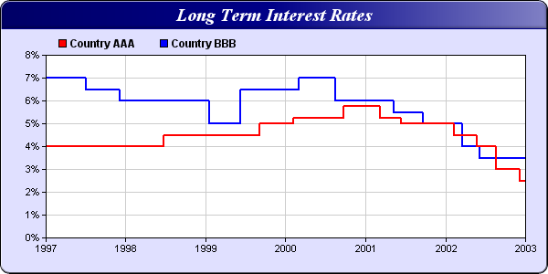
I am trying to accomplish something like this with WebChart. I see that the example linked above is a ‘category’ type and I can not send in anything but doubles so I understand that wont work. However, I have been trying various ways of overriding the settings per this thread and this thread - many thatks to @AlbertoD , @Jeannot_Muller & @MarkusR for contributions to show their efforts, Im doing this trying to affect the Yaxes labels, min, max, steps and scale but Im having very little success so far.
Var injectionValueY As New jsonItem
Var injectionScaleY As New jsonItem
Var injectionValueX As New jsonItem
Var injectionTicksY As New jsonItem
Var injectionTicksX As New jsonItem
Var injectionScaleYaxes As New jsonItem
Var injectionyAxes As New jsonItem
Var injectionxAxes As New jsonItem
Var injectionScales As New jsonItem

injectionValueY.value("min") = 0
injectionValueY.value("max") = 1
injectionValueY.value("stepSize") = 1
injectionTicksY.value("ticks") = injectionValueY

injectionScaleY.value("stepped") = true
injectionScaleY.value("offset") = true
injectionScaleY.value("Labels") ="["+"on"+","+"off"+"]"
injectionScaleYaxes.value("scales")= injectionScaleY

injectionValueX.value("min") = me.xmin
injectionValueX.value("max") = me.xmax
injectionValueX.value("stepSize") = me.xstepsize
injectionTicksX.value("ticks") = injectionValueX


injectionyAxes.add( injectionTicksY )
injectionyAxes.add( injectionScaleYaxes )
injectionScales.value("yAxes") = injectionyAxes
injectionxAxes.add( injectionTicksX )
injectionScales.value("xAxes") = injectionxAxes

options.value("scales") = injectionScales