Xojo Documentation is useless

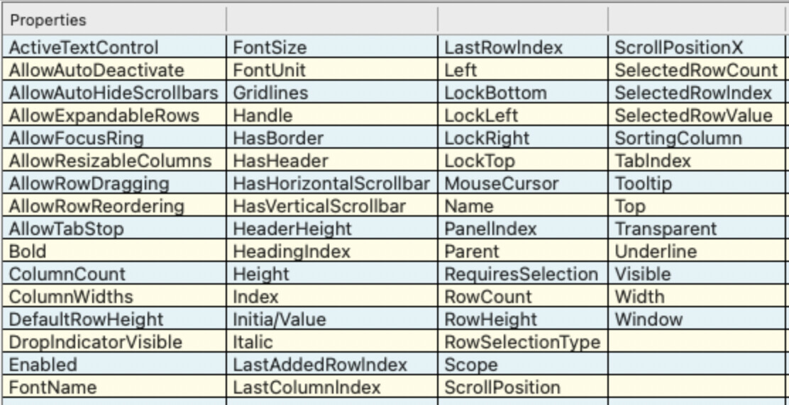
The new docs also list the tables at the top but with additional info such as signatures and types so you don’t have to click to go to another page with this info. With that in mind, what about the new pages are less intuitive?

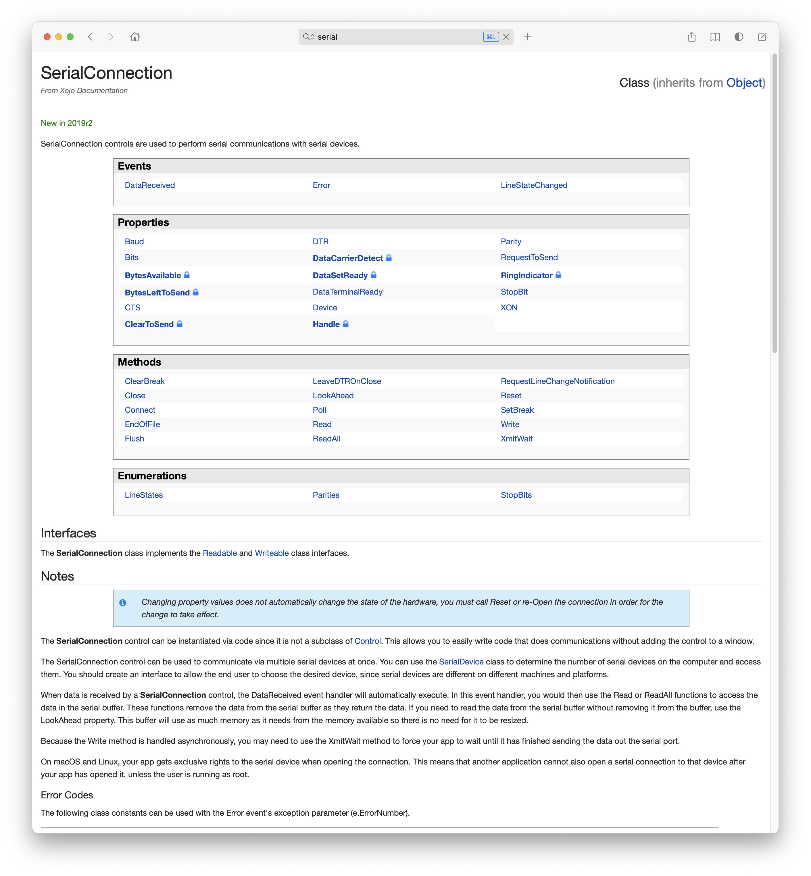
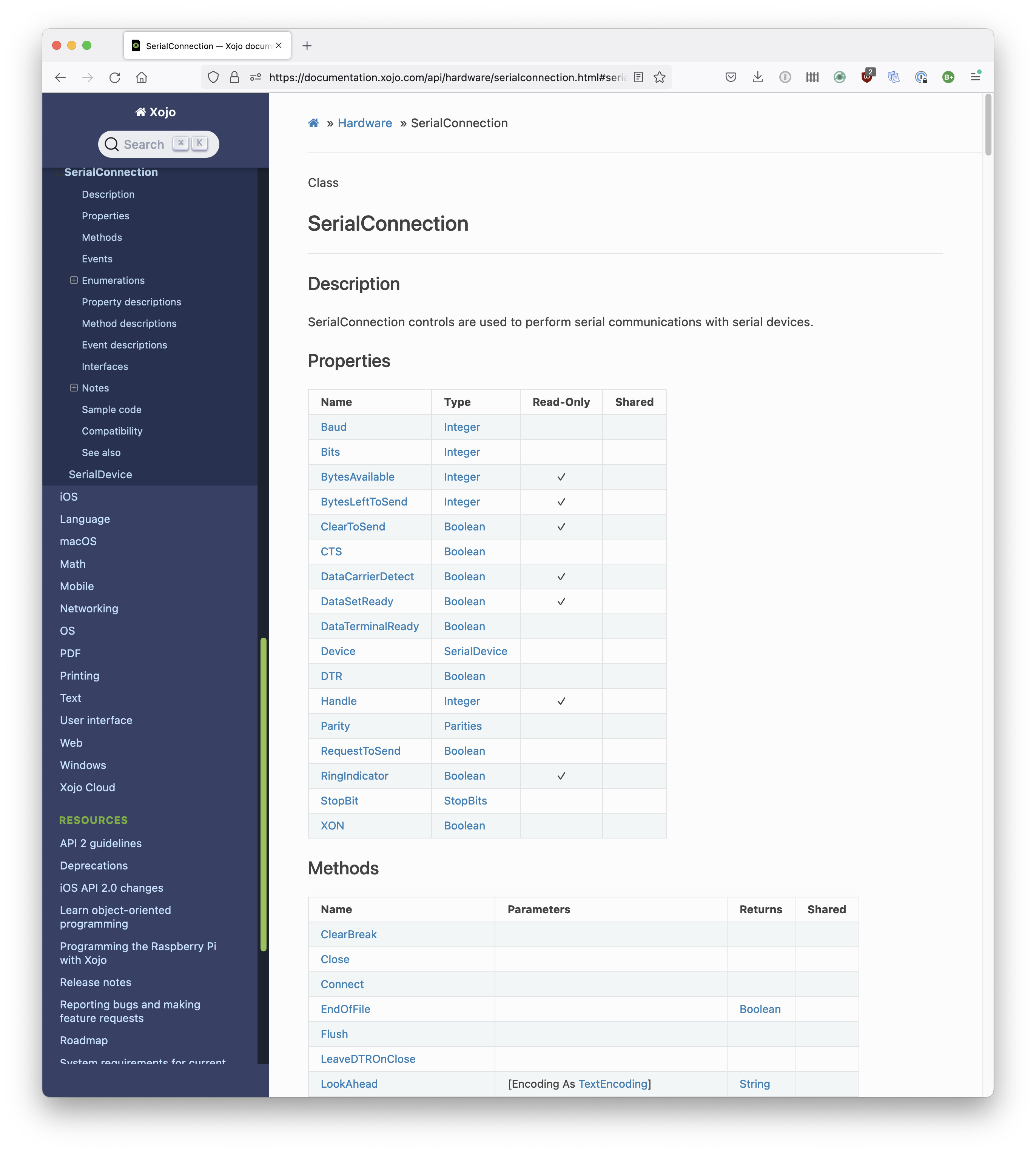
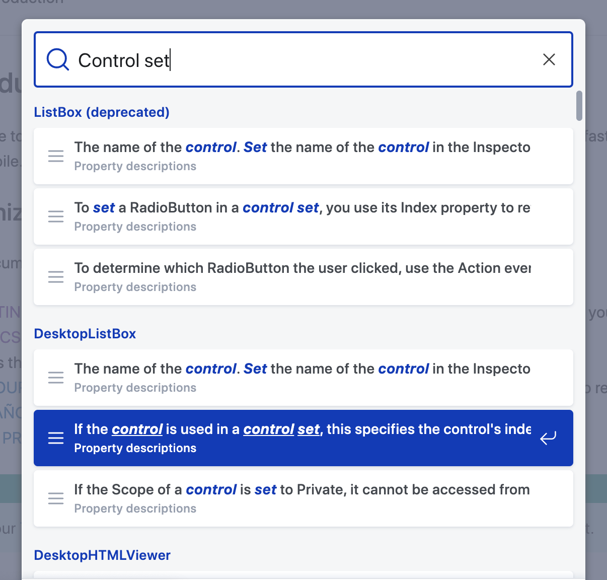
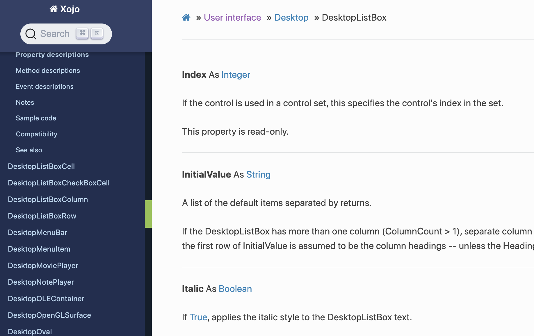
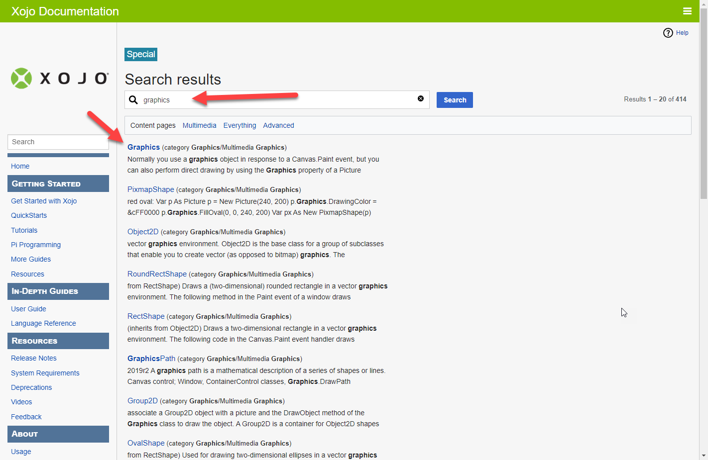
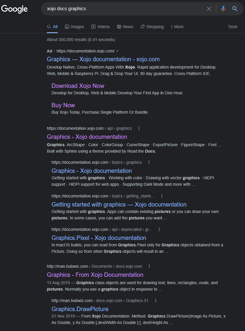
The pages in the new system, in my opinion, do not at first glance present themselves specfically “about” the topic at hand. Rather, they are “about” everything related to the topic at hand. For example, I’ve attached two screenshots, one of the new system, the other of what I use (Old docs loaded into Dash). I searched for SerialConnection. To get to the text that truly describes a SerialConnection (the notes section), the new system requires the equivilent of 13 “Page Downs”. The former system requires zero in order to start reading about a SerialConnection.
I do want a quick list of events/methods/properties that can be used to access the details, but I don’t want to scroll past all those nitty grittys to get to the big picture. I suppose for me, just moving the “Notes”, “Compatibility”, “See Also” sections up above the property / method / event descriptions would solve a lot. Hopefully that makes some sense. Searching in the new system is an entirely different discussion.

And I am not onboard with the categorization of the new docs being “useless”. But I definitely would describe them as inefficient for us users.


2 Likes

The # is simply the search engine’s icon for the page itself. It means that what you typed matches the name of the page (graphics in this case). The arrow is there because you have that item selected so it’s telling you that if you press return, that’s the entry it’s going to go to.

A lot of times the search takes the user to the middle of the page, some times that is not what the user needs. Being at the middle of the page is confusing for many reasons, gigantic page, not clearly divided topics, topics without content, topics without examples, etc.

Lets se an example imagine I want to search for the method SelectAll of the WebTextField

After the trouble of understanding the list of results,

-The list has not one but two deprecated controls before WebTextField (TextArea and TextField)

-Next, about your “tables at the top” suggestion, there is no way to go to the “page itself” The title of the page should be Bigger and clickable.

image

-Anyway, after SIX topics (including the deprecated ones), a user reach the one just to be EMPTY

image

So, with this empty descriptions and ligth divisions is really easy to be annoyed and confused.

  • Deprecated items should be last in the list
  • The little blue grouping title in the results should be bigger and clickable to go to the top of that topics page
  • Find a better way to break between elements (darker, wider HR or even an image)
  • Put better descriptions on each element and dont leave blank ones
  • Put examples and better ones on more of the elements
1 Like

If you have to explain all that, it’s a bad design.

12 Likes

If a word appears a LOT on a page, we tell the engine not to index that word if it’s leading a place we don’t want it to lead. Several people have complained about it coming up with deprecated items. The only way to avoid these is to remove them from the documentation or tell it not to index those pages at all so you’d have to go directly to them rather than search for them.

As for your results, at least it’s finding things related to graphics. Every single result is related to graphics. In the old docs (and you can try this yourself), the first page of search results (20 items in total) doesn’t include a single page that has anything to do with graphics. The closest it gets is Group2D and ColorGroup. So in this respect, the new engine is significantly better. However, it is only searching text so we need to find places where it’s not quite right and tweak it.

In terms of Graphics.DrawPolygon, it’s hitting that page because Graphics is in the title. However, I just added a search hint to the Graphics page so if you try it now, that page now comes up first. Should you find any other search terms that seem not not bring up the page you expected, please create an Issue so that we have all the info we need and can improve the searching.

1 Like

Type “Control Set” into the search field:

You get some irrelevant hits of the word “control” at the end of a sentence followed by “Set” at the beginning of the next, but the fifth hit down does look promising! Now click on that, and you get… what??? Why am I in the “Index” property of DesktopListbox? I clicked a link called “control set”, not a link for “DesktopListbox”! I mean, yes, I can see that it’s talking about the index property of a listbox that’s in a control set, but the problem is there’s no hyperlink at that point to get me to info on control sets in general. If “control set” in that entry linked to information on control sets in general, I’d be happy. But it’s like this throughout the new docs - everything is a dead end. It plops you at a text hit and says “There, I found your text, my job is done!”.

This is pretty much what happens every time I need some info from the new docs - it either comes up with nothing, or it plops me into the middle of a vast sea of endlessly scrolling items that have nothing to do with what I was searching for, giving me no idea where I am in the documentation hierarchy.

In contrast, in the old docs, if I type Control Set, I’m immediately greeted by some auto-fill that suggests that the engine knows what I seek

and when I click on that, after being suitably chastised for using the old docs, I get a link to… a User Guide explanation of Control Sets!

Screen Shot 2022-08-10 at 10.38.50 PM

and when I click on THAT, I get a whole page, entirely (and solely) about the subject I’m looking for information on! (and the added bonus of someone telling me that they don’t think Control Sets are needed because controls can be added at runtime :roll_eyes:)

2 Likes

#confused

[edit]
/me reads rest of post, notes that you just fixed that :slight_smile:

[edit2]
or was that edit on the new site, I have no idea

#goesbacktosleep

1 Like

I agree; I used to write technical documentation for web projects and it is extremely difficult. It took me a whole summer to create the extensive documentation necessary for ONE control panel, now imagine documenting for a whole programming IDE and its language.

The new docs will get better.

1 Like

Ad’s for doc, really? :frowning:

This is part of the problem, hubwiz gets the right target.

Your site design in terms if SEO is all wrong internally and externally and don’t get me started on the showcase.

https://documentation.xojo.com/api/graphics/

will always win over

https://documentation.xojo.com/api/graphics/graphics.html

I don’t envy you fixing this.

Don’t forget that GoogleTagManager is used for the docs, too.

Responses like that lead me to question whether you are in fact looking for genuine feedback from your customers, or if you are just looking to defend your… something?

1 Like

I would take that to mean “It’s better now than it was” and that’s true. It has improved a lot from initial release, and I can see advantages over the old docs given time. There’s certainly still work to be done, though.

@Anthony_G_Cyphers He was actually comparing it to the old docs. I guess I just cut the quote short. Anyway, as someone else (I can’t scroll up on my phone while typing this to see exactly who) has already pointed out, his comparison is actually not accurate.

https://tracker.xojo.com/xojoinc/xojo/-/issues/69593

Yeah, I read the initial post from Geoff so I had the context. My point was (though likely not expressed properly in my currently exhausted state) that the new docs probably aren’t going away so we need to look at improving them as much as possible, and they are working on that.

1 Like

@Anthony_G_Cyphers I’m exhausted too… no offense intended from me. Perhaps I should revisit this thread tomorrow.

1 Like

Maybe we just need a doc for the docs…? :roll_eyes:

6 Likes

I already shared a screen shot. Here’s two to better explain:

  1. A Table Index (here’s the properties, bad order, but you understand the idea):

And in each section where we have a direct access from the index, we have a Top To The Index Table icon to click on.
So when you are reading a Property description, you come back to the Properties Index Table (same for Method and Events).


(imagine the Entries above are links, and if you place the Mouse Cursor above say “ActiveTextControl”, you will get an info text like I show in the previous screen shot far above: “Indicates whether the control is active”).

Actually, one have to scroll and scroll and scroll…

That is for the presentation.

And for the code example, they dates from the day they were added to the Language. A better simple example is welcome.
Something like the example given for FolderItem (Open, Save…).
CellBackgroundPaint (simple, but effective example):


// Set the Odd and Even Colors
If Row Mod 2 = 0 Then
  g.ForeColor = CMY(0.1,0.0,0.0)
Else
  g.ForeColor = CMY(0.0,0.0,0.1)
End If

// Draw the Row Background
g.FillRect 0,0,g.width,g.height

That is for a two colors background, and add code for a three colors background and explanation.

At last, some paragraph (or pages) explaining how to do far away with the ListBox (as this is my example) is welcome. Here’s some ideas:

  1. How to create a Graphic Header (DesktopListBox with images in the Header, but not only: colored / styled text too).

  2. How to insert a Column in a populated DesktopListBox.

  3. How to adjust the width of a column (all columns) to display the whole text (if possible…)

  4. Etc. I think you understand what I meant.

BTW: and before I forget… Add in the documentation each and every important trick / info… etc. that appears in the Forum (as questions / as answers).

What ? Yes, I am dreaming and not talking for my own use.

My screen is full of sputters I burst out laughing so much. :rofl: :joy:

2 Likes

A lot of ink has been spilled over the new documentation. Having briefly worked with the old documentation when beginning with Xojo, and then with the new one since, the latter can be challenging for someone who is learning Xojo. One part of the difficulties stems from erroneous or missing content, sure. The other part is search and find.
Looking for a better understanding of why the new doc’s UI is how it is, I started from this blog:
https://blog.xojo.com/2022/02/11/new-documentation/
One of the major advantages of the SPHINX engine is version control, as pointed out in the blog.
SPHINX is Python’s documentation engine, so I had a look at Python’s own documentation.
One notable difference is the search engine. It employs the standard workflow of

  • enter search criteria
  • hit ‘enter’ key/search button to launch search
  • select desired content from result list
  • hit ‘back’ button to get back to result list for selecting other content

whereas Xojo’s search engine requires

  • enter search criteria
  • select desired content from result list
  • re-enter search for selecting content from the same result list

No way to get back to the result list whithout launching a new search. This deviates from the standard search workflow employed by Python docs, Google, DuckDuckGo etc. One thing we learn in engineering is: stick to standards. If you deviate from standard, it must be for a good and comprehensible reason. What is the advantage we get with Xojo’s doc search over a search as implemented in Python docs?

4 Likes