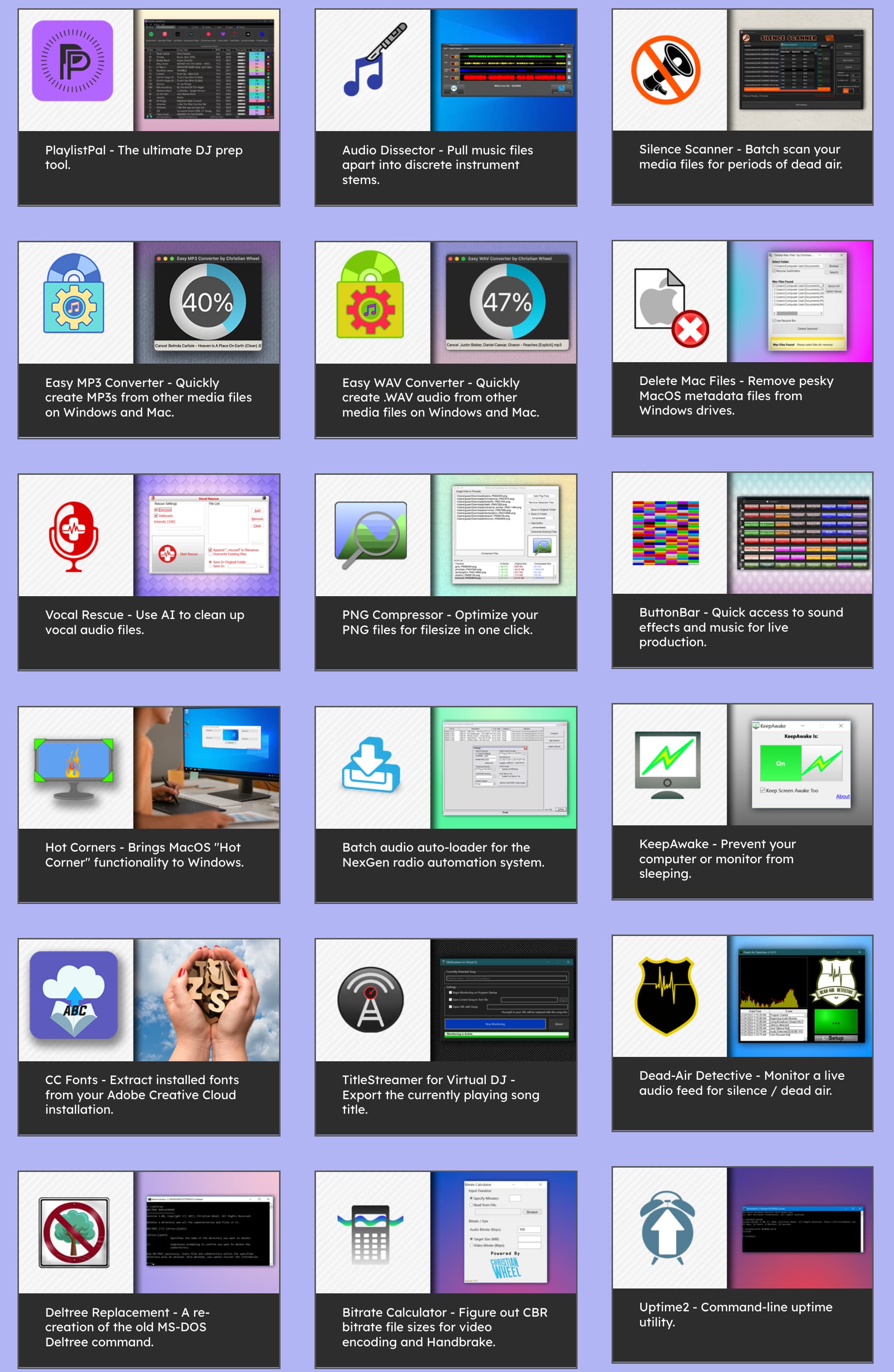
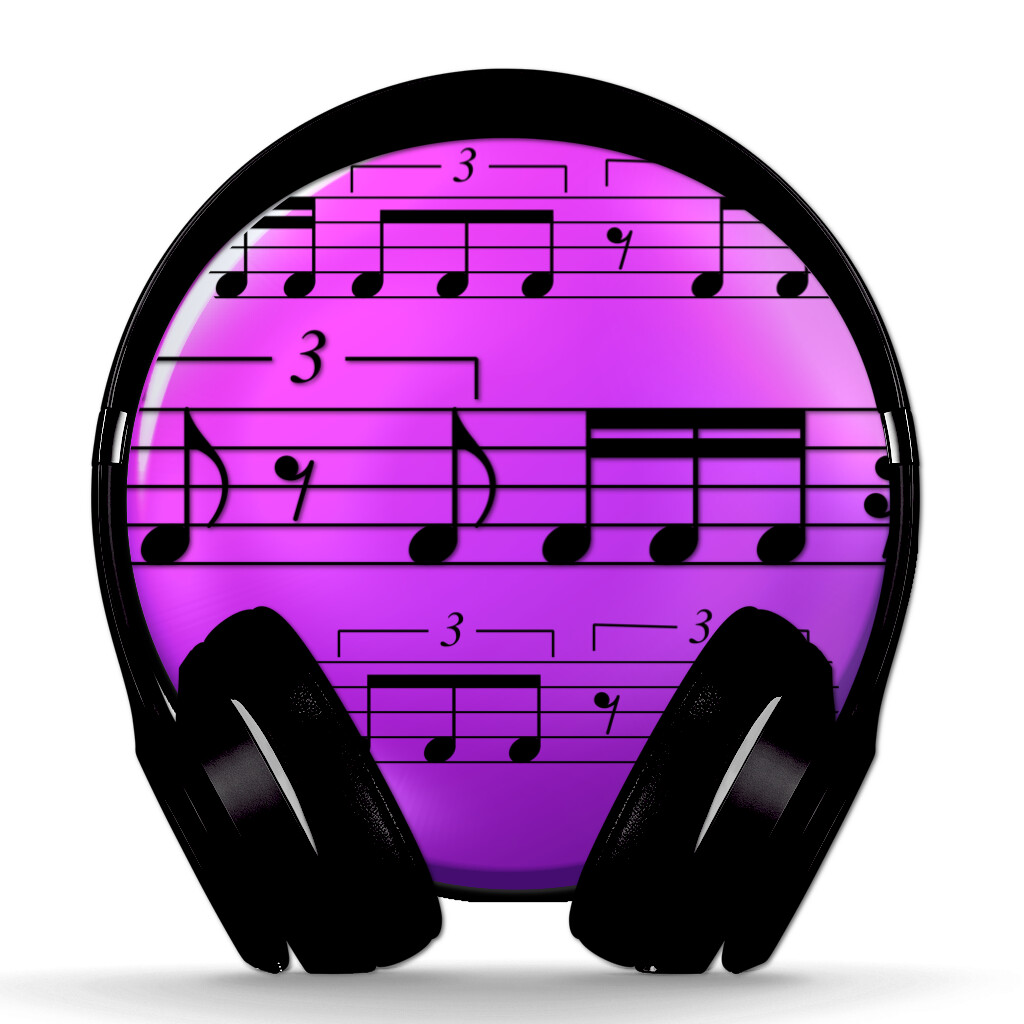
Hello everyone, lately I’ve been posting topics related to the design of applications made with XOJO, and today I’d like to propose another interesting post where you can share the following: We all know how important the choice of our app’s icon is. I’d like to see the icons of your apps to get some inspiration and understand personal tastes. I’ll start by showing the icons I’ve created for some of my apps, which mainly deal with music but also with data management, media management, etc. I look forward to seeing your icons!
5 Likes
Queste sono bellissime! Li hai fatti tu? Ottimo lavoro - Le mie icone sono noiose ![]()
1 Like
Ciao Mike, grazie infinite per il tuo pensiero e commento. Si, sono state fatte da me con Logoist e Pixelmator. Ci sono stato veramente tanto per realizzarle perchè non riuscivo a trovare la strada giusta. Mi ha fatto piacere il tuo parere
1 Like
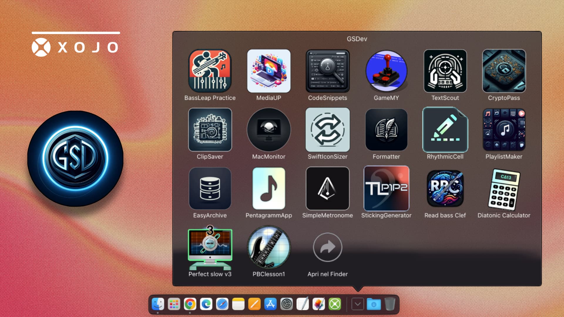
I used to make all my App icons in ArtText 2 for macOS (as I have no design skills). I asked my son who is a Graphic Designer to create some icons for me for the ~30 applications I’ve created over the years. I thought he’d create half a dozen, but he created 26! Here they are:
I paid him generously for them. Now I’m madly rebuilding all my apps to use his icons!
8 Likes
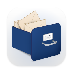
My current app for email archiving:
A new app I’m going to develop this year:
The Mail Archiver icon is from a graphic designer. The icon for the new app was inspired by AI.
1 Like
Beatrix, are you sure your icon is from a graphic designer?
I’am using the same icon (with more powerful colors) for one of my apps - and licensed the icon several years ago from Fotolia, now Adobe Stock.
Yes, I did several rounds with the designer and I have the original Photoshop files (somewhere). Your icon is similar but not identical.
1 Like
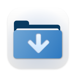
That out of focus arrow is an eyesore ![]()
I don’t have any constructive suggestions because I don’t know what your app is / does, sorry, but that arrow has to go.
4 Likes
The app is going to archive messages from Messages, WhatsApp and anything similar that doesn’t run away.
Perhaps something to show chat bubbles / messages? A folder with a down arrow is very “downloads folder” and doesn’t convey that your app downloads messages from cloud chat services.
The out of focus arrow is problematic because it’s the dead center, the focus, of the icon, and yet it’s out of focus. The focus of the icon needs to be something that your eyes can latch on to.
If you’d like to continue a back and forth, I would be happy to; I don’t think we should derail this thread more though, sorry everyone. ![]()
5 Likes
It looks scaled up from a smaller asset.
1 Like
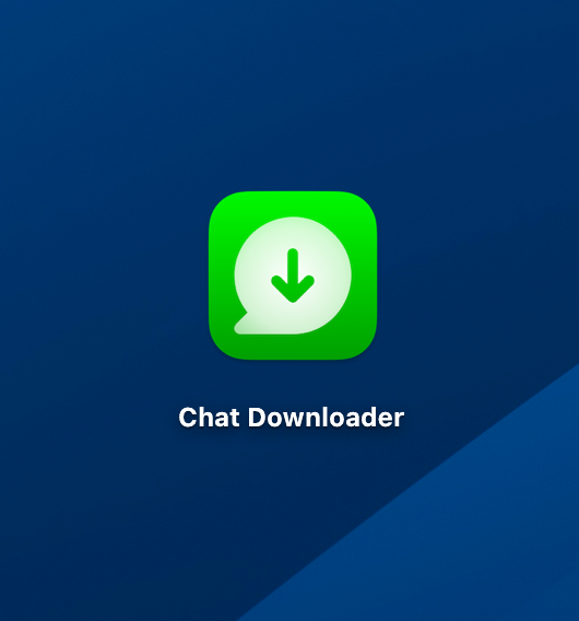
Just wanted to follow up, and to swing this back on to the topic of sharing, here’s what I came up with ![]()
11 Likes
"Nice design, nice color, and above all, the meaning is clear. Great work and valuable advice.
1 Like

Lots of icons I can’t share as they are part of paid contracts and I don’t want to take the time to ask.
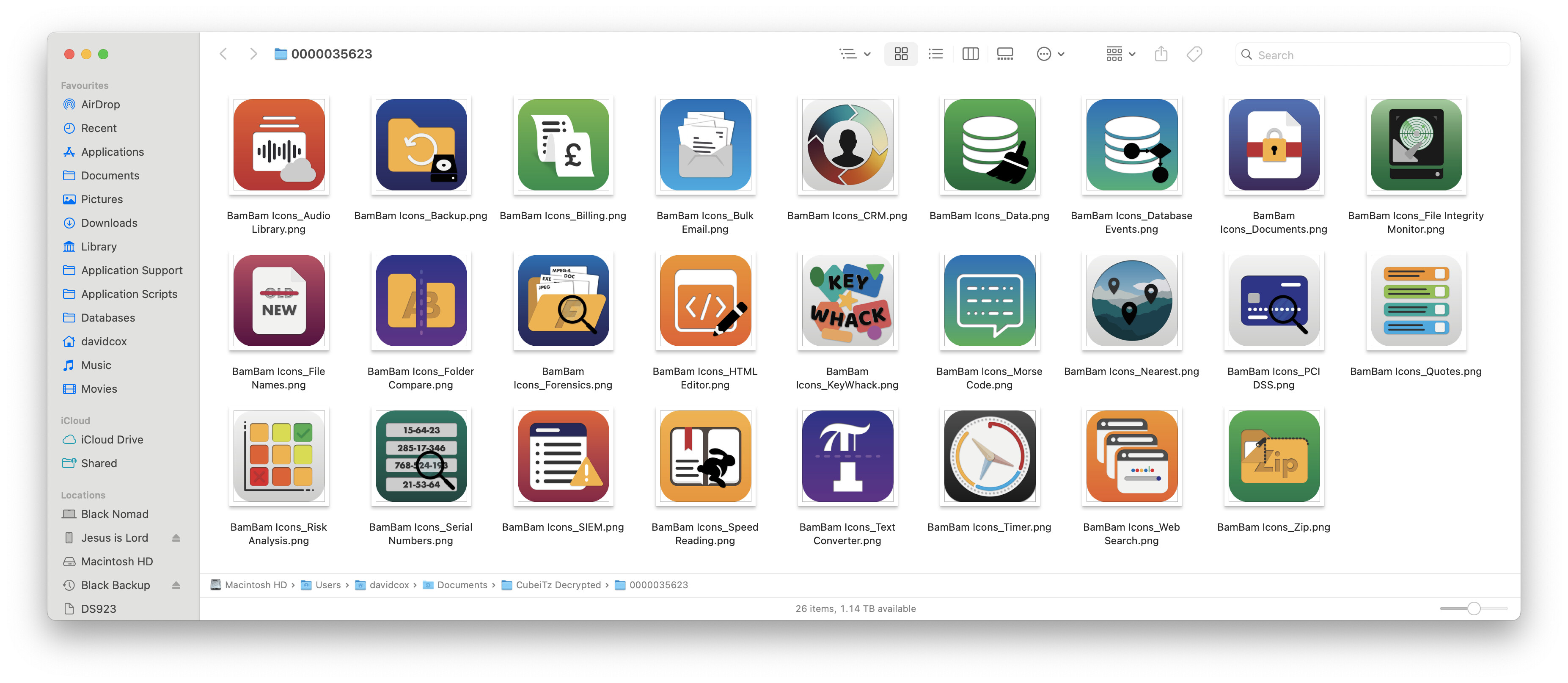
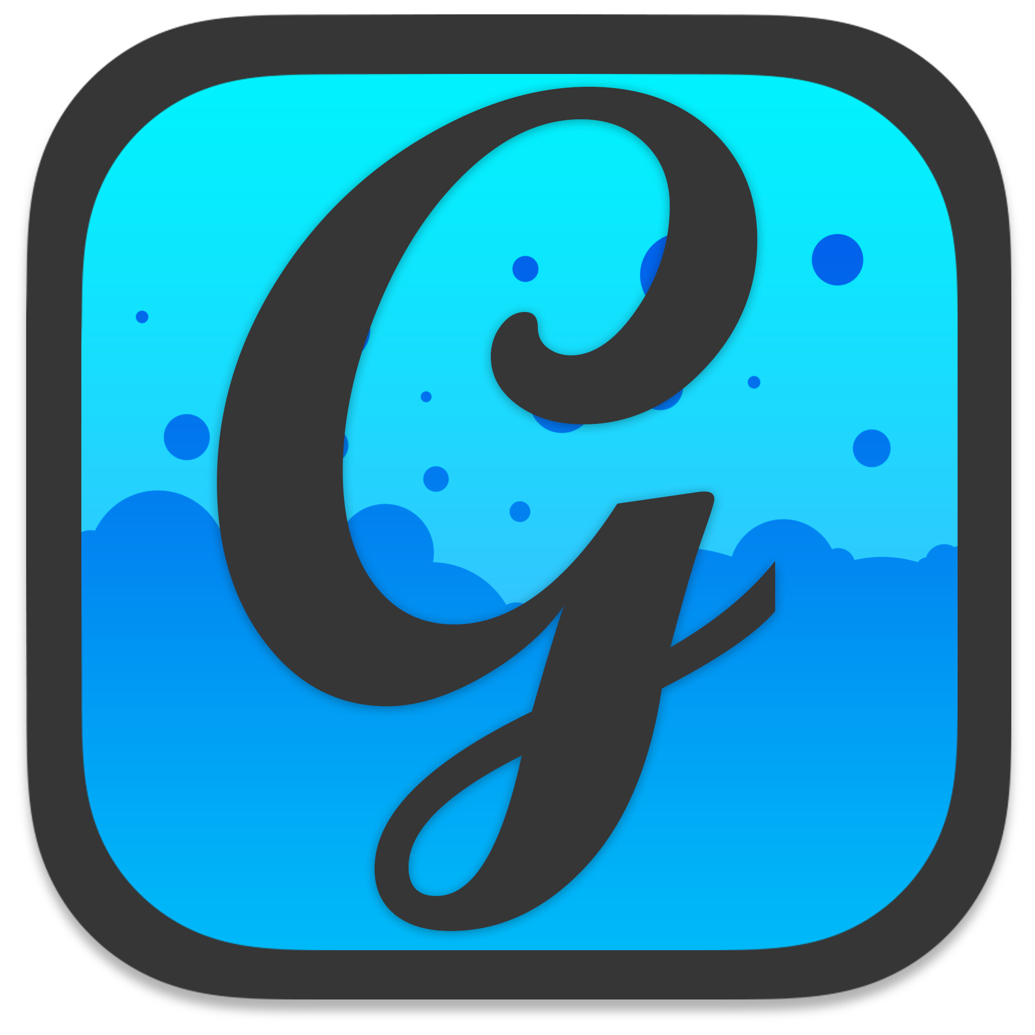
Here’s a couple of variations I created for GraffitiSuite:

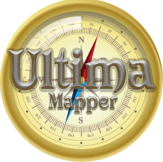
And a couple of large icon styles for one of my free applications, Ultima Mapper, which are about 16 years old now:

If you want to compare the new GraffitiSuite icon to the old (circa 2010):

1 Like

Oh man, I do so miss the days of 3D glassy stuff in UIs. Everything is so flat now.
3 Likes
![]()
![]()
![]()