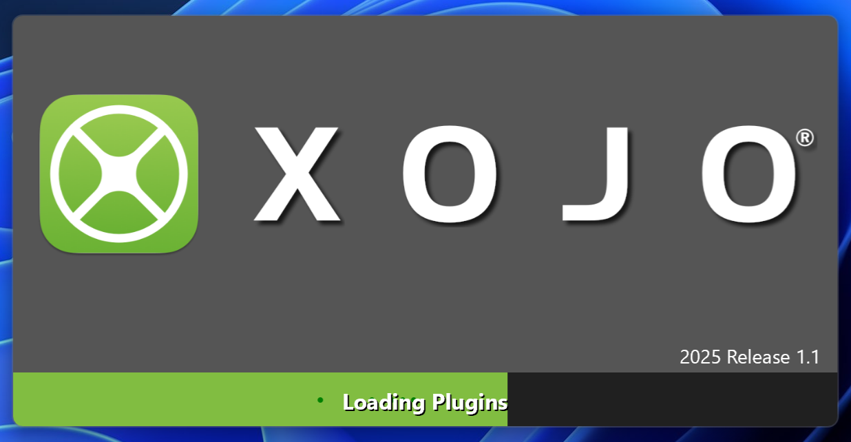
even worse since the ProgressBar has some weird “dots-animation”
so 3 things are above each other and “striking through the Text”: The green filling bar, the dots, the Progress-Text Label
Shadows
2 Labels have shadows, 1 Label doesn’t, App Icon also doesn’t have a shadow
shouldn’t it be “all shadowy” - or no shadow at all (which I’d prefer)?
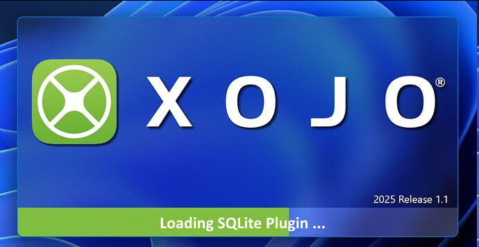
And since loading Xojo might take a while, I often click outside of the SplashScreen (or work with some other application meanwhile)…
…then (in the “not frontmost window state”) it looks really, really bad (in my eyes) - transparency gone.
IMHO, they certainly need to remove the green dots. I agree, if the Xojo logo is going to have a shadow the logo should too. I wouldn’t with the loading plugins and version number. Shadows on smaller text doesn’t work well.
I was pleasantly surprised the first time I saw it.
Yes, it has some design issues. But I choose to believe that it was put in place as a tech demo for the new WinUI updates, and will be aesthetically improved in time.
I’m bothered by the fact that the IDE now has two loading windows: a Windows version and an everything else version. 5 different project types with no practical way to share code, and now even within a single project we have user interfaces that cannot be shared at all. Xojo: cross platform that isn’t!
I believe they said the normal controls would eventually be replaced by XAML controls, so this issue would go away, so I can’t say this is the worst thing in the world. But we don’t know for sure that’ll happen.
I for one am not touching the XAML stuff because I’m a cross platform developer. It’s bad enough I have to use NSPopoverMBS and HTMLViewer on Mac, and a modal dialog and WebView2MBS on Windows. I’m not going down the path of splitting up my interfaces further.
This is a pretty typical reaction among developers. I don’t think it really has anything to do with the design itself — it’s more about the fact that most developers just don’t like changes they can’t toggle on or off when they feel ready. LOL.
Even if the logo had been designed by Prada, Sergio Pininfarina, M.C. Escher, or Paul Rand (okay okay, I know — not all of them are still with us), chances are we’d still grumble about it.
Let’s just embrace our natural love for consistency — call it a “developer quirk” — and accept that sometimes things do look different. (I get the same feeling when I see photos of myself from a few years ago.)
And hey, it’s just a splash screen. I’d only start complaining if I had to see it four times a day because Xojo kept crashing (which it doesn’t).
So… well done, Xojo
I mean… it’s not a great layout. There’s more spacing between the letters than there is horizontal padding from the edge of the window. It’s nice to see that they’re trying to use new technologies, but it’s apparent that no one there has design sense.
OT
i not use third party plugin, the dll’s comes with the IDE are few Kilo Bytes.
that can not be the load times from SSD. more a initialization procedure.
the ide start took 18 seconds at my pc …
I guess that that large spacing sadly is part of the registered design, so, it couldn’t be changed. You can see it applied everywhere in the Xojo contents, as in their blog or in the main website.