Correct. Applications are supposed to automatically support the user’s choice. If your computer is set to dark mode, you expect the user interface to be displayed in dark mode.
3 Likes
As for Dark Mode I think the document background seems a little too bright for me.
I run Safari in light mode, while my OS is dark mode, because I don’t want the high contrast between websites which are mostly white and the dark app appearance.
Could be a Safari bug, that it still tells the Website you’re in dark mode, while Safari itself is in lightmode.
But still, I would rather have the choice my self.
Also because, not every dark mode is equally well made, as the “OSes” one.
1 Like
I have. If it’s leaking memory, please report that.
1 Like
Hey so I filed a feedback ticket, there’s some information missing I think is important.
67659 - New Docs Release Notes are Missing Dates
Thanks for looking ![]()
1 Like
I don’t see this behavior as I scroll in Firefox or Safari (macOS 12.2.1).
I can’t see an option in Safari to override Light / Dark mode?
I can’t see the URL change just because I scroll the page down to a given property. That seems to be what @Geoff_Perlman is suggesting?
However, if I click a link at the top it does change. You can also simply right click on the property link and copy it without even clicking it.
1 Like
Sorry I was unclear. If you click on a link in a table at the top, it will change the URL to that item’s description. You can also just right-click on a link in one of the top tables to get a link to that item’s description.
Good catch. It should be a darker shade of green. We will get that fixed.
My first impression is that it’s a huge improvement. Some annoying bugs e.g. the navigator pane on the left jumps to a different topic from the one I just clicked on, but overall, yeah, I like the direction. Seems to take me where I want to go with a lot less digging than the old system, and is more readable.
Would like more depth in the navigator hierarchy, to reduce scrolling in the main window.
5 Likes
the new documentation is not in context(or filtered) for the project we are working.
the whole documentation should be generated on the fly.
the navigation should not list hundreds of sub items.
openable navigation need icon.
setting favorites would be nice, marking with a star or something.
have a database behind for users.
for me the primary usage of documentation is only interesting as framework description,
to have a overview of class,method,events,properties.
size to 70% would fit my monitor better.
1 Like
So it’s not really a setting it’s a fudge. Not surprising that when asked the css still thinks dark mode is on.
![]()
![]()
Eventually? Not when 2022r1 is released? You’ve only got about 6 root paths on documentation.xojo.com, can’t you put a rewrite in for anything other than those to move them over to the old doc domain?
Yes I appreciate all that, but I’m letting you know that your signature’s are not large enough, all you’re using to deliniate them apart from the rest of the text is a weak hr and a strong tag. Bold/strong is not a sectional header of which the separate signatures are, they are the header for that section of information and quite possibly the most important information on the page. This design makes the page look like one massive block of text, broken up by the code examples. Maybe use H3 instead so they are bigger and they show up in the left nav?
Yes, thanks for the explanation of anchors, it would be nice if that actually changed while you scrolled the page though but it will only change if you happen to follow a link from the top portion of the page, and this is the problem.
If you are proving a link for someone to something specific and you and up there via browsing, it would be nice if you could just hover over the signature to show the chain/link icon (as happens with Property Descriptions) so you can quickly copy the link, but as it stands right now, you have to scroll up to the signature, make a mental note of it (including if there are multiple signatures), then scroll up to the top of the page (because there’s no jump to top) then click the link for the entry you were just at to be sent back whence you came, just so you can copy the url out of the address bar or right click and entry and copy the link instead of jumping back? I don’t know about you, but that doesn’t seem user friendly to me. I’ve seen this on sites before, what would be nice if the signature hung at the top of the page as you scrolled down for it to be replaced when you got into a newer section so no matter where you were in the wall of text you always knew which section you were in as it would be at the top of the browser.
![]()
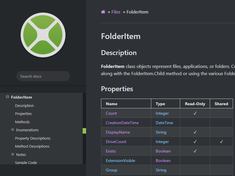
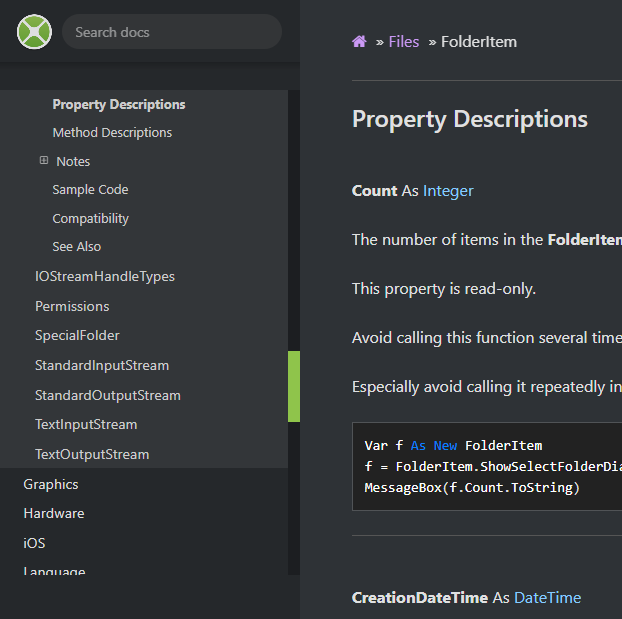
See the code example for FolderItem - Exists, note the colour of FolderItem, paste that snippet into the IDE. Var and As should be the same colour, and f and FolderItem should be the same colour.
I can’t check that as I’m not a tester, you could probably take the code out of the IDE to do that then.
Maybe instead of this, which quite frankly takes the mick and is a complete waste of space if you have height limited (note the reduction in size of the scrollable area below):
You could have this always shown and remove the shrinky/expandy stuff:
Thanks for the explanation of the back/forward functionality of a browser. Could you change the last crumb of the top breadcrumb to jump back to the top of the page, so if you are in FolderItem and you scroll around, clicking FolderItem at the top will take you back to the top, as I note you can go to Home and File, but not the top of the current page.
While I’m looking at the site:
- Topics and Resource under Organization of the documentation link to subsections where they should just be internal anchors.
- As in some code blocks has an additional space after them in the raw html
- Older release notes don’t have links on the ticket numbers
- There is a header issue on Deprecations - 2017 Release 2
- The subscript number 1 at the end of the above section passes through the breadcrumb when the page is scrolled
- Some links to deprecations aren’t working, like Text - Format - See Also
4 Likes
Would just be easy and nice to let the customer decide, doesn’t it?
1 Like
A simple CheckBox (Project Based Documentation) would be enough.
I do not care about Web or iOS or… when I am programming a Desktop application; WORST: it BOTHER me (disturb me).
PS I do not care that in API 3 * the sources are the same for all platforms (Web, Mobile, Desktop)
- I probably will pass away before this will come (API 3).
if i work at desktop i do not want seeing methods that are only for ios as example.
docu need a filter.
Desktop
Web
Windows
Console
Linux
MacOS
iOS
Android
Database …
11 Likes
Apple gave you the choice. You choose dark. Apple provides a very simple way for CSS to decide if it is dark mode or not. You are asking for a more complicated method to ignore that and switch to a mode you have explicitly decided against. Effectively you are forcing them to use cookies, which has ramifications for EU customers (UK too for now) as they have to get permission prior to storing any cookies.
Would it not be better here to encourage a “best” design for dark mode so you don’t think it is a problem using it.
2 Likes
Any kind of dark mode is a problem for me. I left green-on-black CRT monitors behind in the 1970s and have no desire to go back.
9 Likes