I’ve just read the post about the new documentation system so I thought I’d take a look and post some initial feedback on it.
- Search
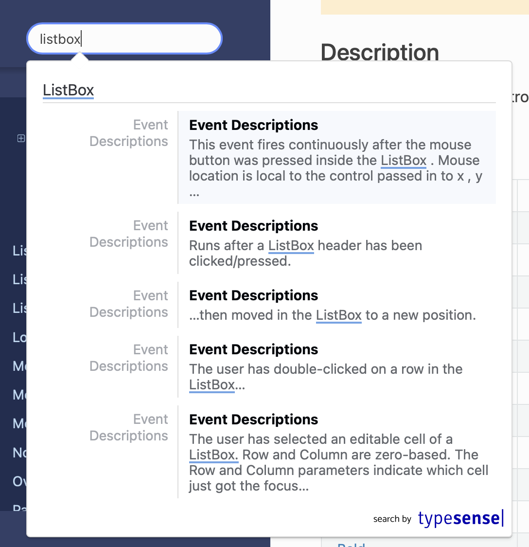
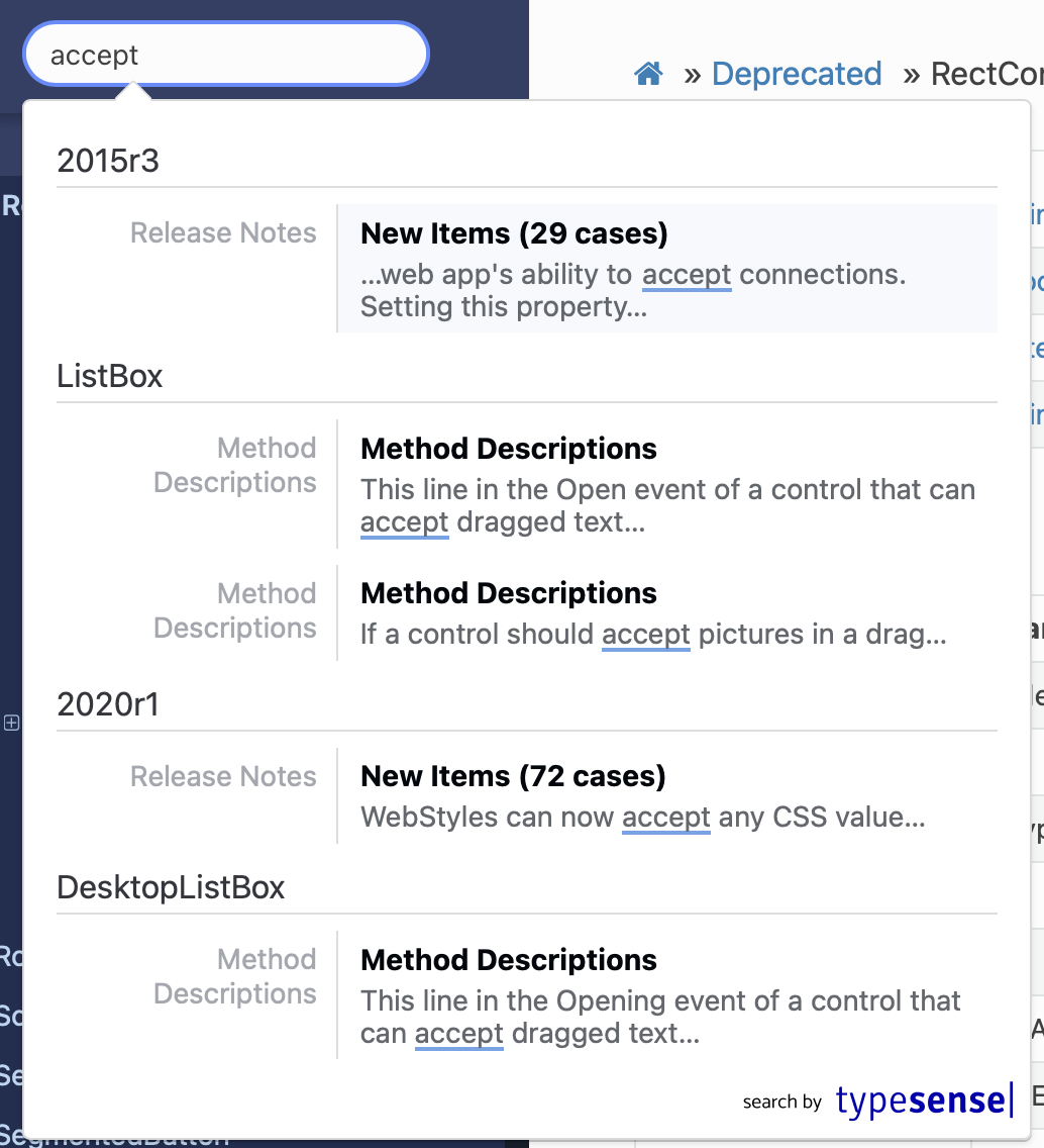
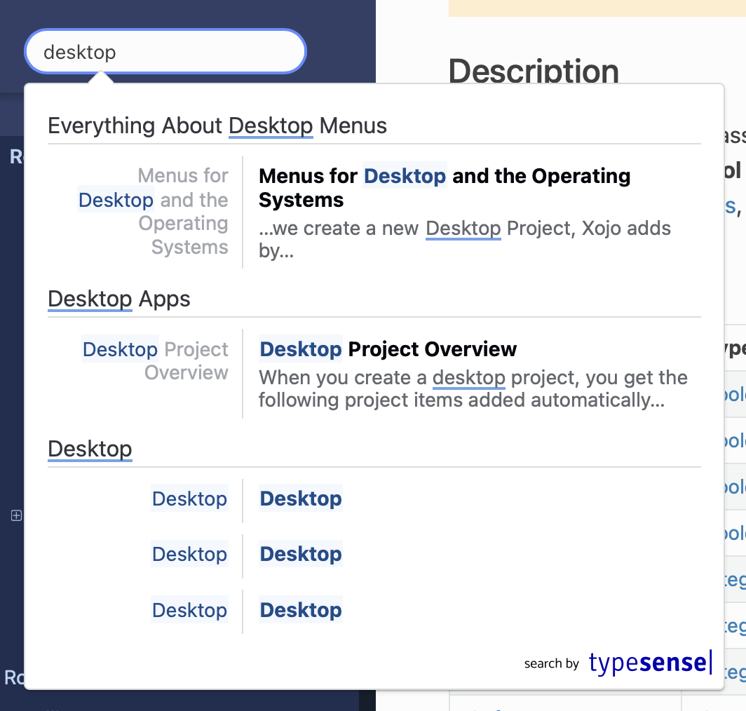
I’m unable to jump right to where I want to go, as an example, if I search for FolderItem and hit enter it takes me into ShowSelectFolderDialog inside FolderItem, not to the root because as I type it’s limiting my results, but why to something 3/4 the way down the page, what made that the top hit in FolderItem?
If I search for Close I’d want to see a list of where Close is used and not end up where it thinks I should be, in Close for the deprecated ListBox.
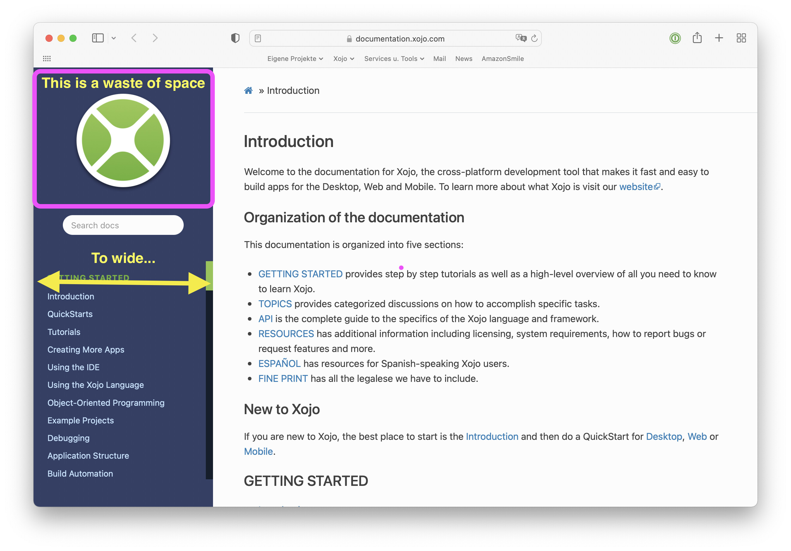
- Mobile View
If you search in mobile (shrink the width of the window to simulate that) and click and entry on the nav you’re taken to just after the entry, so the heading of where you’re meant to be is obscured, just off the top of the screen.
- URL
The url is horrible, can you put it on documentation.xojo.com ? I see that you use a redirector when opening up the online docs from inside the ide so wouldn’t it be “easy” to redirect all older editions to a different url (legacydocumentation.xojo.com?) tweak the target url parameter in 2022r1 to docs instead of documentation so you can check for that and redirect those to documentation.xojo.com while sending all the older ide’s to the legacy docs?
- Layout
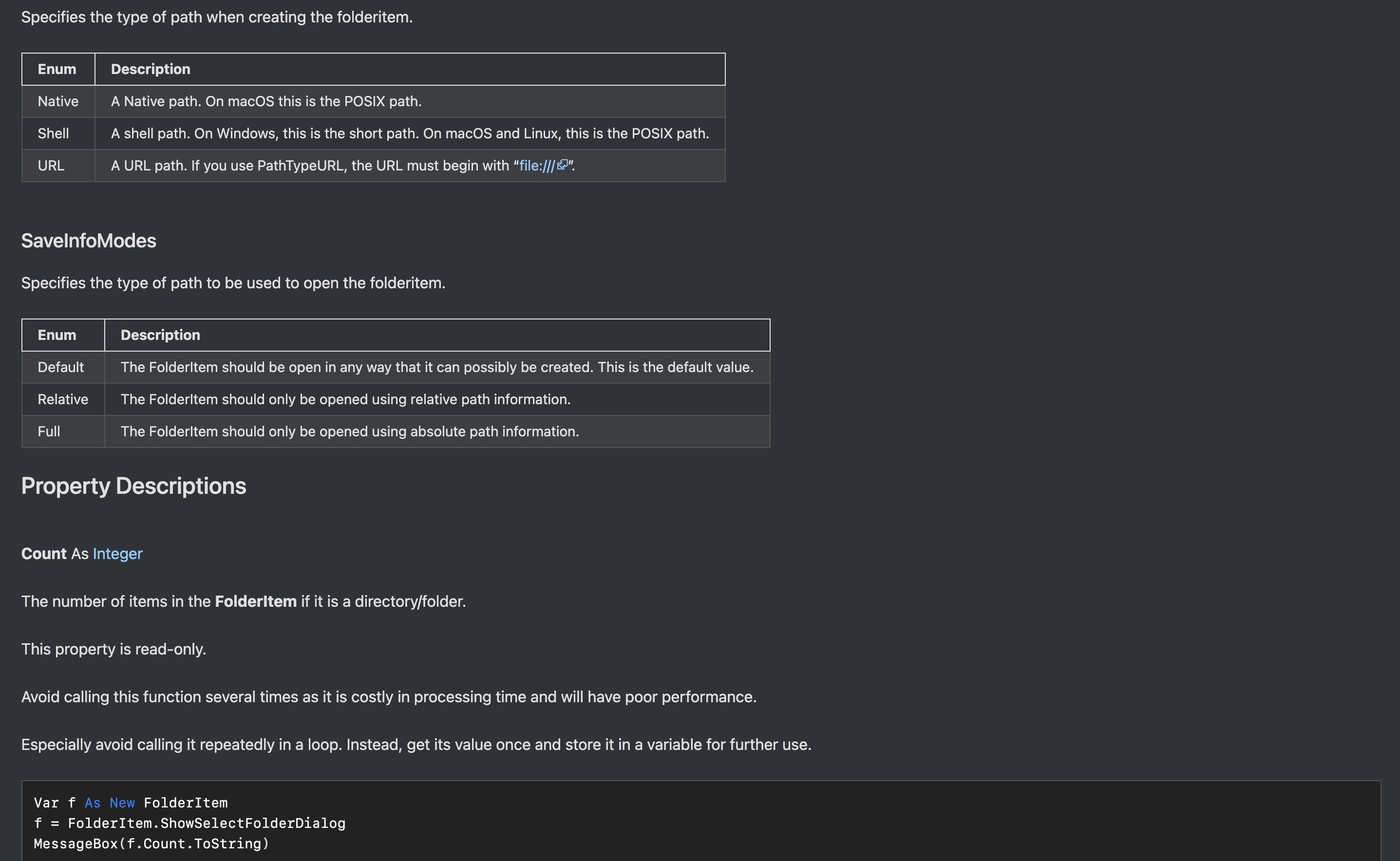
There are no clear defining demarcations between sections so everything seems to flow into one homogenous pile of text. This can be seen in FolderItem where Enumerations just seems to fall into Property Descriptions. This could be work a little better if, for example, each property were listed in the nav, like you do with enumerations. At a glance, you could then see where you were. If I’m in the middle of looking through a list of properties on for example, FolderItem, there’s no way to see what other properties there are without scrolling back to the top to look at the list again as the entries aren’t shown in the nav broken down in their sections. MSDN does this slightly differently with a right nav for the location content that moves as you scroll the page so you can easily see here you are.
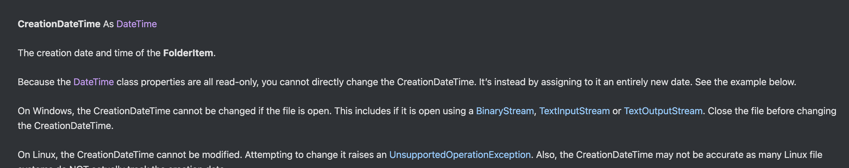
The font choice of the signatures is very hard to tell apart from the description, it doesn’t POP out at you that this is the thing you need to be taking note of, maybe you could change this to the code font this will also demark the blocks of text a little better. For example, with FolderItem.DriveCount, the same font is used for the DriveCount in the signature DriveCount As Integer as the entry a few lines down in the description and the “This property is shared.” looks almost identical in that its a small bit of text ending in a link, the only difference being the ever so slight bolding.
- Navigation
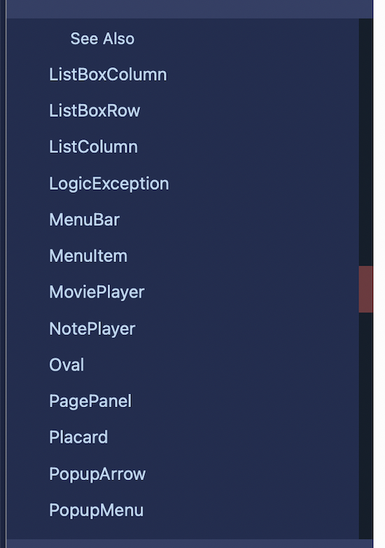
The navigation on the left doesn’t highlight the section I’m currently viewing on the right side as is seen in some other documentation systems so I don’t quickly know if I’m looking in the properties of something or the events if I have, for example, come here via search or a link. There’s also no drilling down into the list of properties for example.
- Linking
There is no way to link directly to sub items without copying the link from the very top of the page where the hastag is inserted to jump you to the correct section. I see there’s a link when you hover over section headers, but not things like property names, event names etc which will make it more cumbersome to link to the forum to help people.
- Copy
Could there be a Copy button on the code blocks, maybe in the top right corner?
- Code colours
Is there a particular reason that you didn’t stick with the code colouring from the IDE or will the IDE’s default colours be changing to match the docs? Also, Var isn’t highlighting correctly, its white (in dark mode), the same as the variable name and also Classes are wrong so the code looks ever so slightly odd and isn’t as easy to read as when it’s in the IDE.
- Input
When you open the site, either from the ide or browsing, could you put the caret in the search field so its ready to receive input, can you imagine google not doing this when you visit google.com
Overall its a lot cleaner and on a quick viewing, it looks like a good platform to build on and move forward.