Yes, this duplicated what was discussed already in this thread.
As I told there, you can rely (as a workaround) in implementing the DateChanged event on the own DateTimePicker instance.
In fact, that would make sense because you (typically) would want to get the date/time selected by the user… so receiving the DateTime in the event handler does it already.
Right… and since you’re asking I guess that’s a big difference
I’m not quite familiar with c++ and win32. But in case you have got an visual studio example project, why not add it to the Feedback so that others can give it a try to see if there is a chance to get the datetime-control in a more comfortable height.
That is NOT true as others have said. But either way, why this control can’t be resized to match the “native height” of the other controls?
Yeap, not being able to resize it is because a BAD implementation, not a restriction in Windows:
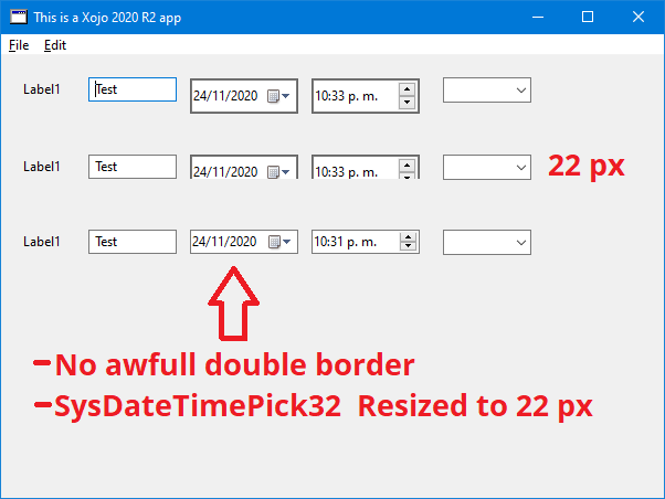
In this image, I just edit the properties of the control at run time, so IT IS PERFECTLY POSIBLE to have a decent looking native control.
I know, Xojo don’t like new features to be called half baked but:
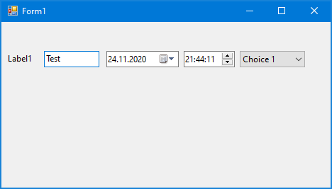
Default size not the same as the other controls in the IDE
Resizing the Xojo control don’t resize the native one
That double border really looks Awfull
The representation on the IDE don’t reflect the options selected on the inspector
The most important function SelectedDate is not even working
It is not you, as the las point in the list, SelectedDate is not working. In what OS are you testing? In windows allways returns Nil
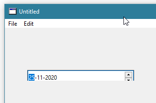
This could most likely be done even better. Like I said, just a quick test.
I’ve added that to the Feedback case, too. This at least looks better, and is done in “pure Xojo”.
This was in Xojo, using the new xojo date picker. You can edit the properties in run time with apps like spy++ or Window Detective. I only changed the height of the native control to 22px and disable its border.
Looking at the structure of the control (using those same aps), it looks like they are nesting the native control in a canvas like container, making both controls have a border, so, disabling the border of the native control, it looks better, just one border.
BUT I would prefer the other way around, to leave the border of the native control. Maybe the border of the canvas is drawn by hand (with a hadcoded height of 22px)
Not only looks better, it actually works. Really a shame that a control could make it in this crappy shape to a “final” release.
The only 32 pixel high date time control I can find is the one for UWP, e.g. add a new event on the windows 10 Calendar app, and that certainly isn’t win32
Let’s be gentle. It’s a welcome first sneak peak. It’s always the same story it seems… new features need a couple of releases until they are usable. It always seems Xojo is working on macOS only, so finetuning for Windows/Linux gets missed/overlooked. All I hope is that that is going to change…
Meanwhile… Let’s put our feedback in the appropriate place, so that it doesn’t take a couple of next releases, but just one until that Control is useable on Windows, too.
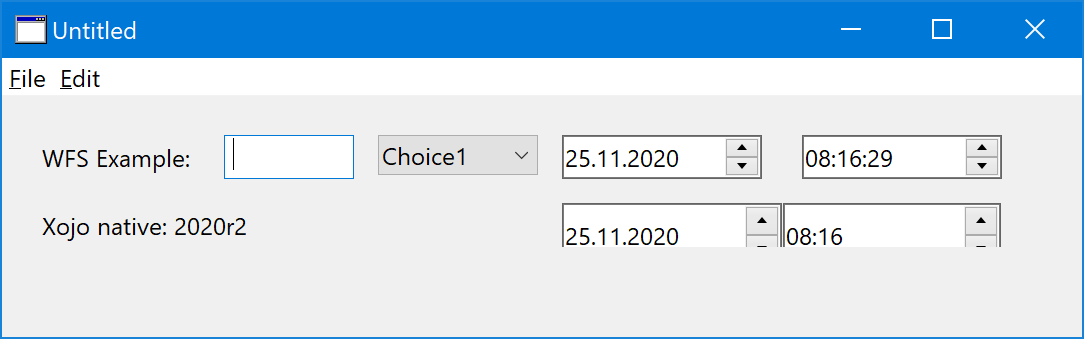
I don’t wish to sound ungrateful, as I’ve been waiting for a long time for such a control, but I was so disappointed by this implementation. Not only is the control a non-standard size, but you have no font/size control so if your interface uses Small System font, every DateTimePicker will look horribly out of place.
But my biggest complaint, by far, is the fact that the control is not what a user would expect from a date/time picker. When have we ever used increment/decrement buttons on a date or time field? This is horrible UX design and I can’t believe that this made it into a release version of Xojo.
When the user clicks on the field, a visual representation should drop down to allow them to select a different value… and this should change the .Value of the control.
This was such a necessary and simple feature but this implementation completely misses the mark.