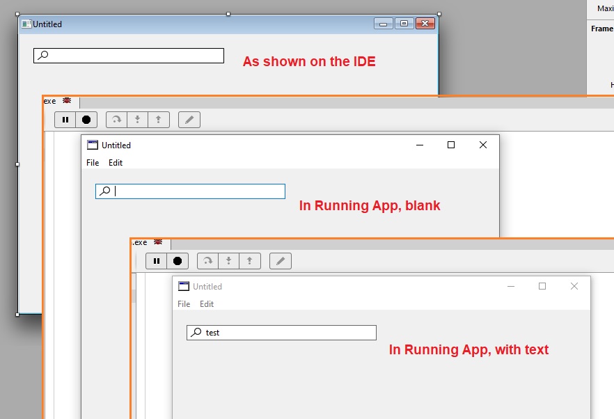
Hello all, looking to see if I’m missing something, if this is by design.
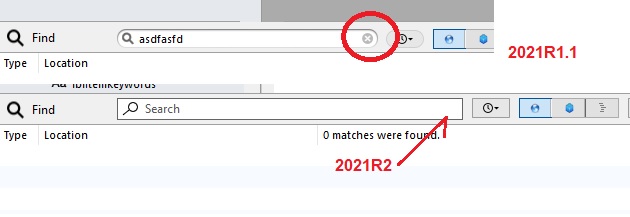
Using Windows 2021R2 I’ve noticed this morning that the clear button is missing on search/replace in the IDE.
Hello all, looking to see if I’m missing something, if this is by design.
Using Windows 2021R2 I’ve noticed this morning that the clear button is missing on search/replace in the IDE.
Xojo didn’t add an option for a cross when they implemented the new SearchField so you now have to press Delete, yes really, you can no longer use Delete. This should be escape, but that’s a bug, <https://xojo.com/issue/65326>, <https://xojo.com/issue/64974>
Perhaps you need to type something in the Search field, as you have for the upper image.
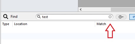
Hi , in R2020R2.1 the delete issue has been fixed, the (X) is still missing from Windows.
Hi Tim Streater, doesn’t matter having something in there or not.
Was this just a windows IDE thing? Did MAC not have the (X) on the right side of the search box? I miss having it.
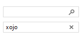
This on a Mac, empty search:
type something:

so Windows never shows the (X) ?
Thanks AlbertoD!
In Windows the (X) was always there if you had something in search or not, now it is just gone all the time.
So maybe it is a bug?
See if the same is true of the search control itself when you drop one on a layout
Looks like this is the native behaviour of the Windows Search Field and the macOS/Linux native ones have the ability to clear the text.
Why do you think so…?
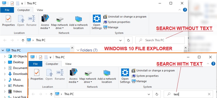
To me, it’s kind of weird to see the “magnifying glass” icon on the left on Windows.
I’d expect a search field to be such as in Windows Explorer… Icon is on the right side. Once text is being intered, the “magnifying glass icon” turns into the “clear button”.
Kind of like here: Win32 - uxguide: Search Boxes

Those screenshots look like they’re from Vista.
Windows 11 Explorer Search:
![]()
One thing to keep in mind, though, is that Explorer is the exception to the rule in a lot of ways. Dark Mode for Explorer, as an example, is custom implemented and has a lot of weirdness in the API. Explorer also uses other custom controls that aren’t readily available.
Hi Jürg Otter,
I think your showing the older Win32, for Windows 7, Windows 8. Windows 10 did change the magnification to the left and a more simple looking box. But, yes many Windows apps still use the older look and feel in their applications. It doesn’t bother me, I’m seeing either type.
Hey Martin T,
If Windows Explorer shows the “X” on the right hand side, you’d think the ‘control’ itself must have the ability - maybe there is a flag or something to allow/disallow?
Xojo is NOT using a native search field. It is just a regular textfield inside a canvas that draws the icon ![]()
They don’t even care about the OS standars, as Jürg Otter posted, the icon is on the WRONG side.
Maybe those images are from vista but microsoft keep the same guidelines aplied to all other windows versions up to date, This is from windows 10:
The article that Jürg Otter posted, it says that is a Win32 control, and the guideline is actually to tell users how to use that standar control it in their own apps.
Microsoft changed the layout in the last versions of windows 10 to have the icon on the LEFT and this layout will be the same in windows 11.
The thing is that if xojo were using a native control for the search field, it should have the correct look and layout in whatever OS the app is running.
Thanks for clarifying… I guess that’s why I’m used to always seeing the icon on the right (our company isn’t using the latest Win10 version).
Yup… The Icon that Xojo is using in their SearchBox for Windows is also looking “wrong” to me.
This all reminds me of how wrong Xojo has delivered the Date/Time picker for Windows… it kind of looks like the same story over and over. It takes quite some (public!) releases for a new Control on Windows to be ready for production. To help Xojo get there - go ahead and file Feedback Cases…
Their current implementation of SearchField is not usable (a bit exaggerated… but for a commercial app I think it is correct) in it’s current state. At least they get bitten by this in their own product as it seems they’ve added this Control to the Xojo IDE.
Contrary to what happens in macOS, there is no native search control on Windows, and Windows itself doesn’t follow any rules about how to implement its own search controls along the SO interface (sometimes the loupe is at the right, sometimes at the left, sometimes there is a companion “X” button, sometimes it is not).
Being said that, please use the Feedback app to file a feature request for adding the “X” button to the SearchControl on Windows.
![]() Well, if this is what the staff working on the controls thinks, no wonder why their implementations are so bad
Well, if this is what the staff working on the controls thinks, no wonder why their implementations are so bad ![]()
Hi @Ivan_Tellez
I’m sorry you haven’t got my point:
“Being said that, please use the Feedback app to file a feature request for adding the “X” button to the SearchControl on Windows.”
Thank you for your support!
I’m assuming that the IDE redesign is now using the new search control. What was it using before, because Windows IDE already had this feature as recently as 2021R1.1
I am questioning the type of feedback, I understand search is a new control so feature request is correct, but the Windows IDE lost functionality so isn’t that a bug?
Nope. Is not a bug. Please, file a feature request if you want the “X” button to be added to the current SearchControl on Windows.
Thank you for your support @Jim_Frankland !
Its a bug. If the previous version had that x button and now its not there to clear the text means its a bug. And what do you mean to say if you want file a feedback. We the customers say if xojo wants you add it. We will then decide if we need xojo or not.