I’m talking about this:
If he could try what I said, would be interesting to see the results.
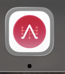
You’re not understanding the UI. That’s a transparent layer, which would render the red circle on to a white squircle, as shown in the preview. Look at some of the layered screenshots on Apple’s website and you’ll see how the layers work. The Icon Composer preview is correct.
Tahoe is adding grey borders when it should not.
Nope, that’s not what I said.
Yes, I realize, I removed it.
Update: I very much misunderstood and have struck everything resulting from that. Sorry.
I understand. No need to apologize.
I guess it seems correct, but rendered smaller than it should be, and containing a transparent border (that preview does not show). Once transposed to the dock, such border renders as grey.
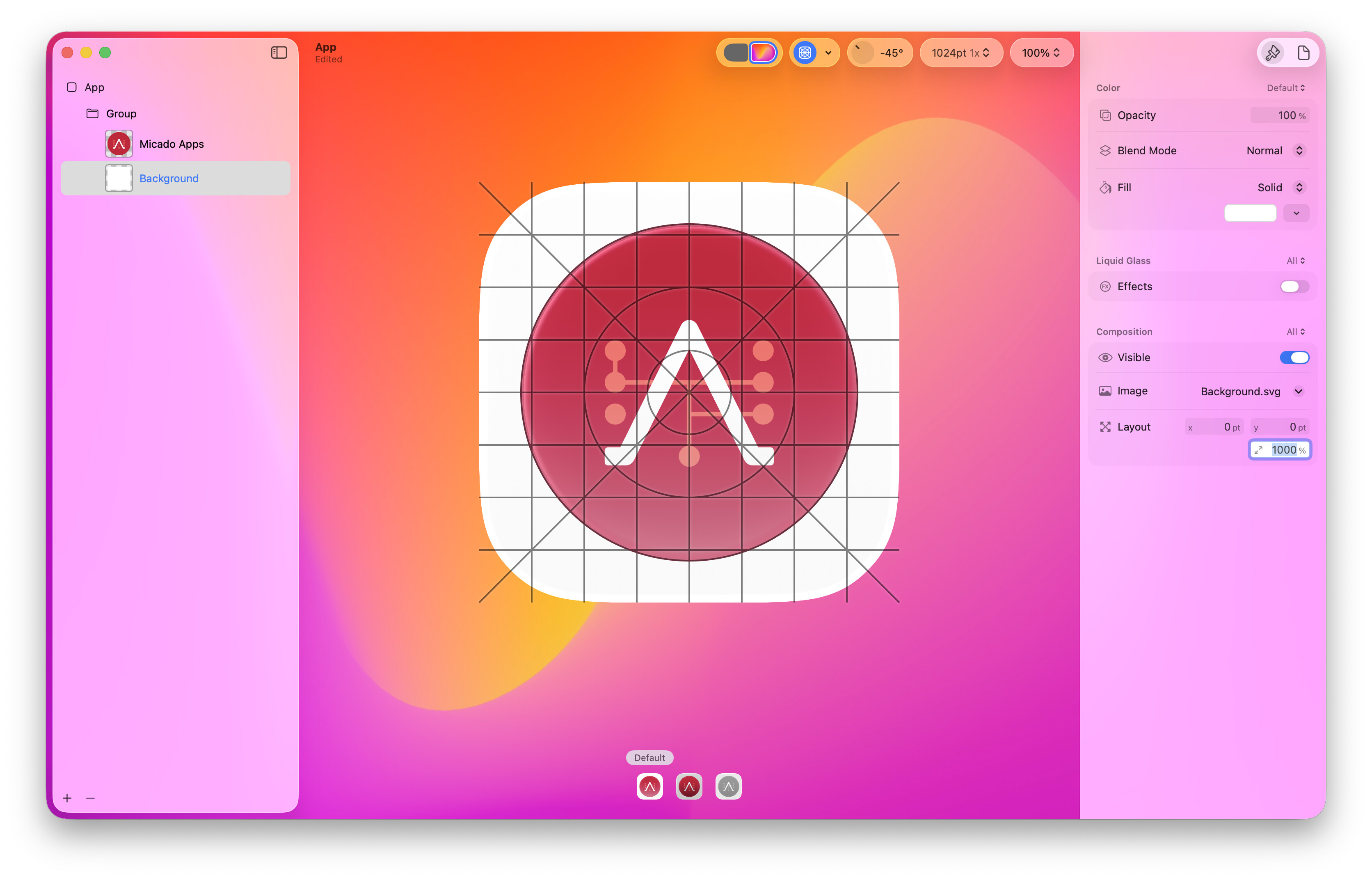
I propose to add a new layer to his design, in the background, set it full white, covering all the area, no cuts, no rounding or masks. And let’s see the new results.
I added a second layer with a white square svg and set the size over the area of the icon.
Unfortunately there is still a grey border.
With this method I would also lose the default background of MacOS.
Anyone who wants can try to find a solution ![]()
Archiv.zip (1.2 MB)
Wait that App.icns came out of Icon Composer?
Because yeah, that App.icns is wrong, at least for < macOS 26.
*tests output*
Yup, looks like the PNG output of Icon Composer isn’t the right size + shape for older macOS.
If Tahoe adds grey borders when the < macOS 26 icon is shaped wrong, then I understand why they’re being added. I don’t know why it’s not using the correct layered icon on 26 though.
If you increase the layout size to 249% or so, the image will fill the squiricle and you’ll have no border in Tahoe. That’s what I did. But in older version of macOS the icon will be larger, too. This is why my original post was how to maintain compatibility with older OS’s, the solutions I found online (and mention in the OP) don’t work for me.
So one again I ask, how can you have both a .icns and a .icon file in the project and have the OS use which one is appropriate? Since Xojo is working through these same issue, maybe someone from the team can give a bit of advice?
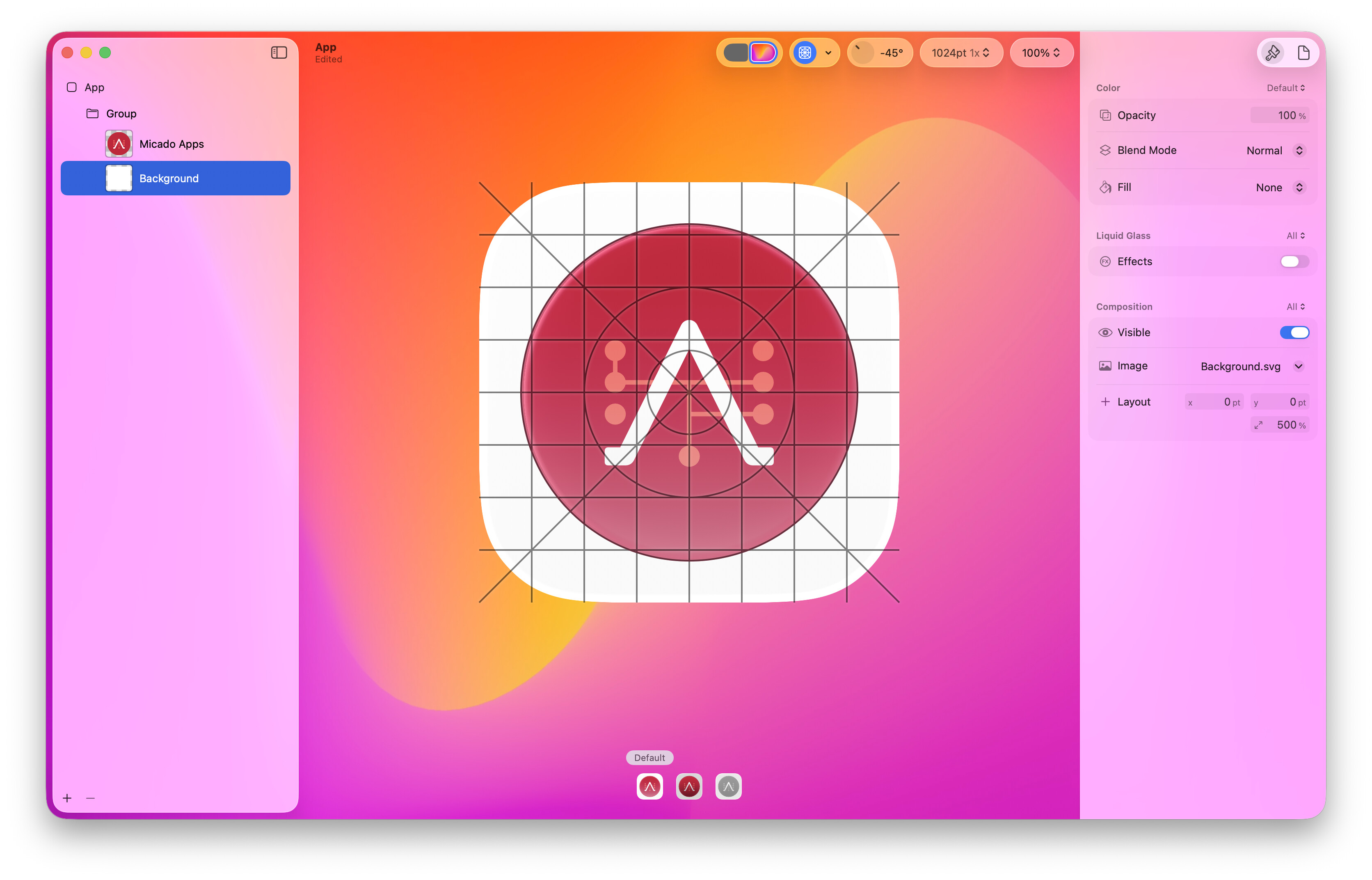
I exported all formats renamed them correctly and created the App.icons file with Terminal:
iconutil -c icns MicadoApps.iconset
Archiv.zip (2.5 MB)
Right, there’s no padding + shadow in the icon, it’s the wrong size for macOS < 26 which is what causes the borders.
OP’s question is really where I’m at now too.
I see the limitations, I know what’s going on, but the problem is:
Why I see a transparent area around it?
The intention is covering all the extent, all pixels, let the composer do the clipping/masking.
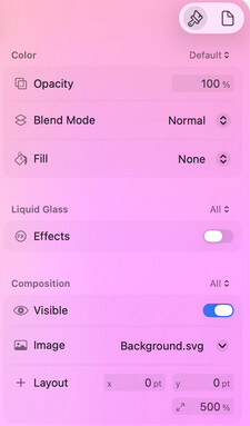
What about setting fill to solid in the background layer, a set it white?
Makes no difference.
Set scaling to 1000 % and solid background.
There is always a transparent area around it.
Try removing the background layer.
That’s exactly what I had before.
I created the background layer for testing purposes.
I guess you don’t need more than 100% to this layer, maybe not even an image, just a solid fill. But I think that right now people will need to continue to study and understand this behavior tinkering with the tool. And I can’t. ![]()
I understand, but I think that may be the reason you always see a border now. I have only one later, the icon, and when I set the layout to 249% if fills the entire squiricle, no border at all. And when I build the icon in the Finder has no border.
Where did this number come from?
Edit: Oh, I see. Trial and error using your design.
Empirically. I increased the value until the icon image filled the rounded rectangle space. The actual percentage may vary a bit depending on the icon I suppose.