I have used Icon Composer to create a new app icon that looks OK in macOS 26, but is too large when used in previous OS’s. Supposedly, you should be able to have both an .icns and a .icon file in the Resources folder, both with the same root name (e.g. AppIcon), and in info.plist add a new entry CFBundeIconName that has the name of the new .icon file. But this isn’t working for me – builds in macOS 26 use the old .icns image. Has anyone been able to get this to work? Or is there some other way to maintain two sets of app icon images, one for macOS 26 and another for older versions of macOS?
macOS26 takes care of this automatically. You do not need to make an new specific app icon for macOS26
Yes I do. The image it creates automatically is too small and has an ugly gray thick border.
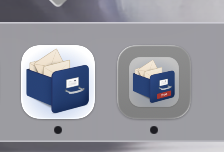
When your app icon has an ugly gray border then you haven’t used the correct template. I had a nice icon with a semi-transparent background which Tahoe didn’t like. So I updated this and now the grey border is gone. New icon to the left and old icon to the right:
Not yet Tahoe style.
That’s because your app icon does not follow the Apple required design/size. If it was, it is ‘converted’ correctly without a border.
It’s a png with an alpha channel, so the border around the image is completely transparent. When you updated, what app did you use and what did you do?
I was poking around developer downloads yesterday and noticed an icon composer app for Tahoe icons. I was curious, but do not know the backwards compatibility nor how to use the generated icons with Xojo.
Did anyone else see this?
2 Likes
It’s available in Sequoia, too. I used it with my existing .icns file to enlarge the icon and fit it in the squiricle (rounded icon border), then exported it as a .png. I entered that in the Xojo 1024 x 1024 image area as the app icon and removed the older smaller images. You can also do a lot of fancy things with liquid glass and graphic layers, if you design with it in mind. For my simple purposes, the icon now looks good in macOS 26. But as I said, is now larger than it should be in Sequoia and earlier.
2 Likes
I think many of us are tinkering right now. ![]()
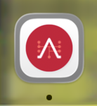
I created a new icon with Icon Composer but still have a grey border.
How did you manage to have no border?
Make sure the size is correct. If borders are added, means you main icon design is too small.
As said, you need to enlarge the main design. In your case the red logo needs to be bigger.
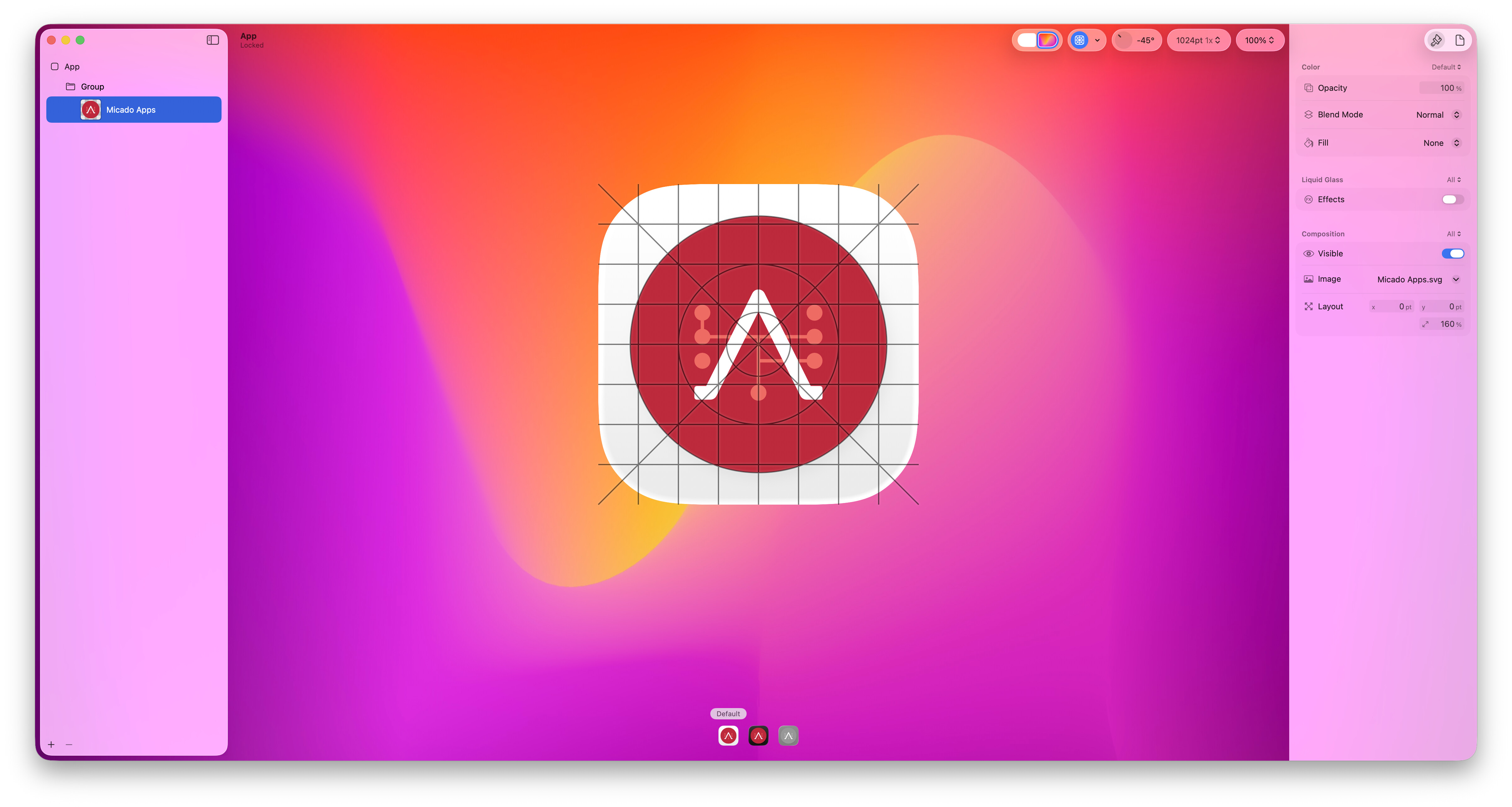
It’s aligned to the grid given from Icon Composer.
The white background comes from Icon Composer.
Why should the red logo.svg be bigger?
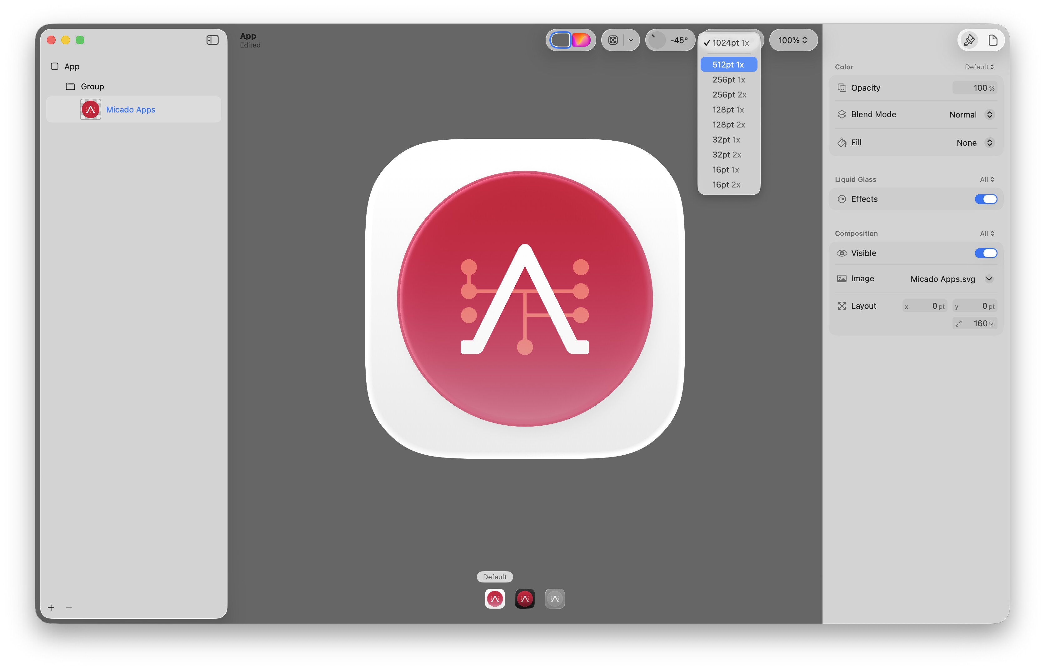
It makes no difference with the exported pngs.
They are always the same size no matter how big the red logo is.
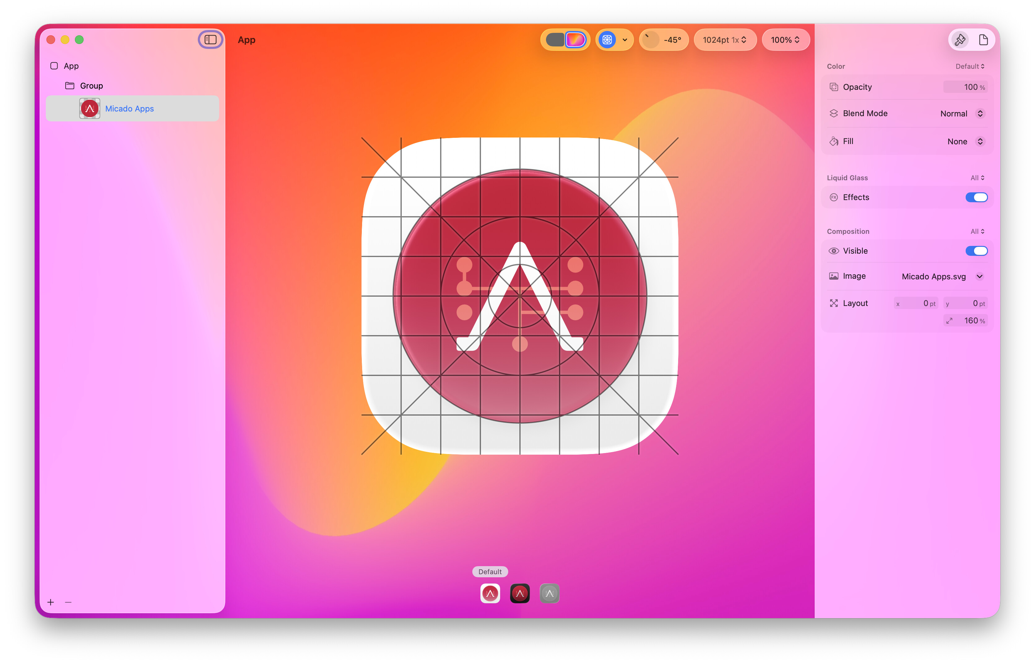
On the right pane, most bottom there is the scaling percentage, just increase it from the 160% to something bigger to fit more of the space.
This increases only my red icon.
The resulting sizes of the exported pngs are the same and there are still grey borders.

It is possible that this stuff requires the app to be built with the macOS 26 SDK. FYI
As far as I know this is not needed. My apps, even older apps, are correctly displayed (no border). Just a glassy edge is auto added in macOS26
As far as I’ve read, you should design your large background without transparency and masks and the composer should cut the rounded borders for you. In your screenshot I see a design with a transparent background, maybe if you add a large white square in the background (another layer) you can get what you desire?
The Icon Composer preview is showing the correct design. When run, Tah-don’t is adding a grey border around the design Icon Composer created.
Take a close look at the differences in this post: