I am developing an application.
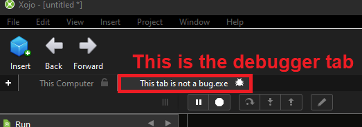
When I run it, a tab appears along the top showing a little symbol of a bug.
Although the program runs fine without problems, Xojo thinks there is a bug somewhere.
Note: It doesn’t make any difference whether I have “Break on exception” enabled or not.
I could go thru the code, and use breakpoints, etc, to try and find where the “bug” is, but is there a simpler way of just going to where the line is that Xojo doesn’t like?
I found that confusing from the beginning. To run the app we click on a button with a “play” icon and that creates a tab with a bug icon?! Who had this idea, why not repeat the play icon in the corresponding tab? Xojo has invested so much time in API 2 to make things clearer and left such a bug in the UI.
I never liked that the tab for the debugger is the right most and not the left most one (next to the main one). It should be easier to identify than the measly bug icon.
My guess is the bug represents the debugger window. But it could be confusing, especially for someone new to Xojo. This is one of those design things that we all overlook - it’s been that way for so long we’re used to it. It takes a fresh and objective view to point out that there might be a better way.
That said, all software has it’s quirks. Sometimes we just need to learn how it works. But if it were my software, I would change the bug icon to something else.
I wondered about trhat. But that tab is for debugging in the app you’re running. Or pausing it and examining its variables to see whether they are what they should be. How else do you indicate that this is a tab for debugging, without using the bug icon?
I can’t tell you how many times my heart has skipped a beat when I catch that little bug icon out of the corner of my eye - “What’s gone wrong?!?!?!?” Terrible piece of UI design.