I’m trying to create a fully client-side responsive layout in Xojo Web using CSS flexbox to avoid server-side resizing logic that slows down the app when many controls are present.
I tried injecting CSS directly in the container’s Shown event, but it had no effect.
I’m a bit confused about how to work with the Xojo frontend and properly apply client-side styling and layout.
You could try to search for Brock Nash’s previous work on responsive web layout with XOJO
Here is one of the links to a simpler example by him:
You need to change the event handler for ValueChanged to TextChanged for the WebTextField in this example to make it work with the current version of XOJO.
Thanks for the reply, I checked the example, but it’s not quite what I need.
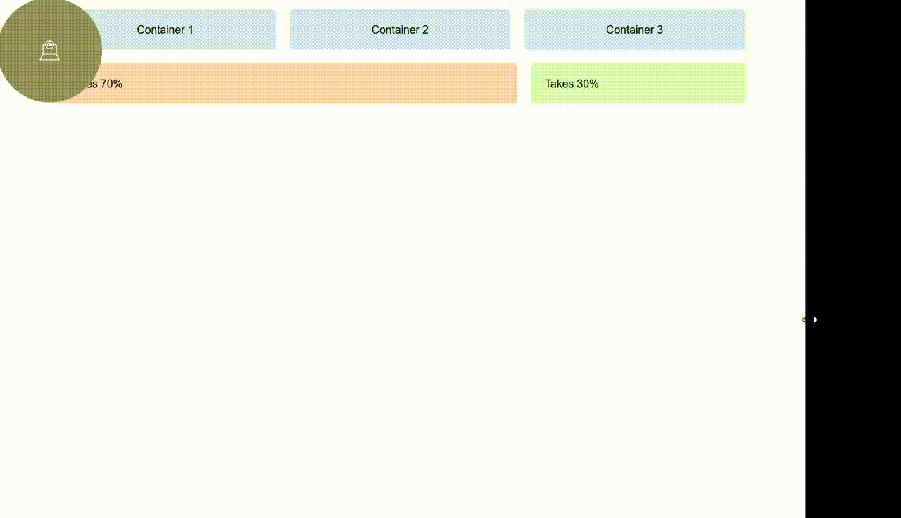
I have three containers that should resize with the screen while keeping a constant gap. Below them, I have other elements that should always take a fixed percentage of the screen width.
So I’m aiming for a layout that scales responsively, not one that rearranges or stacks elements.