Your coding font is a personal, and sometimes difficult choice. With so much variety, how can you decide?
I was directed to two resources today that helps make it a bit easier. The first is:
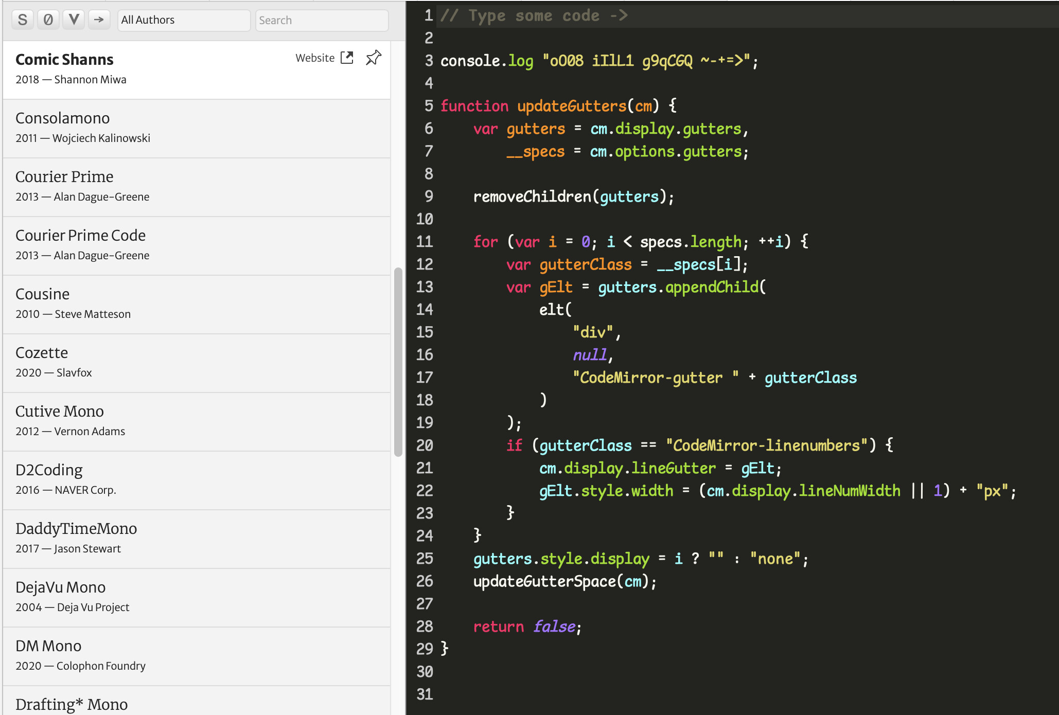
They show you a variety of fonts, lets you pin the ones that interest you, and compare in various sizes and themes.
An even more useful one is:
This presents the fonts in a tournament style where you keep picking between two until you get down to one (or two) that you like. It takes about 10 minutes, and I recommend hiding the font names to eliminate bias towards your favorite font.
Pay attention to how certain characters are presented, like “a”, “g”, “r”, and zero, and how certain symbols are drawn, notably “$” and “~” (the latter is hard to pick out in some fonts!)
Finally, some fonts will combine certain symbols into a single character, like “<=” to “≤”. Don’t pay much attention to that as there is usually a variation that doesn’t do that, e.g., JetBrains Mono (with ligatures) and JetBrains Mono NL (without).
I’m on mac, and switched to using Consolas for the Xojo IDE - I find it a pretty good one for my needs. It’s fixed width and has lots of handy features (such as distinguishing between O and 0 (Oh and Zero) etc…
I just did the tournament and ended up with PT mono #1 and JetBrains Mono #2. They look pretty similar to Consolas to me, and since Consolas is built in to macOS and I’m lazy, I’ll probably stick with Consolas for now. Cool information, thank you!
I have been using Source Code Pro for many years, but the quiz led me to Red Hat Mono Light which I am trying out, and so far looks great on a Retina screen.
That’s what’s nice about that site. By hiding the font names, you eliminate biases and rely solely on what appeals to you. I had to look hard to spot differences in some of the comparisons though.
Heh. I’ve been using Source Code Pro for a very long time. The tournament - with names hidden - lead me too… Source Code Pro. I guess I know what I like.
I stay strictly with serif fonts for maximum readability/minimum ambiguity, and monospace of course. That doesn’t leave many options. I’ve stuck with Courier for many years, I haven’t seen any new fonts that would convince me to change.
I’ve used Hack for many years, but ran through the tool that Kem shared. It suggested I would like a font called Inconsolata. Going to give that a whirl for a bit and see what I think after a few days of use.
Also, if on macOS, go to Terminal.app / Preferences / Profiles and see what your curent font is. Mine is Monaco 10, which I think is a pretty good one too.