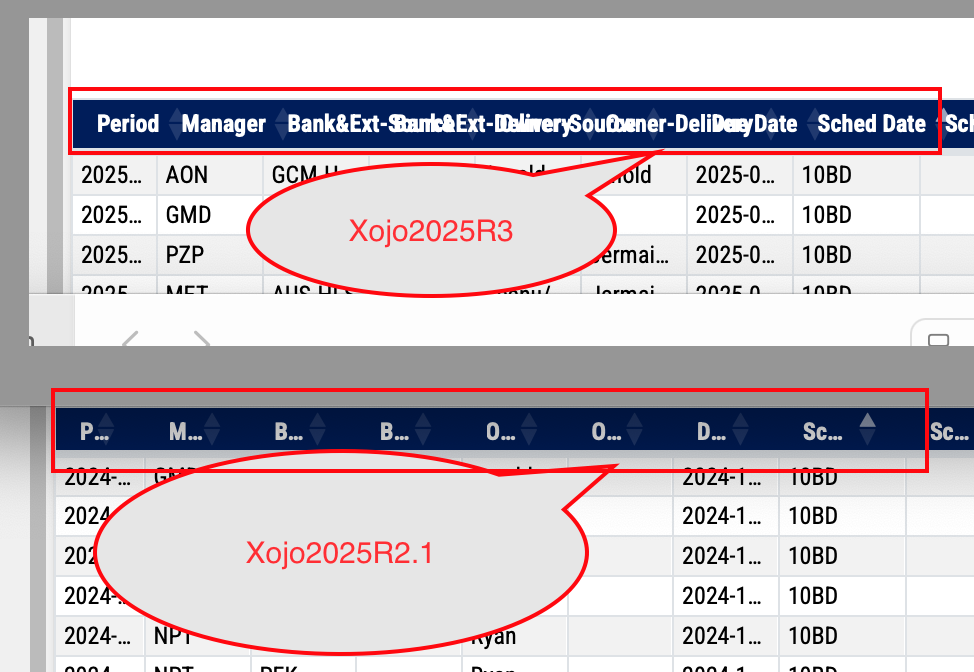
Trying to compare same WebApp in both versions of Xojo, WebListBox specifically, using Data Source.
I have noticed that column labels in newest Xojo2025R3 will be shown rather than truncated but now I am not sure if this is better, see the snapshot for comparison with Xojo2025R2.1:
The answer depends on what you want.
Do you like 2025r3 behavior? Use that.
Do you prefer 2025r2.1 behavior? Create an Issue with a simple sample project for @Ricardo_Cruz to review. He, or someone else, may post code to fix the problem to use before the fix is released.
It looks like a regression to me, that has to be fixed, but I agree with @brian_franco, there might be too many columns there.
I don’t know how many rows do you need to display, but if there aren’t too many, you could design containers using more vertical space and then place them dynamically using the Flex LayoutType.
Well, the number of columns for this particular page is what users need and frankly it is never enough for some users, some columns are always going to be narrow to save space hence the column title may be always truncated. At first I welcomed the fact that column titles showed up when there was enough room, but on this list they flow over which is bad.
I need to keep this WebApp compatible with “latest and greatest” Xojo so that the app is up to date.
In terms of number of rows, well, that is always a tricky question, the query behind the data source can produce many rows (thousands or more). I don’t want to complicate the design by introducing yet another layer of complexity. Right now the WebList is using data source and thread and data seems to be loading smoothly when scrolling through the list, all columns are set dynamically, the sorting on single column works fine. I just wish for multi-sort feature but that is for some other time.
I agree, but keep in mind, users of this WebApp care about the data a lot, hence there are always many columns and they are made narrow when needed unfortunately. So the column title inevitably may be truncated. I am not saying that either of those two version is better, just noticing the difference.
Except that there are limitations with the hardware, like monitor width-to-height ratio, then what can be done: buy larger monitors that cost more, or use other sophisticated technology that also has a high cost? Or you may reduce the font size; everything will be displayed, but unreadable.
How about replacing the WebListBox with a Container in which you create more containers in which you display data in a form-like fashion? If a WebListBox with a unique column can display a Container in that column, then it is even easier. The tradeoff here is that you have fewer records in the screen height, but hey, you can’t have your cake and eat it too!
I certainly hope it doesn’t go back to truncating way too early like it had been. IMO what has changed as far as non-modified controls is operational.
OP is doing a bunch of CSS changes to the table, so in my opinion THEY are responsible for making sure their font change truncates at the right place.
Who knows what they copy and pasted? We haven’t seen their CSS changes, and the built in changes are working flawlessly for me. I will be mad if truncation gets changed without seeing OPs CSS.
I would point out that the truncation model matches the default behavior of desktop. Maybe the way to fix this is to allow users to determine if they want truncation on a header or column basis instead.
One way to address truncated column headers is too make the cell more squarish and tilt the titles by 45 degrees. This gives a lot more room to show them and is a pretty common design in the print world.
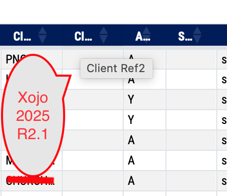
I have also noticed that in the Xojo2025R2.1 the tooltip shows the full column title when truncated, however in the Xojo2025R3 the tooltip does not show since the same column title is not truncated and flows over to the next column. This is actually worse than before as there is no way to tell the column title at all.
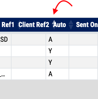
The “up/down” arrows indicating column sort flow over and are hard to see, see snapshot below:
just for comparison the second snapshot below shows what I see in Xojo2025R2.1 (the sort arrow shows in within the column width and there is nice tooltip showing full column title)
You should review your CSS as it looks like is affecting how 2025r3 works.
This is a screenshot of what I get when the text on the header does not fit:
Alberto, your snapshot looks really nice so there seems to be some hope for me after all. I have just checked HTML header in the App, I have this code:
I thought this might be related but taking it out will result in missing column headers also in Xojo2025R3. I guess I will need to examine modifications on CSS side.
I have finally just found the solution, I had to tweak the CSS a little. I use “scss” files for the custom code that I merge with the standard bootstrap file to produce “Bootstrap.min.css”. I have now column labels wrapping the text when needed and data rows truncating the text as needed.
There is still a little issue with the arrows indicating column sort as they have the tendency to overflow but this code:
.XojoListBox thead th i,
.XojoListBox thead th .sort {
    flex-shrink: 0;
    margin-left: 0.2rem; /* keep small space from text */
}
seems to help a little.
So, I am happy now with the WebListBox in Xojo2025R3.
ps.
I also had to add fix for checkboxes as the label text appeared not to be vertically centered and “cutting off”.
* 2026.01.02 <gp> Robust fix for all standalone Xojo checkboxes */
.XojoCheckbox {
  height: 30px !important;          /* match R2.1 height */
  display: flex !important;          /* flex container for proper alignment */
  align-items: center !important;    /* vertically center icon + label */
  padding-left: 5px;
}

.XojoCheckbox input[type="checkbox"] {
  width: 16px;                       /* fixed size */
  height: 16px;
  margin: 0;
  padding: 0;
  flex-shrink: 0;                     /* prevent shrinking inside flex */
}

.XojoCheckbox label {
  margin-left: 0.25rem;               /* spacing between checkbox and label */
  line-height: normal;                 /* prevent extra spacing issues */
}