I have hard times using the IDE. Look below:
Xojo Code Editor was hard to use since the beginning (2013), but things are worse lately.
Part due to my vision (I have hard time to know where the cursor is).
But yesterday it was awful. So I activated the line highlight.
Now I know in what line my cursor is, but selecting text (see below the difference between the IDE and the application when selecting text)…
The contrast between the selected text and the line of code is… far from optimal.
To be honest, I have glasses, but most of the time I have to use a magnifying glass to know what is selected.
Probably before 40-50 y/o, people do not have troubles, but…
I tried to use the Dark Mode, and yes, this is better, but not for the text selection: same trouble.
I will not talk about the use of light grey UI elements: witout glasses I do not see them (they are invisible to me).
Create a nice UI does not means… exclude part of the users.
Last example:
I create a Text Graphic banner: RGB(100,0,0) background and white text.
NICE, but depending on the text size: unreadable.
Black text ? YES… (I love the banner with white text, but the black version is the way to go).
I even see a page with white text and light orange background: nice, but unreadable. The same in a black Xerox copy was givoing its message (readable even without glasses).
This is a selected comment:
![]()
This is a DesktopListBox Cell with three selected characters: OK.
![]()
Conclusion:
seen Miss Universe on TV is good, having a woman who loves you at home is FAR BETTER.
YMMV
BTW: I already changed th text size in Xojo, see below…
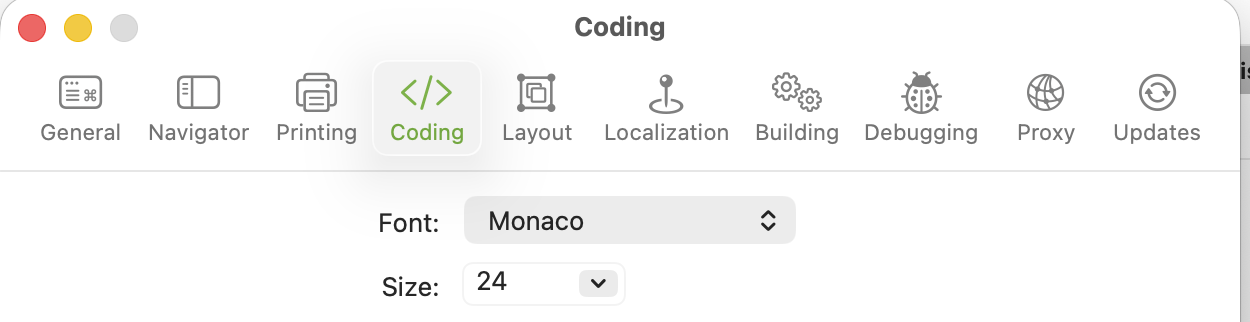
I already talked about:
Standard size on my laptop.
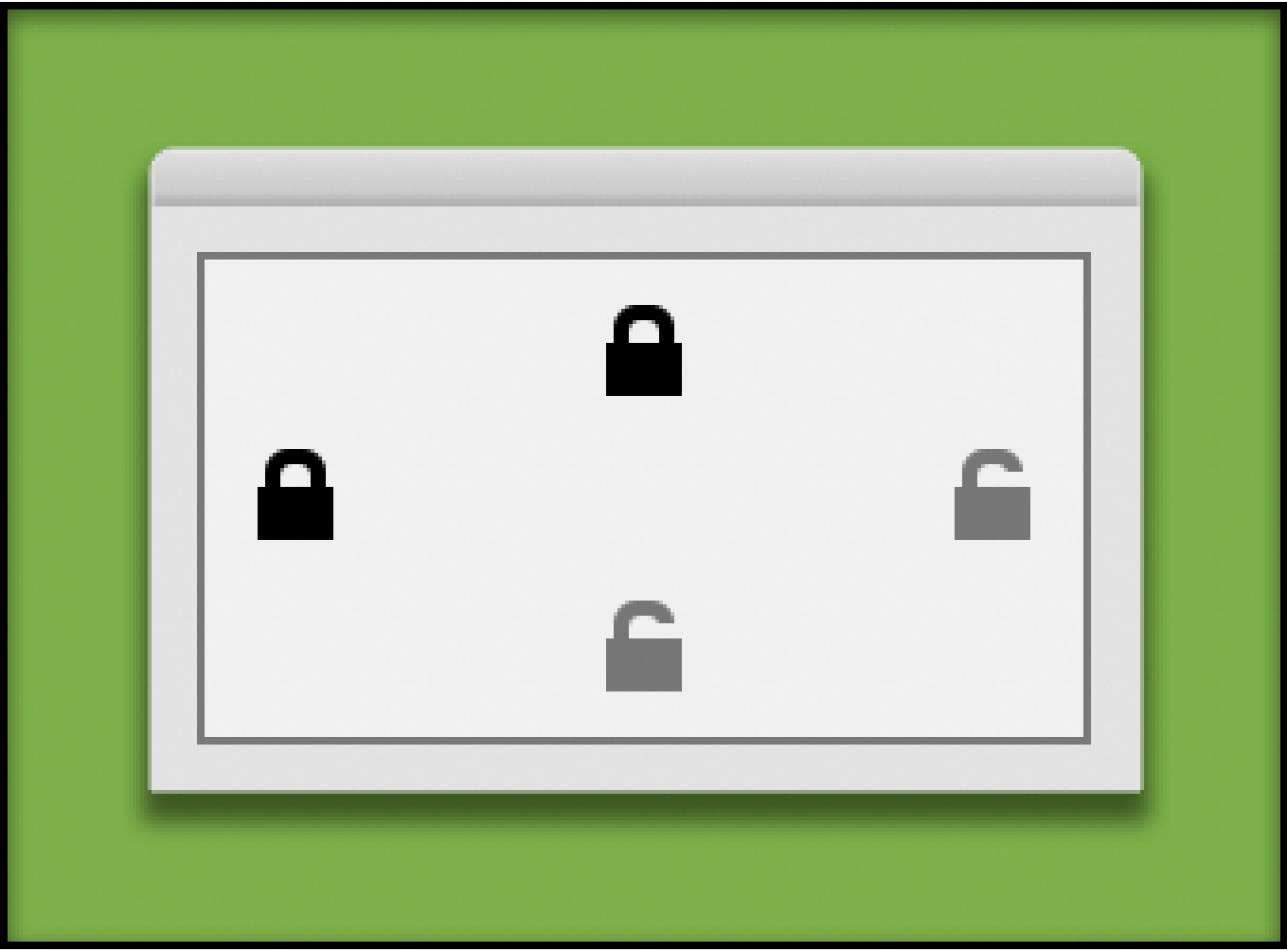
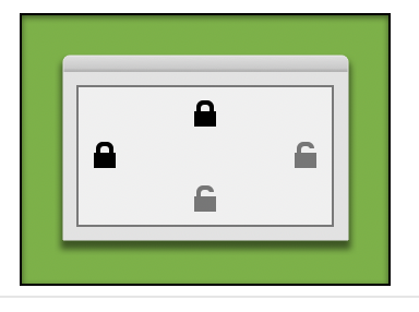
Same computer and screen display, enlarged with Preview.
Displayed at 800% (144 dpi): there are 4 blue pixels (so an open locker have a 2 pixels difference (comparing to the black locked icon). The used grey is “50% Black”.
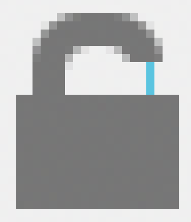
This is a VISIBLE Open Locker Icon ! (I copy the one from the IDE and rotate in GIMP the movable part…)
Yes, I have a meeting with the eyes specialist later this month.
I am not an eagle !
Have a nice day.
MacBook Pro 13" M1.
Current Xojo.