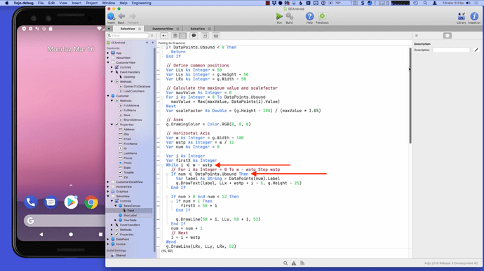
Looking at Paul’s Android keynote again, I noticed a previously unused new operator character for Less than or equal in Eddie’s Electronics code.
This ? may be a little thing, but it could make previous code a bit more readable. The iOS code from Eddie’s Electronics still uses <= at these passages.
Sorry to break the news, but Paul had mentioned on twitter the blog he was trying out one of the new source code fonts. There’s a special function on this font that turns a <= into that symbol. I don’t recall which font it was, but I’m not a fan of the behavior.
I used it for about 10 minutes and the changing of the <= into the other thing made me think my eyes were going fubar
Quit using after that and my eyes are fine 
If you like the font and don’t like the ligatures you can download version 1.0.4 from here:
https://github.com/JetBrains/JetBrainsMono/releases/tag/v1.0.4
That includes the regular font with ligatures and a NL (no ligatures) version.
Edit: use 1.0.5, link on next post
1.0.5 released March 26 2020 v1.0.5
I got used to it rather quickly. It makes editing a challenge though since it looks like one character instead of two.
