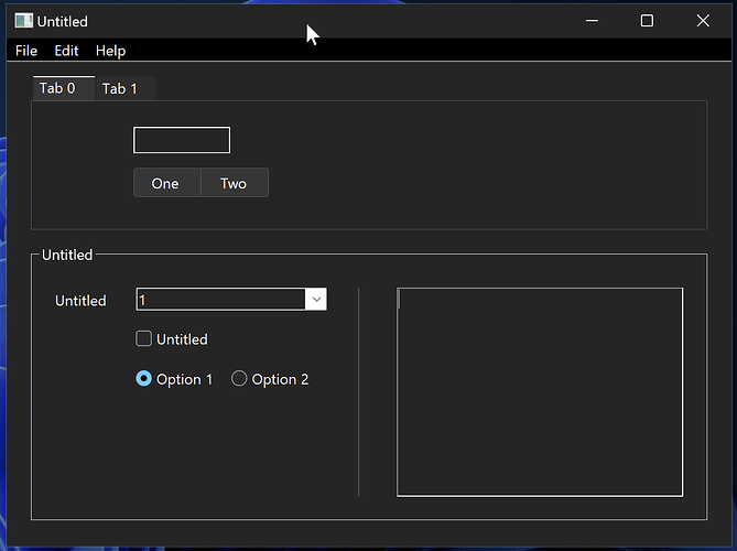
I’m starting to look at building a windows version of my app. So far so good. There’s a few items that require some special fixes as I have made the Mac version very mac with API calls. All that is something I can work through. For now I’m wondering about Dark Mode support. I’m seeing things that don’t quite look correct on Window when Dark. For example:
- There’s a white line below the menubar
- Group boxes seem to be outlined in bright white, as compared to the tab panel edges which are much more subtle.
- Edit fields are outlined in white, again it seems too bright
- Popup menus are again white edged and the selection knob is white.
I’m pretty sure standard application don’t look like this on Windows. Are others seeing this sort of issue?
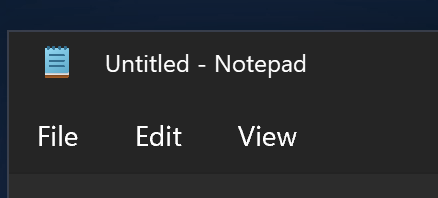
Here is a menu from Notepad and a popup menu:


1 Like
Notepad has WinFx controls, Xojo has Win32 controls.
You can get the WinFx controls by using the Xaml islands for now. Perhaps over time the Xojo will internally make use Xaml islands for you. But at the moment Xojo is Win32.
Why MS dont just fix it so Win32 looks good is anyone’s guess.
1 Like
Ah, ok got you. I’ll look into taking control of some of the borders / colours. Assuming there’s some APIs for that.
I have begun doing a lot of my UI in HTML in order to ensure consistency between platforms and also create more modern-looking elements. On MacOS I can use the HTMLViewer to display it and make changes in the UI using ExecuteJavascript and executeInXojo. On Windows I use the MBS Webview2 component to avoid adding the extra filesize of the HTMLViewer on that platform. This involves making slighly different versions of the HTML per-platform but I have written my own tools to port between those fairly simply.
The downside to this approach is it takes a lot more work to do something as simple as dragging a few controls into your window. The upside is you can create any kind of UI element you like, and make it look however you want, with the caveat that you’ll need to write your own light and dark versions, and also write your own code to detect and display the correct one. This can all be done in your HTML with javascript and stylesheets, but it still is another consideration.
For document editing systems this is usually not a great recipe for good applications. It typically offers poor copy and paste, file open / save options, printing etc etc.
I certainly don’t want an interface that is the same on every platform, I want a Mac app that works exactly like a Mac app and a Windows app that works exactly like a Windows app etc.
1 Like
Totally understandable. It is worth mentioning though that Windows is especially fragmented right now, so in the eyes of users there isn’t much consistency as to what constitutes the look-and-feel of a Windows app. Even the apps that ship with Windows are incredibly inconsistent in appearance. They’re getting better, but there’s a long way to go, so you have some leeway as a Windows developer to take some liberties with your UI.
1 Like
indeed if there are some simple fixes then I will take a look. Otherwise it is “standard” for some varieties of Windows.
Really wish modern control’s were higher on the xojo roadmap
1 Like


