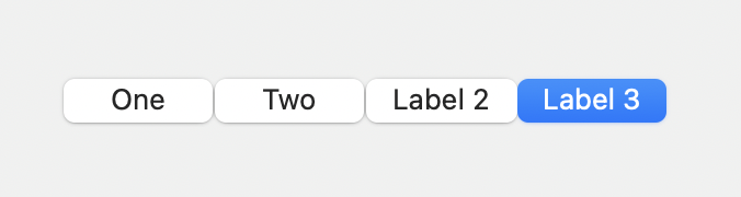
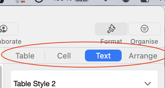
Is this a segmented button or some sort of tab bar in Numbers?
A segmented button has a white selected button.
Is this a segmented button or some sort of tab bar in Numbers?
A segmented button has a white selected button.
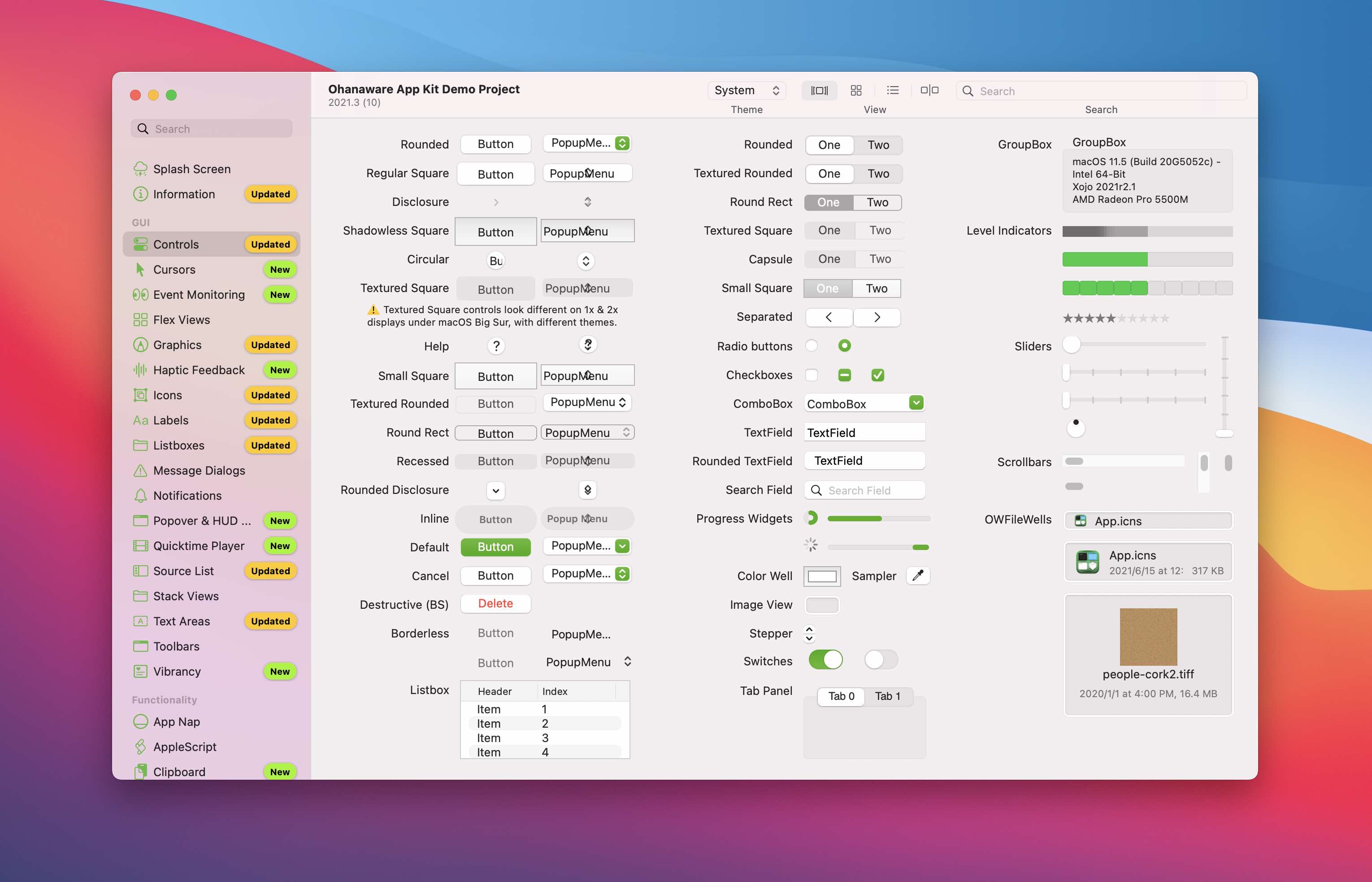
Your screenshot shows too many buttons to know which one you are referring to ![]()
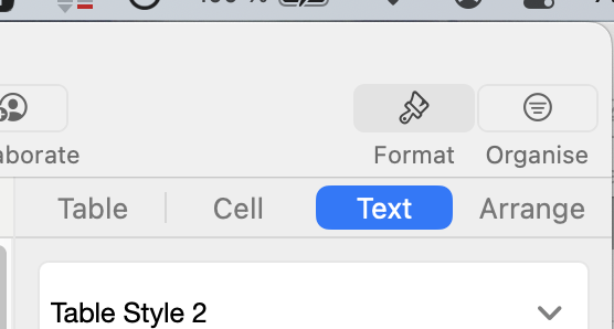
I guess she is referring to Table | Cell | Text | Arrange.
Sorry, my bad. @Gilles_Plante is correct:
I’d always been under the impression that was a custom control. This looks like the newest way to indicate “selected” then, doesn’t it? I’ve never seen this tab indicator outside of the iWork apps. (I could be totally wrong though)
I believe that you are right, I feel like this is a custom segmented control. It’s been a while since I last looked, but there may be a style option for this layout. This could however be very easily replicated in a canvas.
Then again, Apple like to create custom controls specifically for it’s own use, gotta keep those 3rd party developers from utilizing Apple’s hard work.
It appears that you can get that appearance by setting the style on a segmented control like this:
// @property NSSegmentStyle segmentStyle;
Declare Sub setSegmentStyle Lib "Foundation" Selector "setSegmentStyle:" (obj As ptr, value As Integer)

setSegmentStyle(Me.Handle, 8)
If you’re using a SegmentedButton as opposed to a DesktopSegmentedButton, change obj as Ptr to obj as Integer.
Huh… How the styles change. 8 used to be to make it look like separate buttons (mainly used for navigation).
I forgot about my cheat sheet… It’s not been updated for Monterey, but I don’t think that there’s much difference between the iOS versions.
Thanks for checking the cheat sheet. The problem I have with a white selected item is that it’s not clear to me which item is selected. How did the Affinity folks do their segmented button? This doesn’t look quite macOS like:
That’s a custom UI styled.to look like flatAqua. Probably electron or .net.
Kinda takes the ■■■■ outa the Indie who try, when Apple ignores 'em and promotes this kinda crap.
Edit: Yeah; most Mac controls look like garbage now.
.net or QT I think. Electron looks different. As we saw in the other thread younger devs just don’t know the difference.
Which is strange. On my system (also 12.3) there’s no drop shadow.
I believe it is a SegmentedControl (NSSegmentedControl) with an override on the drawSegment function as seen in this example: swift - How to change the selection color of a NSSegmentedControl button - Stack Overflow
I am not sure Xojo allows to override class methods with declares.
It can be done, but then you become responsible for handling the display for every single segmentedControl within your application. All the drawing must be done via NSDrawing or CoreGraphics as there still is no way (that I know) to create a Xojo graphics class from a NSContext or CGContext
In all honest, I would recommend using a canvas at this point in time.
I’ll try with a canvas and a push button. The push button has a gradient which the segmented control in Numbers doesn’t have.
Do you mean like this?
It has the dividing lines, but doesn’t highlight the active segment with the controlColor. It really does feel like Apple made a custom control, or there’s a secret sauce combination of view layers that get this mode (like controls when placed in the toolbar).
The way I’ve done this before (probably not the “right” way, I’m not sure) is to make a Xojo picture of the size necessary then use CG declares to draw that picture into the NSView.
@Jeremie_L look into method swizzling that’s what needs to be done for this.
Affinity as far as I know is C++ using their own UI framework.