I updated my Xojo version from 2022r4.1 to 2023r2 on Windows 10. After the update all of my web charts stopped working. I have tried a couple of things to get them to work but nothing has helped. Here is the code that I use to fill one of the charts. Does anyone have any suggestions?
I don’t get any error. The chart does not show the bars.
// get a data set.
var sql as string
var rs as rowset
Var data(6) As Double
sql = "select status, count(status) from DispatchEquip group by status"
try
rs = session.db.SelectSQL(sql)
catch e as DatabaseException
messagebox(e.message)
end try
if rs <> nil then
if not rs.AfterLastRow then
for each row as DatabaseRow in rs
select case rs.columnat(0).StringValue
case "Scheduled"
data(0) = rs.columnat(1).DoubleValue
case "Invoiced"
data(1) = rs.columnat(1).DoubleValue
case "Delivered"
data(2) = rs.columnat(1).DoubleValue
case "Delete"
data(3) = rs.columnat(1).DoubleValue
case "On Hold"
data(4) = rs.columnat(1).DoubleValue
end select
next
end if
rs.close
end if
sql = "Select Count(1) From DispatchEquip Inner Join "_
+ "dispatchrequest On DispatchEquip.ticketdate = dispatchrequest.ticketdate Where dispatchrequest.submitted = ? And DispatchEquip.Status Is Null"
try
rs = session.db.SelectSQL(sql, 1)
catch e as DatabaseException
messagebox(e.message)
end try
if rs <> nil then
if not rs.AfterLastRow then
data(5) = rs.columnat(0).DoubleValue
end if
rs.close
end if
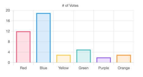
Var colors() As Color = Array(Color.Yellow, Color.green, Color.orange, Color.DarkGray, Color.Blue, Color.Purple)
var myset as new WebChartCircularDataset("Status Data", data, colors)
Chart1.HasAnimation = true
Chart1.AddDataset(mySet)
Chart1.AddLabels("Scheduled: " + data(0).ToString, "Invoiced: " + data(1).ToString, "Delivered: " + data(2).ToString, "Deleted: " + data(3).ToString, "On Hold: " + data(4).ToString, "UnAssigned: " + data(5).ToString)
It appears that WebChartCircularDataset no longer works for a barchart in 2023r2. I changed it to ChartLinearDataset and the bars now show up.
Is there a way to have a different color for each bar in the bar chart?
Thanks
Martin
Thanks for the suggestion. I did try ChartCircularDataset but it does not work for the Bar Chart.
Not sure why ChartLinearDataSet does not support different color bars. Unless I am missing something.
Thanks
Var data() As Double
For i As Integer = 1 To 10
data.Add(System.Random.Gaussian)
Next
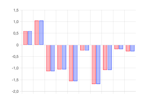
Var ds1 As New ChartLinearDataset("Foo", Color.Red, True, data)
Var ds2 As New ChartLinearDataset("Bar", Color.Blue, True, data)
Me.AddDatasets(ds1, ds2)
I don’t think so, no, but it doesn’t feels right to represent the same dataset with different colors. Even the label appears as red in that screenshot.
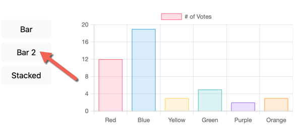
Maybe there is a way to remove the red rectangle next to the label?
Of course is not ‘typical’ to have a bar chart like that for same data (like sales) for different months.
Bug Gary was using the colors for each bar to indicate that one bar is ‘Scheduled’, other ‘Invoiced’, ‘Delivered’, ‘Delete’, ‘On Hold’ and ‘UnAssigned’.
If Gary already used that colored chart to deliver something to a paying customer and now is not possible, then it is a problem.
Anyway, Chart.js can do it (as shown above) with the backgroundColor option for the dataset. I hope is not hard to add (if not already included).
I’m previous releases it was possible to use circular datasets to display Bar or Line charts, and linear datasets to display Pie or doughnuts charts, for example. That lead to all kind of little “bugs” here and there… since 2022 you need to use linear datasets to bars/line charts, and circular datasets to, well, pie, doughnut chart, etc.
I think that was updated in the Docs, plus the published blog posts and videos on our YouTube channel, including the session about Charts for the London XDC.
I have the same problem… it don’t work on older browsers (or OS).
Charts don’t appears on Safari 11 On Mac OS High Sierra but works on Safari 16 on Mac OS Ventura and Safari 14 on Mojave.
@AlbertoD Thank you for pointing me to this solution. I now have the color added back to the bars. Also removed the legend which removed the colored box, then added a Title and was able to make the font larger in the Title. My customer is happy now. Thanks