When ? When ? When ?
When will this empty but useful wasted space be used to see more (twice ?) of the items ID ???
this may be a 2 minutes fix …
please Xojo ?
Please ???
2 Likes
Not everyone has this bar set to this width. It would be nice if certain (presumably rarely used) sections could be collapsed and expanded.
But please don’t put more information in the rows. They’re often too wide already… ![]()
Just my personal experience.
Wow, this must be one of the worst titles for a topic. Absolutely no information about what is being discussed…
This is a great suggestion. And there’s already a feature request in issues for it https://tracker.xojo.com/xojoinc/xojo/-/issues/49245
5 Likes
yes it’s a worst title, for people to open it ! …
I konw there are issues for this already, for a long time, and I’m having always too long titles I can’t read in the id section…
it’s been discussed here for many times, I can’t recall when, but sure often
and nothing has changed .
please xojo team please ?
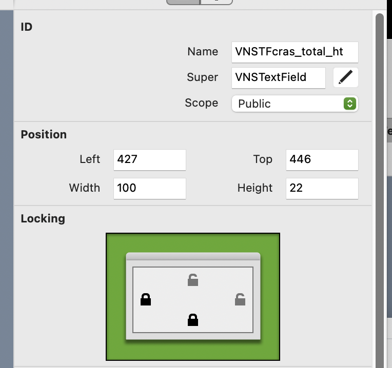
edit: looking at the ticket, I don’t specially want collapsable headings, I want to use all the space available to read the control ID: there is 2 more space available for the textfield of the control ID.
just make it wider, along with the super combobox and I will be more than happy !
1 Like
Wouldn’t it be fun if an LLM checked in the background whether the title fits the content and suggested changes before posting. ![]()
I created an issue for this:
3 Likes
I do the opposite. Since the title isn’t meaning, I usually just skip reading the thread.
This time I made an exception.
1 Like
2 minute fix assuming it is laid out by hand. The inspector is entirely data-driven and built dynamically. You have a very long property name that is defining the label column’s width.
A change that could be made is each group getting its own label width. But when we tried that, it made the inspector look cluttered. Setting a maximum label width of 50% might be a decent alternative, but you will see truncated property names in some situations.
1 Like
And we notice that several have proper locks following correctly expansions/contractions, so even by code is just adding the lock left/right lines as the others.
1 Like
Correct. There are a few different mechanisms at play. There are a couple “specialty” groups that allow swapping a group of controls for a custom container. If you were to remove any one of those properties from the group, it would revert to the “single” property editor for each property in the group.
The identity group isn’t one of these because there is quite a variety of different properties that can belong to that group. As I just mentioned, remove any one property and the specialty version would not be used.
Of course, Xojo controls all this logic so behaviors could be changed. I’m not trying to argue this is the way it has to be. But my point is that it’s not a 2 minute job. It would require some decently-sized changes to the inspector.
2 Likes
As I have no idea how they got that, all I can say is: That’s sad. ![]()
And as we all have more important things to work on, we must live with that for a while.
The inspector is my design. Unfinished, but my design. Despite the flaws, we put the id there because it was quick and good enough. We needed to get the IDE shipped. The intention was for it to be temporary, being moved into the code editor in a release or two. We just didn’t have the time. Following the 2013 release, focus was going to be made on the code editor to introduce things like variable placeholders in autocomplete. Part of that work was going to be an id field. Yes, singular field. The idea was it was going to use a variant of the code editor itself to guide you through writing the definition. You could write it all if you wanted, or could click into various spaces to define parameters, return, scope, and so on.
But I never got to finish and 12 years later we still have an IDE with some really weird compromises.
Wow, 12 years. It seems that it will take a bit more time for some future redesign. That seems in their very low priority schedule list.
I guess you are talking about the area within the red rectangle here:
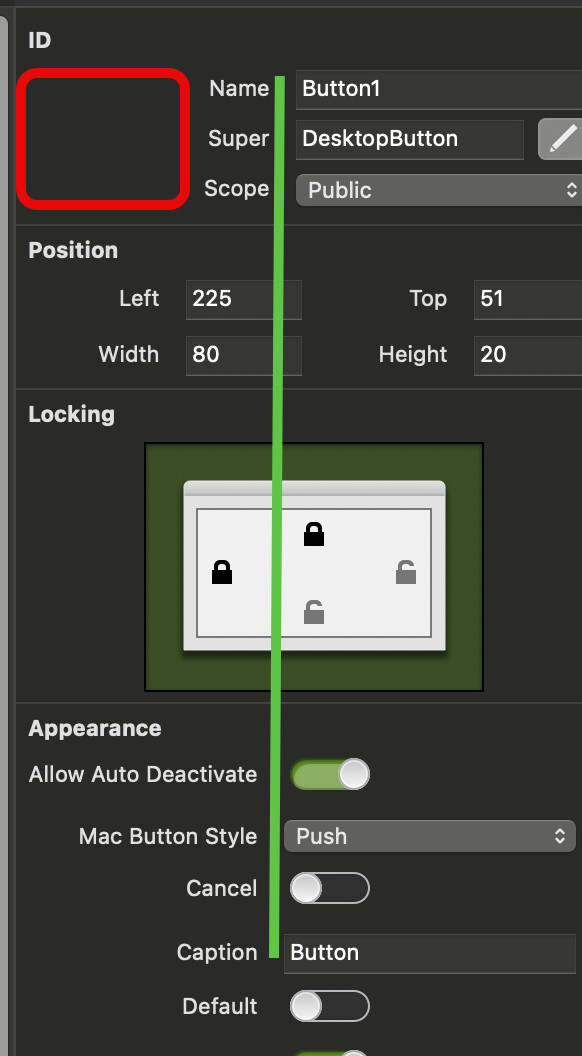
Looks like the up area is ‘locked’ to the bottom area (Appearance section). Not sure if in 2 minutes they can make the upper area independent.
If we define long names, we can even get this:

1 Like
I’ve opened this one a while ago, but no action yet.
1 Like
Yup. All of the properties that have a single value are aligned on their labels. Trust me, it’s a lot more readable that way. As Thom said, staggering them by group makes it hard to find stuff in the groups below the first one because your eye doesn’t have a line to follow.
For me, as Position and Locking separates the ID from the rest I would prefer the ID section to be unlocked from the Appearance/Behavior sections.
1 Like
You’d have to go back to this reply to understand why it follows the same rules as the rest: When ? when ? when? - #10 by Thom_McGrath
If you had something with name, super, and scope, then another with name, super, scope, and interfaces, you’d need two separate containers. The inspector is looking to make sure all properties for a defined speciality group are available before swapping it in. Given the variety of combinations and the intended code editor changes, it wasn’t worth investing time into at the time.
Those properties in the ID group, because they aren’t using a custom group override, must follow the same rules as every other property. That’s why they can’t just be allowed to use a different width.
[Moderator action: renamed thread]
3 Likes
I said “this MAY be”, I did not say “this IS” a 2 min job !
but it’s annoying me for years that’s for sure !