Trying to draw "sparse" chart labels

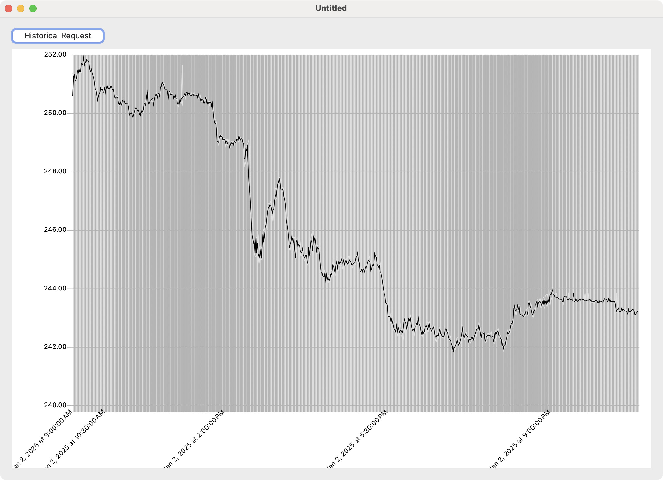
I appreciate the addition of the Chart control in XOJO. I’m having trouble with label density in my chart. I’d like to have better control over which labels are drawn. See this intraday stock chart:

I only need labels every 15 minutes. I tried this: I only created a timestamp string for every 15th minute as I created my labels array. For the other times, I set the label to a blank string. Unfortunately, XOJO didn’t ignore the blank strings and is still used them with its label layout algorithm:

As you can see, it sometimes gets lucky and draws a non-empty label. Ideally, I’d like the chart to ignore any blank string label and skip drawing the corresponding axis line.

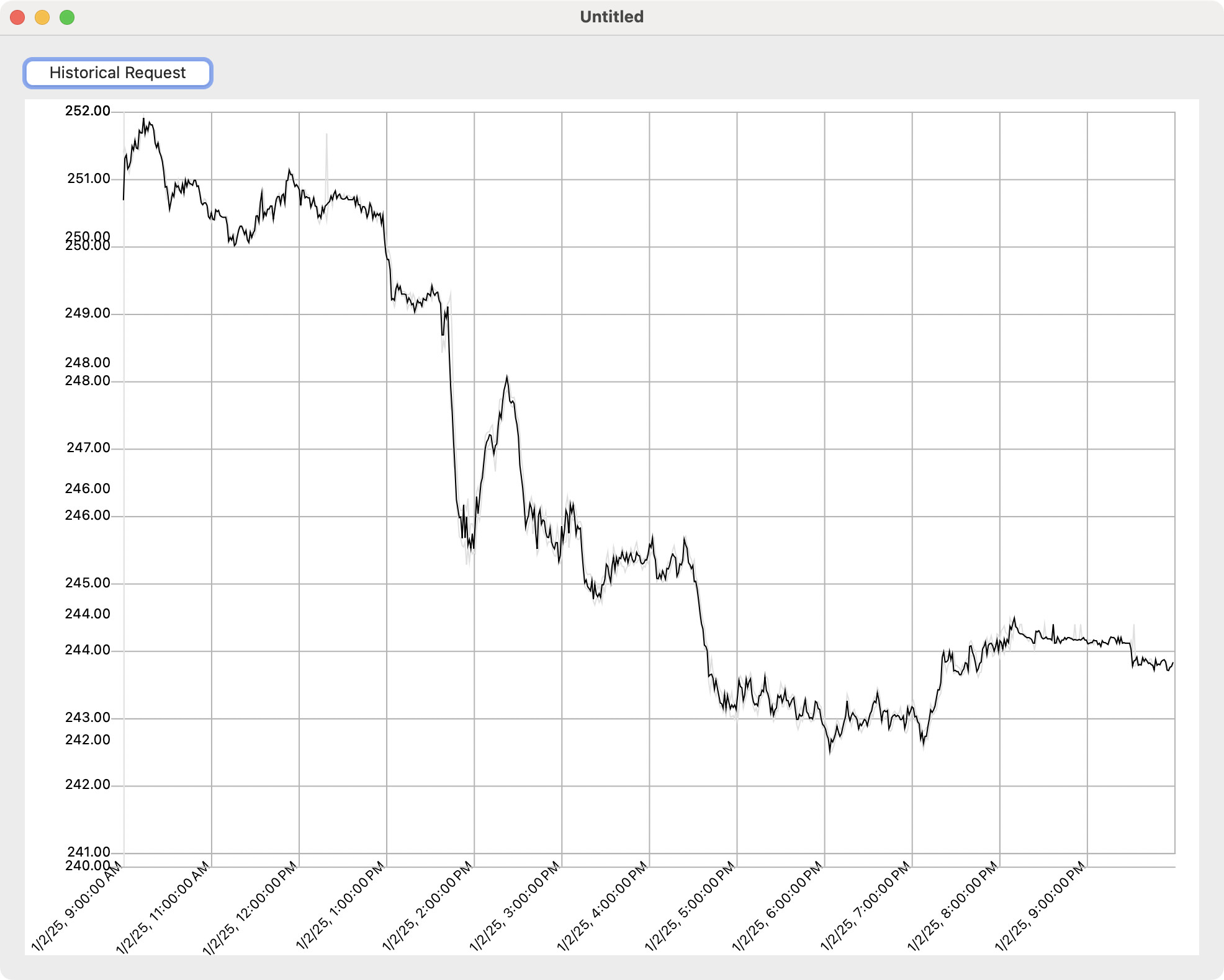
Can I achieve what I need—“sparse” labels? Such as those in Apple’s Stocks app, where the only labels in the intraday chart are the hours:

Unrelated: I would love the addition of candle charts—is there a feature request for this?

Workaround: Until they’re an option, I think I can use stacked bars to represent candles and create an “invisible” dataset to represent the lows.

(Yes, I’ve tried ChartDirector, but it got rather glitchy when I tried to change the label sizes.)

Could you not change to a line chart, it should give more control over the tick marks?

But it is a line chart already: ChartLinearDataset

No, I mean a x-y style graph. ChartScatterDataset?

I suppose, and I’ll try, but it’s probably not going to work as a chart type for my application.

On a side note, I’ve tried overlaying two charts, but how each chart draws its plot depends on the styling, so the results don’t line up.

And for comparison, this is the ChartDirector problem I mentioned in my first message. ChartDirector doesn’t seem to like retina displays.

The labels are too small, but I can set the X axis point size to something readable:

mFinanceChart.setXAxisStyle(“Helvetica”, 7, Color.Black, 0)

But when I set the Y axis point size, the vertical scaling of chart breaks:

mFinanceChart.setYAxisStyle(“Helvetica”, 7, Color.Black, Color.Clear)

I’m happy for any workable chart SDK or plugin, if anyone has recommendations.

This might be useful: DataPlotClasses

3 Likes

Thank you, Roger!

You’re welcome!

The Graph.XTick() property lets you define where along the x-axis you want your tick marks. And the Graph.XTickLabels() property lets you set the text you want to display at each tick mark.

1 Like