What is the protocol for Toolbars moving forward if I am updating apps or creating new ones?
Pre MacOS11 I would usually just use some simple icons8 images
On Monterey if I run the App it just looks the same? Is that ok or are you suppose to create alternate Toolbars with appropriate replacements

It really depends on if you’re trying to emphasize your own design or follow each platform’s UX.
Emphasize My Design
Do your own thing that you feel is good, and adjust with feedback from your existing customers.
Platform consistency
Try to use as much system supplied imagery as possible. For the Mac, I personally follow this route.
- Use Aqua Swatch to browse known icons which are exposed to all applications. Using these constant will most likely give you different icons per OS version, but they should be inline with that version of the OS.
- Use Apple’s SF Symbols, either directly via declares and limit your new version to 10.16 Big Sur and above, or use App Wrapper to rasterize them into multi-image TIFFs so that they can be displayed in older OS versions.
When using Apple’s images, try to find a situation where that image is used within an Apple application as this provides some context as to what the icon should be used for. I find SF Symbols to be a fantastic list of images, but without context you don’t know what should be used where.
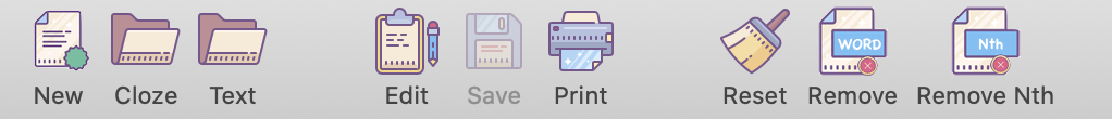
However, don’t be surprised if there are missing symbols and styles don’t match up. For instance “new” is simply a plus sign, remove a minus sign, reset is a incomplete circle, close is a X, while print can sorta look like a printer, or a dogs foot! and there is no icon for save.
You can be clever and offer the user to option to use full color icons (like I do in App Wrapper and demo how to do it in the Ohanaware App Kit), so the user can choose between lifeless line based symbols or pretty and easily recognizable (sometimes more consistent) icons.
In the past I would have encouraged going with platform consistency, but Apple themselves don’t care about their own HIG and often promote the most ugly apps, and sometimes very poorly designed UI on their App Store.
1 Like
There was a thread this week on how to do the “lifeless line based” symbols (guy named Pawlik I think).
I do my own icons and not the super boring Apple icons. And I offer the users the ability to use nice colored icons or the lifeless line ones.
3 Likes