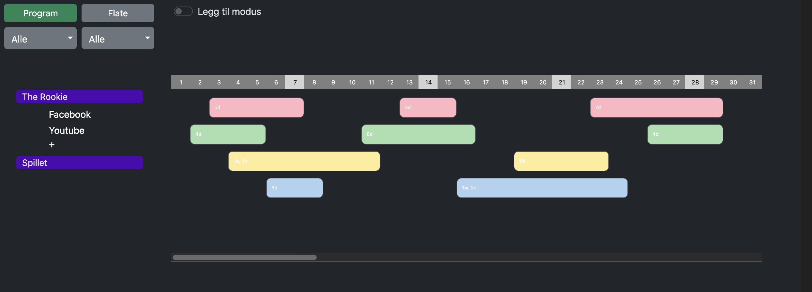
I’m wondering what would be the best option for horizontal scrolling. Default on MacOS the scrollbars are off. I normally have them on, because I’m tablet user, and needs to have them.
But when not on, I kinda find the UX to be a little confusing. If I have a mouse with scroolbar function, like swipe left and right, I get it to work, but swiping the wrong direction when no more space is left to scroll, I end up on the previous web-page, and that is not the thing I want.
Have a look at the picture, and imagine the scrollbar gone, how would you give the user the clearest way of scrolling. In this example, which is a mockup for a media planning tool. (to finally get rid of separate excel files…) the edge can be quite far away, like a year of planning… so how to tell, how to scroll…
I’m very thankful for every thought of this. ![]()