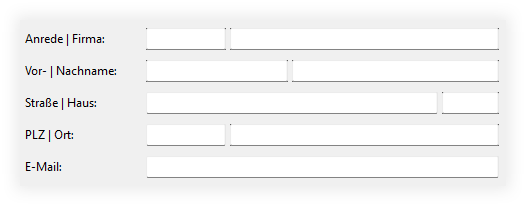
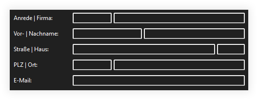
TextFields don’t look very nice in Xojo apps under Windows 11 (see the corners of the TextFields), but in Dark Mode, TextFields simply have absurdly wide borders.
Since my app uses a lot of TextFields (based on a subclass), I’m looking for an easy way to change the border.
Simply omitting the border looks even worse, and it has nothing to do with the focus.
I haven’t been able to find a suitable declare yet.
Basically Win32 Darkmode does not exist per see. MS made “some” controls for use in Explorer (is why there are missing ones like the DatePicker for example).
And it just looks as it looks……which is not same look as WinFx.
You can have some controls be converted automatically when you check “Use WinUI” in Windows build settings. But there are drawing issues, at least with some of them, so it’s probably better to wait what Release 3 will bring. Unless you do not target Windows exclusively and want to use the XAMLUserControls.
well, to get around this I just turn off the border in the properties and make the background a bit lighter then the darkmode. To stay compatible you can check if the customer uses light or dark mode, then you can use in a small module some code to switch between the modes. (dark: turn off border and make background lighter, light: turn on the border and set the background back to the default color.