Text Ascent

I think I had a conversation with @Dave S about this but can’t find the thread…

Text ascent does not appear to give me the height of the highest character in the current font of a graphics object or am I missing something. For example I am trying to vertically align text in a box on a graphics object. If i DrawString on a canvas and then draw a box around this string with the height TextAscent, the box is always taller than the text.

How do I get the exact height of the text?

I don’t believe that there is any measurement exposed by Xojo that gives you exactly what you want. Text ascent gives you the measurement from the baseline of the font to the top of the font. The baseline being the line that your uppercase characters sit on when printed. Lower case characters with descenders have their descenders below that baseline. Textheight gives you the correct amount of space to descend when printing single spaced lines of text which include the leading, or space below the text giving the gap between lines. The question has been raised numerous times and I don’t recall anyone ever coming up with an exact way of doing it as things vary from font to font and for various text sizes used. In my experience, if using one particular font and size you can learn the proper amount to adjust your positioning by to get thinks looking properly centered.

and then you get font designers that design font with glyphs that extend outside the defined bounding box for the font and all kinds of fun things

best you can get is TEXTHEIGHT and TEXTASCENT as far as I can tell


a+-----------
  |
  |
  |
b+--------- Text Baseline
  |
c+---------

from A to C is text height, from B to A is textAscent. You draw the character at “B” for the Y position, and the top of the character should be at A for the “tallest” character (see Normans caveat above)

So to box you string… draw slightly ABOVE “A” and slightly below “C” and you should be good

Oh yeah… and the SAME FONT at the SAME FONTSIZE will NOT give the same Textheight and TextAscent on both Windows and OSX

I needed this info for a class, and as pointed out font designers can draw outside the box so the brute force solution is to draw the string into a picture with a good amount of padding then scan the RGBSurface for where it actually starts. If text is detected at the very edges then redraw with even more padding and try again.

The text ascent - in typography - is larger than the height of the box around a capital letter. It includes some space above the letter.

Right, This all sounds a bit hit and miss and I cannot believe there is not a way to do this. I have labels on a custom control. The font size and face can be changed by the end user but the label (g.DrawString) needs to remain vertically centre. So I should guess the amount to adjust by?

Sorry not a moan at the answers above but I figured all of what you said above from my hit and miss trials. Surely there is a declare for both windows and mac which can correctly determine this?

https://developer.apple.com/library/mac/documentation/TextFonts/Conceptual/CocoaTextArchitecture/FontHandling/FontHandling.html

I have found this centers rather nicely in most situations

y=g.textascent+(g.height-g.textheight)\\2

cheers dave i will give it a whirl

Sweet, thanks Norman. I’d seen that link before but focused on font metrics which doesn’t bound. boundingRect gives the actual bounds, duh. Here’s my test code fwiw, looks like all NSFont functionality is in MacOSLib. Time to update my class :slight_smile:

[code]//Property
pic As Picture

//PushButton
Sub Action()
const CocoaLib = “Cocoa”
declare function NSClassFromString lib CocoaLib (aClassName as CFStringRef) as Ptr
declare function fontWithName lib CocoaLib selector “fontWithName:size:” _
(cls As Ptr, fontName As CFStringRef, fontSize As single) As Ptr
declare function glyphWithName lib CocoaLib selector “glyphWithName:” _
(inst as Ptr, glyphName as CFStringRef) as UInt32
declare function boundingRectForGlyph lib CocoaLib selector “boundingRectForGlyph:” _
(inst as Ptr, glyph as UInt32) as NSRect

dim testFont As String = “Zapfino” //fldFont.Text
dim testSize As integer = 150 //Val(fldSize.Text)
dim testLetter As String = “q” //fldLetter.Text

dim fontClass As Ptr = NSClassFromString(“NSFont”)
dim aFont As Ptr = fontWithName(fontClass, testFont, testSize)
dim glyph As UInt32 = glyphWithName(aFont, testLetter)
dim rect As NSRect = boundingRectForGlyph(aFont, glyph)

dim p As new Picture(500, 500, 32)
p.Graphics.ForeColor = &c000000
p.Graphics.TextFont = testFont
p.Graphics.TextSize = testSize
p.Graphics.DrawString testLetter, 200, 200
p.Graphics.ForeColor = &cFF000080
p.Graphics.DrawRect 200+rect.x, 200-rect.y-rect.h, rect.w, rect.h

pic = p
display.Invalidate

End Sub

//Canvas “display”
Sub Paint(g As Graphics, areas() As REALbasic.Rect)
if pic <> nil then g.DrawPicture pic, 0, 0
End Sub

//Structure
NSRect
x As single
y As single
w As single
h As single
[/code]

[quote=69028:@Dave S]I have found this centers rather nicely in most situations

y=g.textascent+(g.height-g.textheight)\\2 [/quote]

I wonder how many times you’ve done the “textAscent” explanation. I know I first read it from you years ago :slight_smile:

A problem with centering, not to be solved here, is that to center properly mathematics only get you so far. Depending on the text the actual vertical middle of a text may be placed higher or lower than the middle of the full height, so for nice aesthetic purposes one needs not only to draw the text to a picture but to analyze the picture and use the amount of “black” to find a better “middle”.

A line like “qqqqqqq” has it’s vertical middle at the baseline, pretty much. Whereas a line line TTTTTTTT has its vertical middle at some point between the baseline and the top. Without visual analysis or perceptual hashing it’s just not worth it, but then some texts in some situations will always look a bit off (in my case, I noticed in buttons with bounding boxes and large text, it was very obvious).

I say “not to be solved here” because this is even more intensive than drawing the text to memory and then box-bounding that, and that’s intensive enough already.

But the baseline for “qqqq” is identical to the baseline for “TTT” (assuming same font/size of course)
This becomes important if you are analyzing characters or words within a line of text… if you attempt to measure top/bottom black value, the different words would be baselined differently.

but then again… that is why I said “nicely in most situations” :slight_smile:

The text ascent and descent are set by the developer of the font. A lot of languages have diacritic marks, and the space above is required to be able to show them, see Common accented characters.

But on the other hand, there are some (rare) fonts which don’t need this space, like these: http://typophile.com/files/Umlauts_5364.png.

AFAIK you can’t develop a formula for calculating the upper bound of an uppercase letter like A or T.

Font technology is such that fonts can be drawn largely outside the box and still work fine. So in effect, most font designers do place diacritics and descenders much higher and lower than what code can gather. So there is no sure way.

Dave posted a good formula for standard text fonts.

Which would not work for all fonts. See Rodolphe :wink:

Yes, I meant the “visual weight”, not the baseline. In “qqqq” first the visual weight of the text is lower than in “TTTT” in the same way “‘’‘’” is higher than “,”

I didn’t mean to criticize your formulas. My point is precisely that they’re the best we can get without getting too intensive, since anything more precise/aesthetically pleasing requires us to paint and analyze the “weight distribution” before placing.

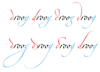
Ah, yes, decorative script fonts love to do this. Some variants in Zapfino take up three lines :slight_smile:

[quote=69012:@Mike Charlesworth]Right, This all sounds a bit hit and miss and I cannot believe there is not a way to do this. I have labels on a custom control. The font size and face can be changed by the end user but the label (g.DrawString) needs to remain vertically centre. So I should guess the amount to adjust by?

Sorry not a moan at the answers above but I figured all of what you said above from my hit and miss trials. Surely there is a declare for both windows and mac which can correctly determine this?[/quote]

Mike, if you look at the font above even if you had the exact top and bottom of the font ‘extremes’ you may not be vertically centered if you don’t use all the characters. For example if it were determined that lowest pt was baseline - 10 pixels (the letter f) and you never use the letter f you’d be off center for whatever you are putting beside it. The easiest way to get the exact center of the the string you are using is to use a picture, fill it white, draw your text in black, scan it from the top down until you find a pixel that isn’t white, scan it from the bottom up until you find a pixel that isn’t white. Now you know the exact height of the string from g to T (or whichever letters go the lowest or highest). You only need to run this when the user changes the font size or face.

Indeed scanning would be the only way to actually get ascenders and descenders, as the font parameters themselves are off. And doing so on a picture where the characters are DrawString-ed is not that difficult.

That said, not all fonts escape ascender and descender boxes like that. Most typographical designs do comply to the font internal metrics.