I’m in the process of adapting one app to Tahoe interface.
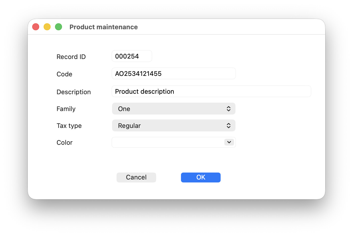
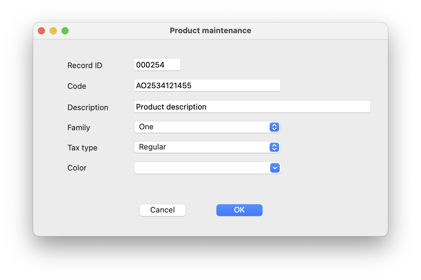
One of the worst UI elements in Tahoe is the flat, insipid PopUpMenu control: looks really bad specially placed next to text fields, with that ugly grey background that points to a disabled control. Very bad visual design, IMO.
I’ve tried to change it using NSPopUpButtonMBS.backgroundColor, but background doesn’t change.
Any suggestion ?
Why try and make it look different from every other PopupMenu in the system? Sure you don’t like Apple’s choice, but, if you leave it standard, at least the user with get a consistent experience. Making it different will only make the user question what the control is, not isn’t that pretty.
I’m not saying I like it. Any more than I like that all sheet windows have a white background, that the likes of text box are invisible on.
I completely agree that changing the native appearance of controls should be avoided. However, in certain contexts, such as record editing, there’s usually a combination of TextFields and PopUpMenus, and it’s here that the latter look out of place, even appearing disabled.
Comparing Tahoe with Sequoia clearly shows the difference, being Sequoia much more user-fiendly IMO.
I tend to put a group box behind controls in windows like that. Especially if there text boxes as they’re practically invisible without. Apple always seem to use a group box on its layouts. System settings, print dialogs etc
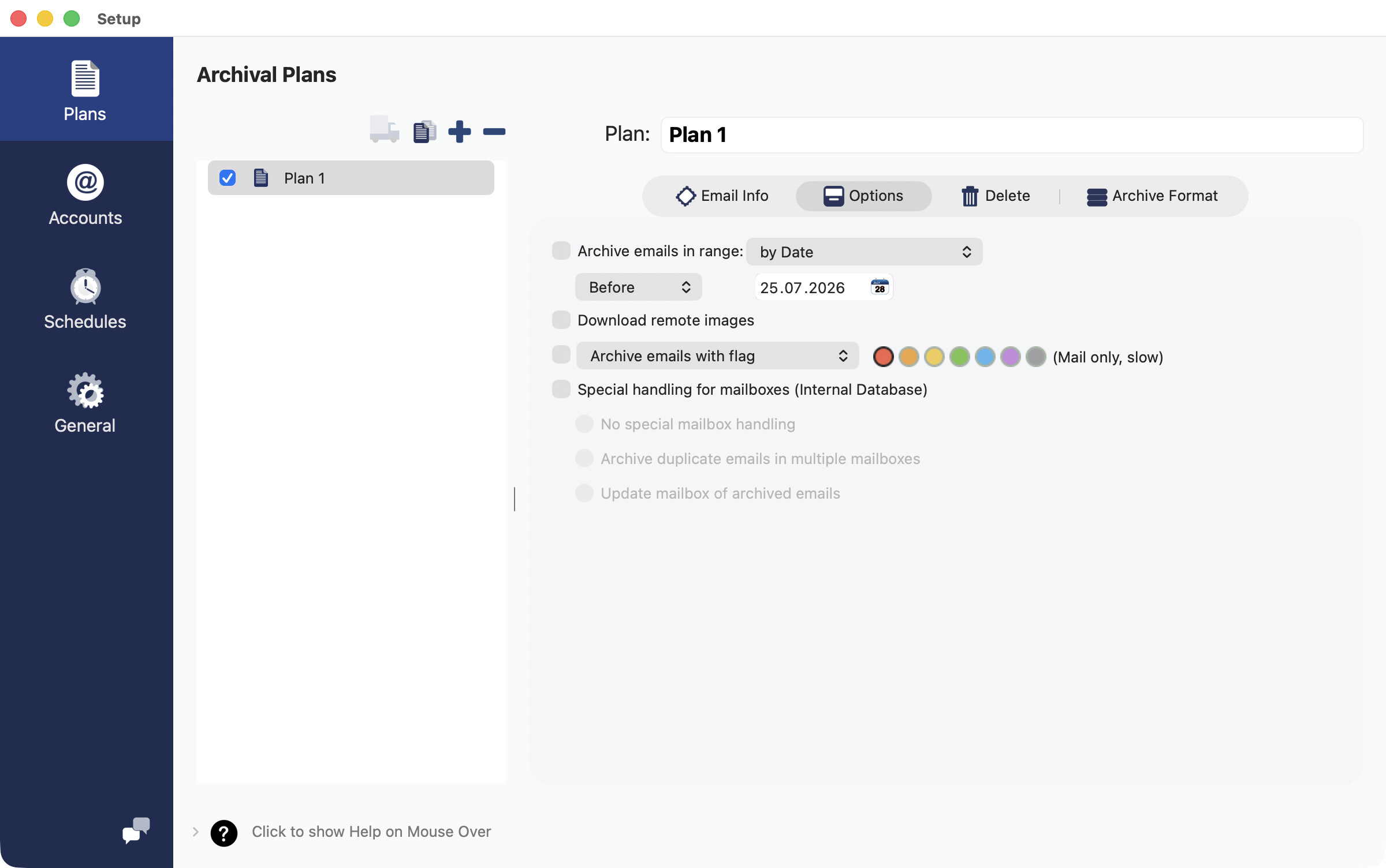
I have my own colors which make the interface independent from such changes. In the example the window has a window background color and another color for the background of the selected page panel:
TabPanel is another good one to use as a background, especially when more complex layouts requiring tabs. GroupBox is sort of the same for single page windows.
I’m intrigued as to why you seem to have used a Segment button and title less group box rather than a tab panel? I’m guessing the wish to put icons on the tabs?
These are pagepanels and my interpretation of the new style Tahoe style.
It was more of a “why not use a TabPanel” question. But it’s getting off topic.
I like the Tahoe version much more. Sorry. 
FWW it’s the same in macOS Golden Gate.