Finally updated to Tahoe and I don’t much like what I see. Lots of wasted white space and stupid font sizes across most apps. Steve Jobs would have fired whoever was responsible; the old Aqua UI was far superior.
Now as for the UI in my Xojo app there are some uglinesses as well. the main ones being:
DesktopTabPanel - the tabs don’t render properly - the centre portion of the tab is OK but the rounded ends have the wrong color and no gradient. Ugly.
DesktopTextField - with a border they look OK when the text is editable, but if you set it to read-only the border vanishes, and there’s no focus ring, leaving the text floating in an ocean of white space. Looks absolutely awful.
I’m only the brink of rolling my own canvas-based controls to replace both of these and look respectable.
I have a suspicion that they are going to do a partial U-turn at some point, like they did after releasing one lone version of macOS that used Helvetica Light as the system font.
Under Jobs that thing would never reach public. Maybe would die as a sketch, or mock-up, or a prototype. I blame Tim Apple for that, I guess he pushed it trying to create some unnecessary and never needed novelty.
They’ve clearly bitten off more than they can chew. Perhaps if they had not been too closely wed to a particular release date, they could have taken more time to refine the approach. But it seems like they wanted all the Liquid Glass OS releases to happen simultaneously, and macOS was declared “good enough to ship.” I don’t hear nearly as many complaints about iOS 26 as I do about Tahoe; it’s going down as quite possibly the worst OS X release since, say, the largely unuseful OS X 10.0.
You can see the light grey borders in the Window Editor / running application.
To be at ease with the interface (buttons, textArea/Field, etc.), I set a background color to my windows until I do not need to change my UI (yellow, orange, colors like that).
That are years that I usually cannot click in the correct window’s title in the Finder because I can’t really see where it is and invariably i set another window to be frontmost.
And this is not a quastion of glasses: it is a question oc color contrasts (in some previous macOS, I knew where the Window’s title was…).
Apple: add a grey (not light) as background, so people will know where to click to move a window !
Yeah Liquid Glass on iOS doesn’t look half bad. It still has problems, but I’d probably update all my stuff if it wasn’t for Tahoe. But Tahoe is very unpolished, and it doesn’t take more than a moment to spot the problems.
The whole Liquid Glass theme is ridiculous. Apart from being ugly imho, it doesn´t benefit the OS in any way. Why not use it as a theme? People who can do without fancy trickery keep the plain theme, everybody else can have their way by installing other themes.
They sort of had that with “reduce transparency”. But either they don’t have a quality department anymore or testing is too much work because that option doesn’t work anymore. Even more stupider is the following bug: show the scrollbars always. Have a broad window in Finder in column view. The scrollbar is now over the widget to adjust the width of a column.
I’m not sure what point you’re making about Maps. That’s one of the few apps where Liquid Glass actually works. That sidebar floats above the content decently well.
But they must have designed that first, because they then took that floating sidebar concept and applied it to places where it can’t work, such as Finder and Mail. So you get this ugly sidebar with unnecessary gaps between it and the window border. Just bring the damn thing edge to edge if the content view is not behind the sidebar.
Everything is just… HUGE. They have to be getting ready for touchscreen. Icons are boring and uninspired. The cursor is chubby.
And as a Mac app developer, Xojo’s inability to give us proper design features to allow us to handle the control size differences between Tahoe, previous macOS, Windows, and Linux is really starting to sting. We’re supposed to design our layouts in the layout editor, not code!
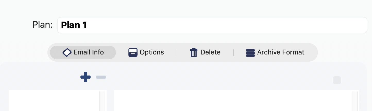
Another issue. Xojo’s Bevel buttons don’t handle Dark mode. So this morning I’ve now rolled my own button class that does behave properly, enabled/disabled, active/inactive, light/dark. With their own background colour.
And also a new tab bar that renders properly.
Next targets are the little sliding buttons as used in the IDE and scrollbars, I’ll do an Aqua knock-off. With configurable colors, I quite liked the Platinum theme and for Aqua, gold looks good too instead of BondiBlue. They even look nice in Windows 11. Sorry, Microsoft and GenZ/GenAlpha.
Gee Xojo, it wasn’t that hard, so frankly I’m disappointed you didn’t fix this stuff within the IDE.
Apple Maps for macOS used to have a Share button in the top right of Maps. So I could get directions on my Mac, and then send them to my iPhone when I leave my place.
Now, you have to scroll to the bottom of the Details of the directions to find the share button, or use the menubar.
Thanks Apple, I love when you make it harder to do the same thing we’ve been doing over and over.