Been a while since I posted. I recently did an update to my iOS app and discovered that for iPads the tab bar has suddenly changed both position and look. It is no longer at the bottom of the screen. It’s now at the top. It doesn’t have icons any more. It looks awful. What changed and when? Is there a way to put it at the bottom and go to the way it used to be?
I’m not at home right now and can’t show a screen shot. I can post that later. I just tried running in the simulator and it still shows the old way. Maybe my iOS SDK is out of date, but this would be an awful change if there’s no way to adjust it…
I don’t have the latest SDK installed on my Mac. The iPad I was using does not support iOS 26. And yet this still happened.
And now, you are telling me that Apple has basically different user interface elements for a phone vs. an iPad? And they are now breaking their own Navigation Bar rules?
Is there no way to utilize the old nav bar and put it back to the bottom? I would rather my apps have consistent interfaces…
Yeah, that sounds like the issue. I’m on a trip right now and the iPad I have with me is not running iOS18 at this point, so I can’t take a screenshot - I’ll do that when I get home.
So these declares - were would they be put? In the opening event of the view? That’s where I am not sure. And does this just move the position of the Nav bar or does it basically make it the same like it used to be. This was a really bad design decision by Apple. IMHO worse than liquid glass…
So if anyone wants to help me with some declares, I could use the help!
Here’s the lines of code suggested in the article:
For the main view:
func overrideHorizontalSizeClassToCompact() { if #available(iOS 18.0, *) { if UIDevice.current.userInterfaceIdiom == .pad { self.traitOverrides.horizontalSizeClass = .compact } } }
And for child views:
func overrideHorizontalSizeClassIfNeeded() { if #available(iOS 18.0, *) { if UIDevice.current.userInterfaceIdiom == .pad { self.traitOverrides.horizontalSizeClass = .unspecified } } }
So the UIDevice.current.userInterfaceIdiom function is available in UIKit. So the only ones where I would need help with then is with self.traitOverrides.horizontalSizeClassand seeing that to either .compact or .unspecified.
If no one is able to quickly help, I’ll try to figure it out and post the results here, but would love it if someone could provide some guidance..
Why does everything with Apple have to be so difficult? Why can’t Xojo do a better job of making things easier? I program in Xojo so I don’t need to jump through hoops and read articles from StackOverflow. But yet, here I am needing to do that. Grrr…
There’s probably a constraint that’s not being taken into account there that would push the content down a little bit, but this new toolbar is meant to float above the content anyway so…
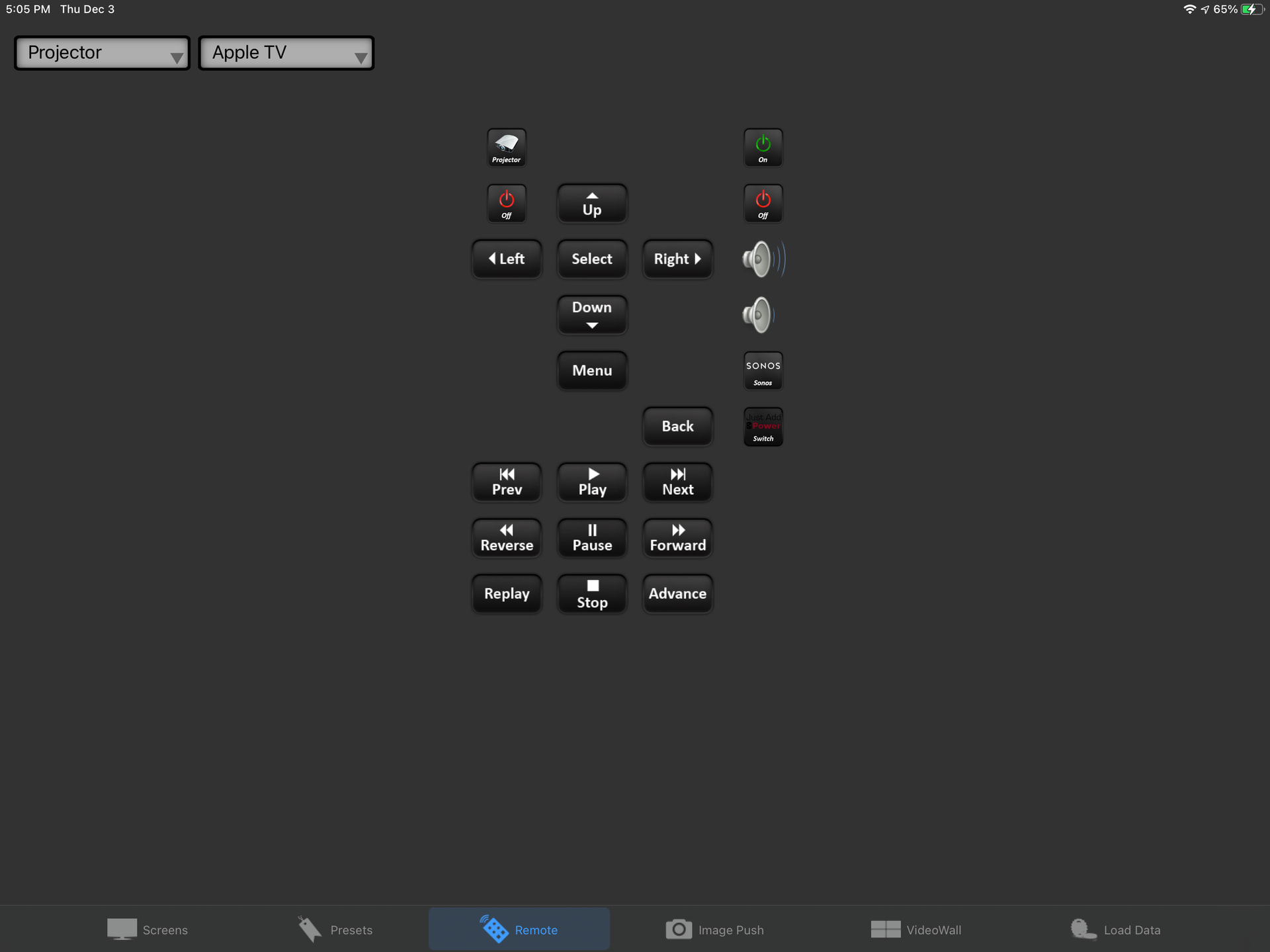
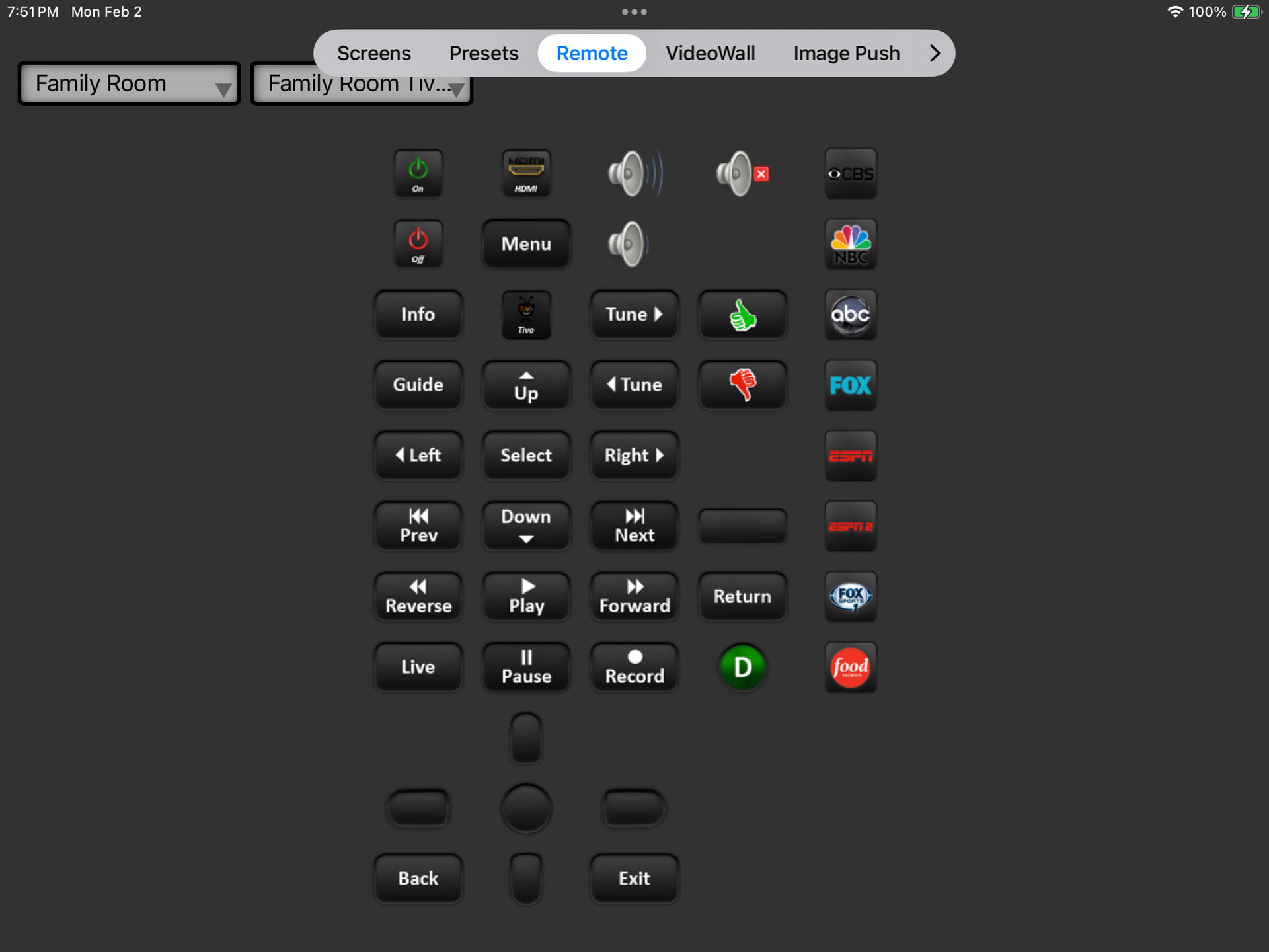
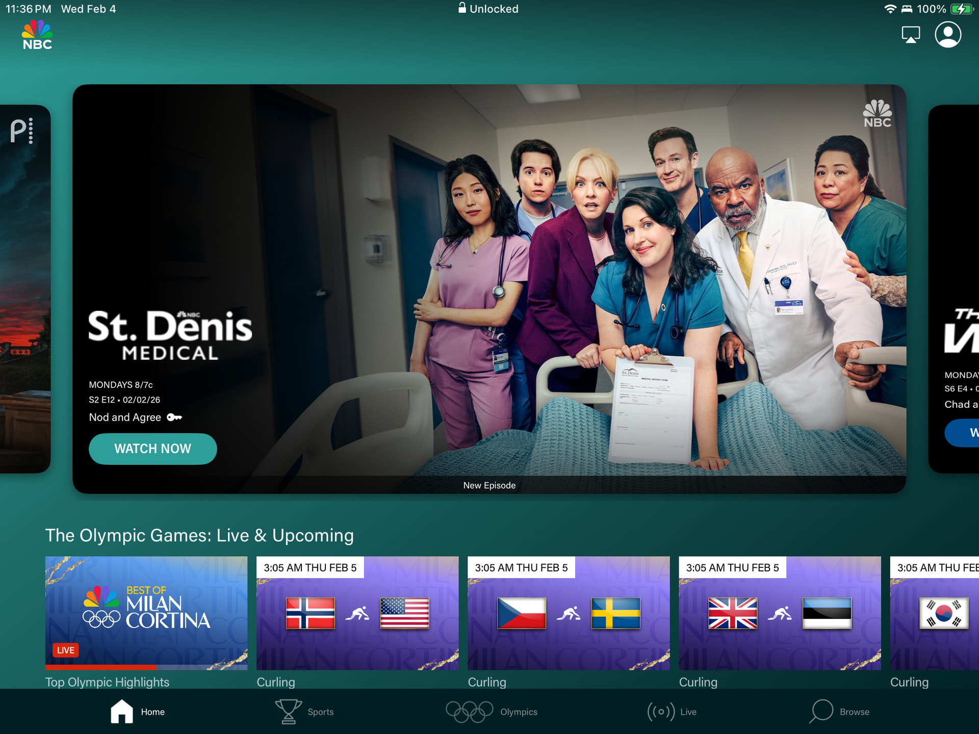
Technically right but practically and aesthetically wrong. Here are screen shots of several popular apps taken on an iPad where my app has this new awful nav bar structure yet these apps still have the nice nav bar at the bottom.
That’s what I was wondering. But it’s clear then that no one likes Apple’s new awful UI design (except those Xojo users who heard Arnaud’s post I guess).
For those big name apps, they’re often written using a third party framework just so they can easily build for Android too and those frameworks have written their own controls instead of using native ones. So yeah, the reason some of those apps have the “old look” is because their frameworks haven’t been updated yet.