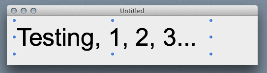
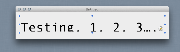
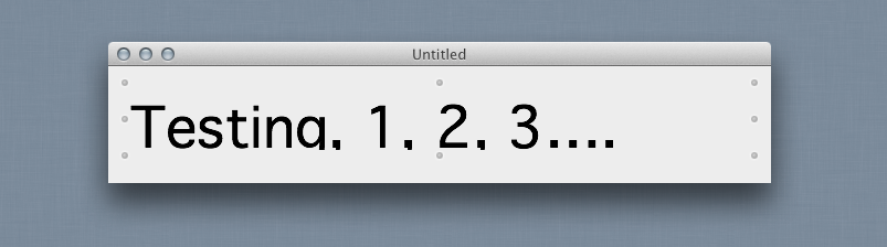
We want to use some custom fonts in our app, and really like the Open Sans face from Google Fonts. However, this font appears to either have a different “leading” (the space between lines) or some other funkiness in the glyphs that force the baseline of the font to be much lower than the baseline of other fonts when it is put into a label. Here is an example of Arial on a label:
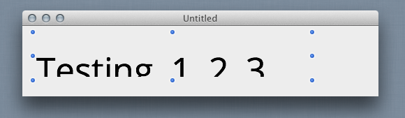
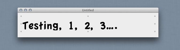
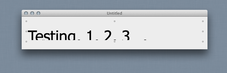
Here is the exact same label with Open Sans instead - nothing else changed:
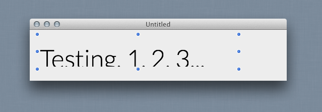
In looking through some of the other fonts on my computer, I notice that this is not unique to Open Sans - but rather is prevalent among lots of fonts, to varying degrees:
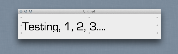
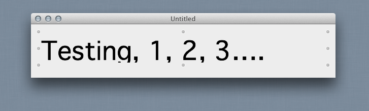
Now these are not off-the-wall-oddball fonts, either… some of them are apple system standard fonts. Some work fine, some don’t. Some are only shifted a little, others are shifted nearly completely off the label so you can only see the tops of the letters. This also seems to be agnostic of the font size as well - so these examples are at 50px size, but it is just as noticeable at 20px and 200px. Also, this happens in labels and text fields, but not in other UI types, like the headers and contents of listboxes, etc.
Further, I’ve checked, and it does not seem to have anything to do with the format of the font files (some are .otf, some are .ttf, etc) or whether the font has a large family or only 1 variant.
So, here’s my question: Can I do anything about this other than make the label taller? Some of my UI space is already very crowded, and I will wind up with overlapped controls etc if I am forced to make my labels 30-40% taller to make sure the fonts show up.
Also note, I have not tested this cross platform yet - only on my Mac, running 10.8.3, in 2013R23, Cocoa builds.
Any insight would be welcome.
Thanks!