I really took a dislike to the ribbon toolbar , when it appeared in Microsoft products and took away the menus.
Later, the menus and keyboard shortcuts we grew up with returned. (Sounds like the Windows 8 UI experience)
But as I add new features to my main app, I find I am running out of toolbar space, and the concept of the ribbon bar is starting to appeal.
I can see that having File operations in one tabbed bar, Area-based operations in a second, copy/paste operations in a third and so on would make a lot more space available, and allow functional grouping which could lead to simplifying the user experience.
JamieLeroy has such a toolbar available for Xojo:
And I’m quite tempted.
The question:
Has anyone implemented a customer-facing app using this control on the Mac?
Its so clearly a Microsoft look-and-feel that I wonder if using it would alienate narrow minded Mac end users?
Yes, that is the one I am considering. (I mistyped Jeremie Leroy)
I want to know if anyone has had any negative feedback from using it for a Mac application.
As a narrow minded Mac end user I would say that the ribbon toolbar looks horrible. The problem is that it tries too hard to be too many things.
For example “Line Numbers, Invisible Chars, Border” can be shown by simple icons which use about the same amount of space horizontally and far less vertically. Use the icons with a tooltip or better with a label which shows the text over which icon you are and what it does (I use this for all interface elements in my app).
Another idea would be to give the option to show the icon with the equivalent keyboard shortcut as text below. That might be more useful as users become more familiar with the app.
If you have too many items for the toolbar then it might be time to simplify or rethink your user interface. As Steve Jobs rightly said: “It is often more important to know what to leave out than what to put in”. Sounds to me like you are on your way to featurities.
[quote=215547:@Jeff Tullin]I
Has anyone implemented a customer-facing app using this control on the Mac?
Its so clearly a Microsoft look-and-feel that I wonder if using it would alienate narrow minded Mac end users?[/quote]
The one aspect of the new office UI I absolutely loathe
I own the Jeremie Leory Ribbon bar (actually own the source code versions of 5 or 6 of his controls), but have not implemented the Ribbon bar in my apps. I do use his Toolbar, Status bar and Chartview, they are pretty easy to use and seem to work well. Personally I like Ribbon bars, but I’m a Windows guy. Yes, they can be a little slow to scan visually, but not any slower than repeatedly clicking 2 times on multiple menu items when you are looking for something in a traditional menu.
You can hide Ribbon bars with a single click. Actually it is a double-click, but to your point, the interface is not cluttered unless you as the user want it to be. Some programs I like it shown, some I want it hidden.
Speaking of moronic interface decisions, I love it when I’m on my 27" iMac and working on a application in the lower right corner, I have to pack a lunch before heading to toolbar to get some menu command. Over and over and over again…
Change your mouse speed. I have Twitterific in my lower right corner, activated by hotkey, and controlled by shortcuts.
There are some things you can change to make your computer easier to use
uhmmm seems I am the only one here, but I really like the new Office 2016 Ribbon Bar Concept. The very first time Microsoft gives us Cross Platform Experience.
Like many things, the current generation of new users won’t know anything different than the ribbon bar so in a few years anything else will be a ‘horrible’ UI experience. In twenty years when a new UI concept comes out they’ll be screaming about how ‘bad’ it is. But their kids will like it.
Been a computer user since the early 80’s and every ‘new’ UI has it acolytes and critics. In reality, they’re just different. Use what works for you and your clients/customers.
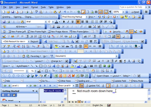
Well, no… thats not ribbon, (and surely the point of Ribbon is it avoids all that clutter.)
You click on Drawing tab, and you only see drawing related icons.
In a sense, showing that ‘toolbar hell’ image is making the case for the Ribbon style…
I trained myself to use an Apple Magic TrackPad and a mouse. With the trackpad, I can easily navigate to every corner of the screens (I use a 27" Retina iMac and and additional color proof screen) with only one finger, and I added a few custom gestures via BetterTouchTool that perform frequently used mouse click. When I need more precision, I use the mouse. Took a while to adopt to, but now I’m quite fast with it.
And hope that Apple will sell a keyboard with an integrated (force touch?) trackpad soon because sometimes the pad decides to sit on my enter key
For the main topic: I truely believe your interface offers much better comfort when it’s rather reduced. For me, it takes longer to analyze five similar looking icons than to find one general icon that offers a submenu.
[quote=215622:@Jeff Tullin]Well, no… thats not ribbon, (and surely the point of Ribbon is it avoids all that clutter.)
You click on Drawing tab, and you only see drawing related icons.
In a sense, showing that ‘toolbar hell’ image is making the case for the Ribbon style…[/quote]
No, it may make a case for a “tabbed toolbar” but not for a ribbon which is a mess of icons and labels.


 That is impressive in the wrong way.