I’m not planning to do a lot of development this way, I’m wondering what everyone’s thoughts are about creating small applets with the menubar disabled. Basically, everything would be done with buttons and other controls. Everything but the close button on the window would be disabled. The thought is, it might make for a very simple and consistent usage experience between OS Builds where menus would not really be needed.
Again, not trying to toss standards aside, just food for thought.
No, I’m not building any type of app with this idea in mind. But a Kiosk certainly would be a reason to do this. This question is purely out of curiosity.
I hadn’t considered forcing full screen, but that is an interesting thing to add to the question. My thoughts were more fixed size, non-resizable applets.
Yuk. Mac users would expect to see a menu bar even if it only had the app name menu for preferences etc. and Quit, and likely an Edit menu with standard items plus a Window menu with Minimise, Maximise and other possibilities. A Help menu is also very useful and a way to get the user support or to direct them to your web site. I ask why wouldn’t you want them available? They are familiar to the user and also reminders of what you can do in the app.
As I mentioned in my original post, I’m not saying I’m going to do this. I was just wondering what people think. Depending on the app, some things may not even be used.
Firefox and Chrome are already like this, at least on Windows. They do have a toolbar where you enter the URL, and if you want the menu, there’s a button on the toolbar to display it vertically along the right edge.
For my own use only, I have an app that displays a small amount of information, it’s less than 1 square inch. No menu or borders. You can drag it to move it, or right-click it to close it. There are no settings or options with this app.
I have another app for a handful of users. Also shows information and should take up as little space as possible. It has the Windows title bar and usual borders but no menu. It does have a small gear button that opens a settings window.
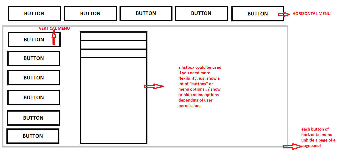
actually, i use that approach in my own desktop app. the main menu is on the upper part, and the secondary menu is on the left in vertical position. when a button is pressed on the upper part, a page of the pagepanel control is shown, unhiding the vertical positioned buttons. my users love this approach. is so simple and effective
I’d think it would depend on the app and it’s design. If it has a simple, straightforward design and it’s obvious to the user where things are and what they are for, how would the user suffer?
I don’t have designs of this type to compare. As I indicated in my original post, this was a question out of curiosity, not something I’ve been doing or necessarily going to do. It does seem that opinions are all over the place.