[POLL]: UI Icons - Blue or Orange?

Steve: I just was able to watch your screen shots…

Outch ! That is dense. I suppose you cannot do otherwise.

Reset: I use Clear, or New Button’s name (depending on context), but you know if Reset is the correct name.

Watch here the way I set what I call “contextual help”. In Window1.MouseEnter, I place some text in the Label at the bottom of the window and I clear it in MouseExit.

BTW: nice window. What is the Windows version ? (XP, 2000, Vista ?)

Blue is better than orange, but the blue used here clashes with the colour of the paper. IMO, that’s why the orange looks so much better.

I think a slightly desaturated, or lighter blue would be better. That is, try to find a blue that complements, rather than clashes with the paper background.

Blue

I say purple!, no, I’m kidding!, +1 Orange
Good color

I expected a rerun of the Blue/Gold dress thing. :slight_smile:

+1 Blue

Orange - goes with the paper, as Sascha said.

Add support so user of app can select skin which will use in your app and cover both colors for now and later you can also include new ones if is in need.

Someone likes darker someone likes lighter so, let end user take control of it :slight_smile:

Thanks for all the replies - it’s been very interesting reading. It’s pretty close: 8 for orange, 10 for blue.

I’m not sure if this was clear - the smaller icons are not persistent, ie. they are toggled on/off using the larger symbol in the menu panel. The reason being that the whole window can look overwhelming as it is.

My preference was for orange, but now I’m swaying towards blue. At least when dealing with code it either works, or it doesn’t! This is so much more subjective and can sometimes seem irrelevant.

I guess the best solution is what Paul and Bogdan have suggested, as in the user can choose via preferences. But then what? There may as well be a colour palette for them to create their own colour… too many options.

I’ve written in my notes (more than a year ago) that it would be nice to have “skins” as Bogdan suggests. This would change the main graph background (and even the panels). So in that case, the information symbol colour would have to change to suit. However, I can’t see that I’m ever going to go that far - they are just “pipe dreams”:

eg.
*Plain Jane
*50 Shades of Grey
*Old School
*Mythbuster
*Soviet Era
*Las Vegas
*Grunge

  • User Defined
    Etc… etc… For the record, this version is “Old School”.

Back to reality.

@Dave S: Thanks Dave, at first I thought you were just being facetious :slight_smile: perhaps you were? However, I did try green, but I didn’t think it worked well and clashed with green I’ve used elsewhere for other purposes.

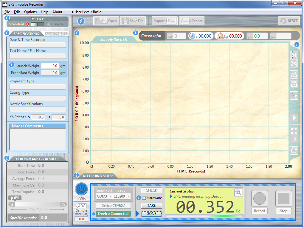
What I’ve tried now, is to tone the blue back a bit as suggested by Dave Kondris, but if I go too far, it then recedes into the background (of the left and bottom panels). Also I’ve included the “activation” of the recording setup panel scenario, which is already blue and always has been.

The reason for using blue is not just some arbitrary color that I plucked out of thin air, but because it matches the “Blue LED” that is part of the attached external hardware device, which indicates it’s turned ON. A tenuous link perhaps, but better than no reason :).

So, do the following updated images change your mind?

Cheers.

[EDIT] @ Emile, this is Windows 7. I don’t like the ugly borders but the app does work with Win8.1 and 10. Windows 7 was chosen as the base OS, and also a Win7 laptop is inexpensive. Using this software could potentially destroy your laptop, so best it be an old cheap one.

Regarding Polling:
For situations like this, or any other Poll for that matter, it would be better if it was a “Blind” poll. Otherwise it’s hard to be objective when you can see the opinions of others that you regard similar to your own.

So for UI questions, it would be nice if the forum allowed for a poll where you don’t see others opinions until you make your choice - much like a lot of other forums.

I chose the original blue over the original orange as for me the orange seemed to blend into the paper too much compared to the blue and wasn’t as obvious to me.

IMHO the new light blue is too light. The i’s are to aid the user spot where more information is available, not to blend into the surroundings or look like they fit in somewhere, they should standout/POP and be in your face and obvious. As they are only a transient informational marker turned on/off by the user make them loud and proud!

Steve, what i would do is 2 have both the help icon on your application and a place to set which one the user prefer and you can simply use some come on the open event to set the correct icon.

i would not bother with changing colour for other things since your application got too much component to think about

Of course there is no wrong or right answer to this. It also depends on what monitor (screen) you view this from.

The two variations of blue are very similar (to me), therefore let’s forget the blue? Whereas the Orange sticks out like the proverbial “canines testicles”.

Having a user selectable colour, then adds yet another level of complication (which is exactly what I’m trying to avoid) to an already complicated and clustered screen.

This software aplication will ALWAYS have a “sharp but short” learning curve:

from the help system:

Therefore, it ALL has to be in one window. Software-wise, there is no area to cut or simplify, therefore I’m left with the UI to try to simplify the user experience. It’s not an easy task.

I’d suggest that you consider that not everyone has perfect vision. What you choose here may be affected by people who have different types of color blindness.

Mac App Store has an application called Sim Daltonism. i have use the app mention on steve’s two screen shot. for someone with color blindness, the orange icon look a bit wishy washy

Yes, I’ve fallen into that trap more than once. Built a piece of custom production-line test equipment that used red and green LEDs to indicate Pass/Fail, only to find out after shipping the thing that some of the operators (and the shop foreman!) are color-blind.

[quote=393164:@Dave Kondris]Blue is better than orange, but the blue used here clashes with the colour of the paper. IMO, that’s why the orange looks so much better.

I think a slightly desaturated, or lighter blue would be better. That is, try to find a blue that complements, rather than clashes with the paper background.[/quote]
+1

either blue looks good, for me the main reason for suggesting blue is that the orange jumped out too much shouting press me press me, i would not want them jumping out in my face, nice and subtle is best, as very soon they become familiar in their location and would be very annoying if so bold (for me i hasten to add).

I don’t think a lighter blue would work because you wouldn’t easily be able to see the white “i”. Also if the colour is/was offensive, the symbols can always be toggled on/off.

Nevertheless… I had to make a decision (finally). I decided to go with Blue. This is the second blue version in post June 24 above. Not as bright as the first and similar to the blue I’ve already used throughout.

To convince myself this blue is the better choice:

Blue:

  • is the general standard for the “i” symbol
  • suits the “overall feel” - it looks neater/cleaner (more professional?)
  • is easier to see for users with colour blindness
  • preferred by more participants in this poll (and others sources)
  • takes up less ram than orange

I think one of the above points is possibly not true :slight_smile:

Thank you everyone very much for your participation. Whilst not a huge issue in the scheme of things (ie. coding), it was a nagging question that I’m happy to say has been resolved.

I’m not going to mark this as “Answered” because with these sort of UI questions, “Beauty is always in the eye of the beholder”.

Cheers.

But that’s an interesting question! Do you know how much memory an icon takes? But if the picture data is compressed, it’s possible that a blue icon needs less RAM than an orange one :wink:

Haaa, there had to be one person… :slight_smile:

Well, the icons are not bitmap images. They are drawn into a small canvas:

[code] // draws solid filled circle

g.ForeColor = kWhite
g.FillOval (0,0,20,20)

g.ForeColor = kInfoCircleIcons
g.FillOval (1,1,18,18)

g.ForeColor = kWhite
g.TextFont = “Georgia”
g.Bold = True
g.Italic = True
g.TextSize = 15
g.DrawString (“i”,7,15)[/code]

Now I wonder if would that any difference?