I recently posted about this but was unclear so posting again for clarity. I want to use XOJOs native Desktop Chart tools to plot data. I have two lists, one of time values, and one of values of f(t). I want to plot points of the form (t,f(t)). Here is the code I have so far, which is not working at all, and I know will not work. I am not sure how to make each f(t) value correspond to a time value in XOJO.
Var GraphData() As Double
Var TimeData() As String
Var n as integer = ChartArray.LastIndex(2)
Var j as integer = GraphChoicePopupMenu.SelectedRowIndex
for i as integer = 0 to n
GraphData.add(ChartArray(j,i))
TimeData.Add(ChartArray(0,i).ToString)
next
Can you find a chart similar of what you want searching in Google? or can you draw one up?
I’m not sure the native chart can handle what you want (because you posted on your other thread that you want to chart “will have over 600,000 elements”)
I have a similar need. I think what he was getting at is how to plot a line graph when you have a time series consisting of unevenly spaced TIMES and the corresponding VALUES. For line charts Xojo seems to assume that all points are evenly spaced along the X axis. One workaround is to use a scatter plot so you can provide BOTH X and Y coordinates and then use the line style to connect the dots.
Look at DesktopChart.Modes.Scatter and add a line there. The Line chart is just for Categorical X axis. Scatter does true X Y charts and can use lines, symbols etc.
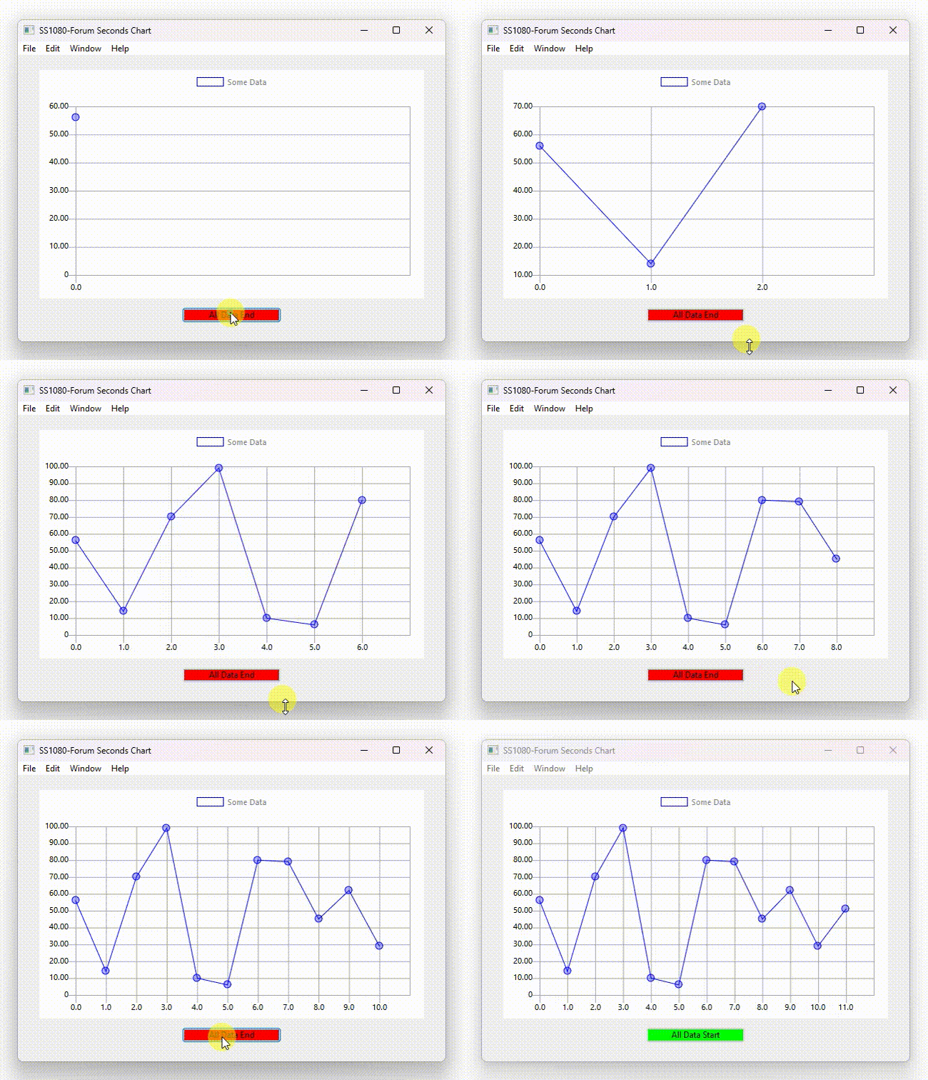
Here is a demonstration of the Chart control that I use for DAQ (Data Acquisition) on the Raspberry Pi with electronics.
The Xojo file has been zipped and is called: SS1080-ForumSeconds-Ver3.zip. This program dynamically shows the time that has elapsed with a random number generator creating data to show the user how this displays the data.
This is on Xojo 2026r2.1, written on Windows 11.
Is this what you were looking for to answer your original question?