Personal PopupMenu control

For an aesthetics matter and in order to have identical visualization for deployments in Windows, Mac and Linux I had created my own PopupMenu control

It is a container control that contains a textbox, a listbox and a canvas

The container control I placed in the window always in front of the rest of the objects of the window.

In many cases when I open my PopupMenu and display the listbox, the listbox is over a textbox of the window.

In Windows, hovering the mouse over the listbox mixes the textboxes that were under/below the container with the listbox of the container.

I show some screenshots.

PopupMenu closed

Popup Menu opened

Hovering the mouse over the listbox

This do not happen in MAC.

Any solution or tip for this problem ?

Of course if someone would be interested on this piece of code (my personal Popup Menu) just ask me. I have the same done for checkboxes and optionboxes where the color of the elements could be personalized.

Thanks a lot

seems the popup list is not the top control for some reason.
i would use a extra window for the select list because i not like this minimal size select view.
with a extra dialog you could also add a search or filter for the items.

Please use listbox inside a container control so that it wont show the beneath control’s.

In order to help me on finding a solution, I include the small code of the personalized PopupMenu control
https://drive.google.com/file/d/1RafUFeEn8iAEZxZO0Kc0zpoWuf7usvFQ/view?usp=sharing

Hi @Mariano_Poli

It would be helpful if you provide a minimal test project where you are using the customized control in (more or less) the same way you’re using it in your real app… that way we could see if it is really added to the window as the topmost control (among other possible issues)

@Javier_Menendez In the previous post is the link to the project.
I already applied what @MarkusR suggested (use a window with the listbox asociated to the container control where the textbox and the canvas are) and I have solved the problem, but it would be interesting to understand what is happening with the original code placing the listbox in the container control.

When I click the link I get:
image
can you share without that restriction?

1 Like

i have only one answer in mind.
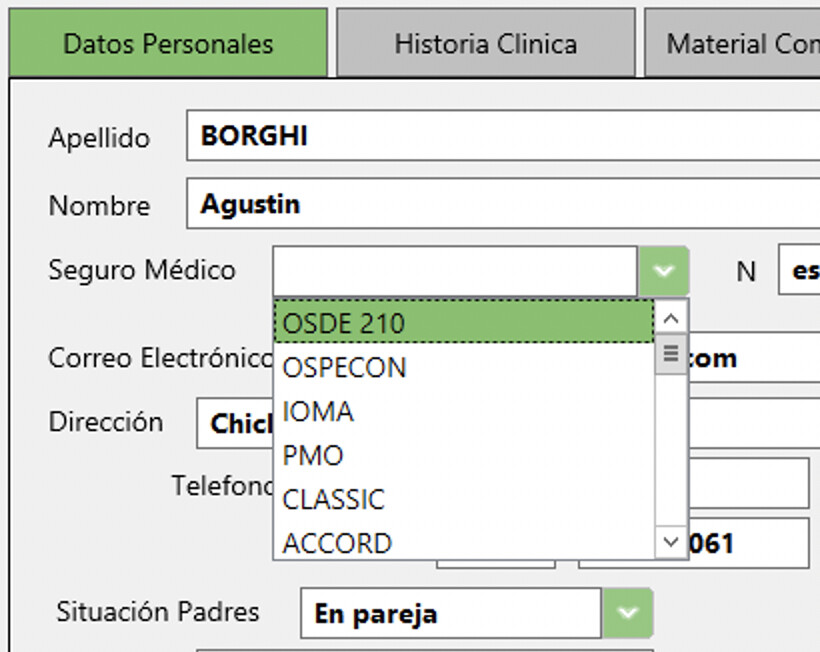
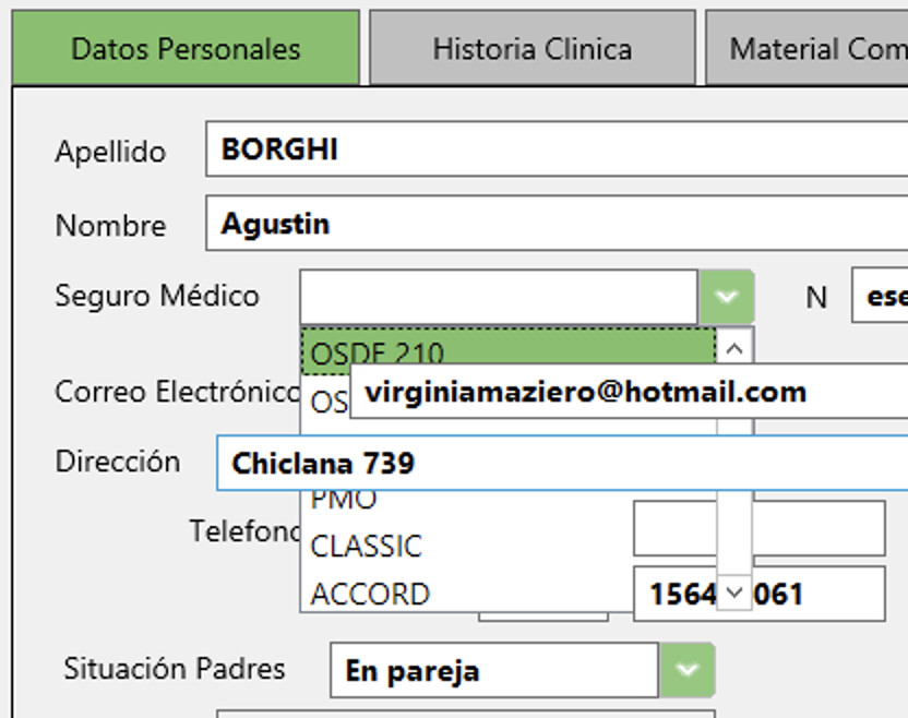
i guess you design this container control with the height of the textbox and it looks good in the editor but it is not the top control. if you open the list you make the cc larger and then it is below the others.

Ashampoo_Snap_Samstag, 17. Juli 2021_7h32m10s_001_Xojo - test

Why not use a menuItem (instead a listbox) and pop it at the right place when needed ?

What version of Xojo are you using?

I also made such a control, using a listbox, because on the Pi, if a popupmenu was too tall for the screen, it would not scroll at all.

@AlbertoD link without restriction… sorry

https://drive.google.com/file/d/1RafUFeEn8iAEZxZO0Kc0zpoWuf7usvFQ/view?usp=sharing

I tested on several versions including the las ones.

As I said when lunched this post it is for an aesthetics matter

@MarkusR … if you download the code I posted, you could see that order and tab order places the container control at top.

I can replicate it in the version that the project was saved in (2017r1) but that is understandable as this problem was fixed in 2018r1 with the flicker fix, this was one of the reasons the fix was implemented. However, I cannot replicate it with 2021r1.1 (latest) as you mention, could you provide a video of it happening in 2021r1.1 so I can see if I’m doing something differently than you?

I can probably provide a fix if you would like to keep with an older version of the IDE for whatever reason, just let me know.

1 Like

yeah, looks correct but the display if me open the list looks also ok over the other with xojo 2021r1.1