I notice that message and dialog windows may adopt two different designs: the “classic” design where the buttons are at the bottom on the same line (left, and right), and the “new” design where the buttons are one on top of the other.
Two: the app-icon may appear on the left, followed, on the right by the message; or it may sit on top-center, with the message printed below.
Three: the message and the explanation’s content may be justified or center-aligned.
Apple apps (TextEdit, Pages, Safari etc.) tend to use the “Classic” design in their Save, Print, PageSetup etc. windows; alternating the justified/center aligned message/explanation.
Xojo IDE, when saving, uses the vertical design, and for our apps (message dialog) it offers the new vertical design; while for Open and Print functions keeps the horizontal design.
So, when I have to built custom modal dialog windows, which design should I follow?
Are there guidelines, or does everything depend on one’s liking?
Regards.
So here are a few screenshots taken on my Intel MBP running BigSur.
As you can see,
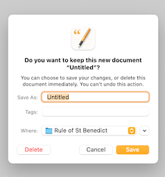
Pages app has the icon on the center, the ‘message’ and the explan. are center-aligned and the three buttons are one beside the other.
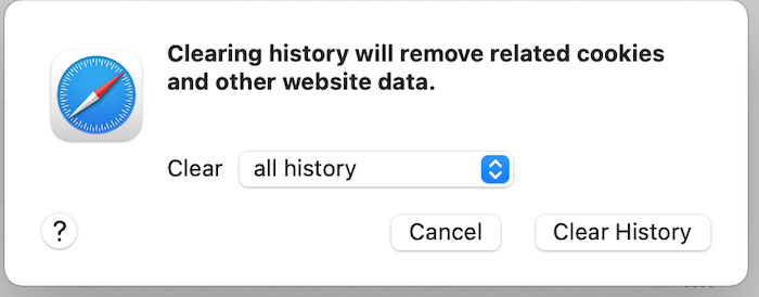
Safari has the icon on the left, the message is left-aligned, and the two buttons are one beside the other.
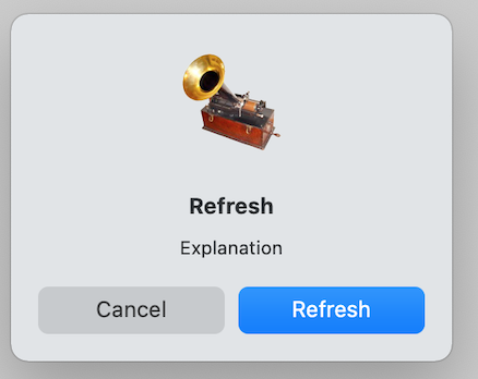
Xojo, Icon centered, message and explan. center-aligned, and the three buttons are one on top of the other and as wide as the window.
Xojo, Icon centered, message and explan. center-aligned, and the two buttons one beside the other and the two of them, together, go from the left margin to right margin of the window
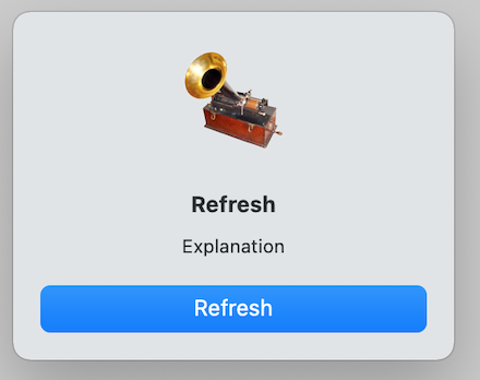
Xojo, icon centered, message and explan. center-aligned, and the single button as wide as the window,
That’s why I was wondering about guidelines about UI design when making a Xojo custom modal window.
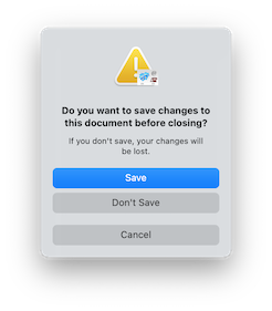
3, 4 and 5 are the default super ugly message dialogs in BS and Monterey. You can’t do anything about those.
1 is more BS style while 2 is before-BS style. A long long time ago I learned that centered text is not very readable. Clearly, Apple didn’t get the memo.
I prefer the Safari style. If you want to go with the BS style use 1. If you want nice dialogs use 2.
This is part of a NSDocument based application, which is not available by default in Xojo. It’s something that I’ve made strides in getting there, but I still haven’t gotten it working to this extent.
3,4 & 5 is a normal NSAlert or MessageDialog, the layout varies based on how many buttons you show (it can take more than 3).
2 is a custom sheet that was designed to fit in the pre-BS era UI and hasn’t been updated, because the engineers don’t have enough to make sure the UI fits within the current guidelines.
If you want to see what Apple recommends 3rd Party developers to design UI like, check this out. But I warn you, while it states it is for macOS 11, it is already out of date and don’t expect Apple’s own application to follow these.