What would be a cool way to illustrate to the user that an update is available?
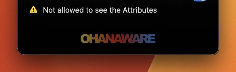
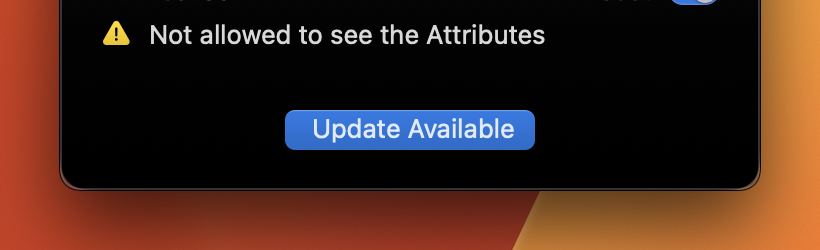
Right now, the bottom of the window changes from showing the Ohanaware logo to displaying a default button.
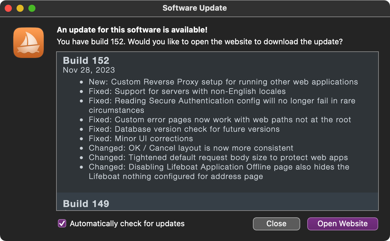
I like me a Sparkle style change notes window, even if it doesn’t download in-app I prefer it to be big and unmissable.
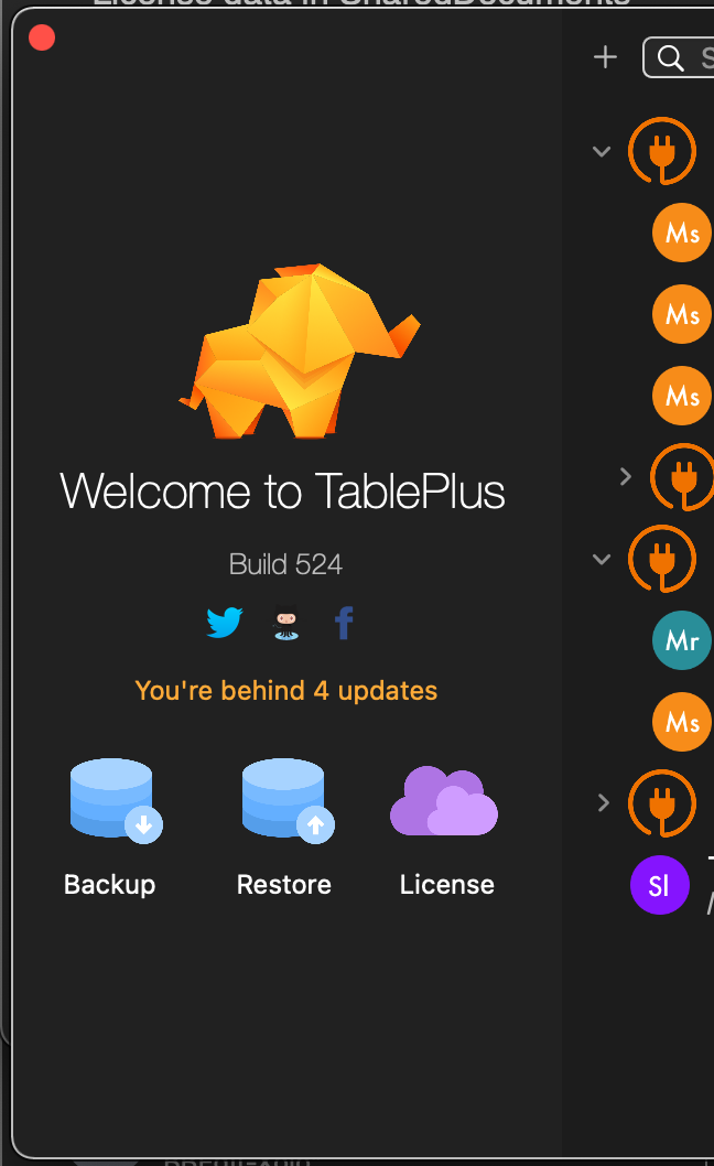
TablePlus does this on their main window and I’m not a fan.
2 Likes
Silently, whenever possible. I like seeing that updates are available, but the average user doesn’t care. Update silently and show a “what’s new” after the update is installed.
1 Like
It depend of the king of users…
Developer users: choose Tim look a like window,
Average user (and few KB update, read below): do the free update silently.
I have a friend that is always ranting about the way microsoft do the udates while downloading. So a large update have to be visible.
My MacOS updates experience:
I always strongly dislike the updates since I do not know what to do while the computer is busy.
BUT: during the last months (.x) updates, I waited lunch time, and run the update while I am eating. I ended eating around the same time the update was done: I was happy !
1 Like