This is such a minor thing, but it annoys me every time I look at it.
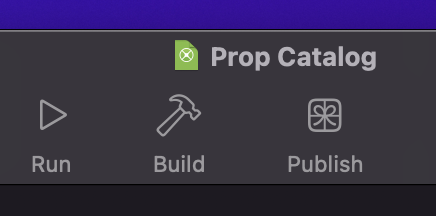
The run, build, and publish buttons should really be centered on the toolbar.
Is this even worth opening a ticket? Does it annoy anyone else?
AlbertoD
April 14, 2025, 7:46pm
2
Looks like the space before Help changed from previous version to new version
2024r4.1
2025r1
Maybe that is part of the problem?
There are three groups of buttons and the middle one with Run, Build, and Publish is approximately centered between the other two. Now should this button group be centered relative to the toolbar width or between the other button groups?
As far as I’m concerned I’m fine with either option.
Greg_O
April 15, 2025, 11:32am
4
Could you post a picture of the entire toolbar, all the way to the left and right?
AlbertoD:
2019r1.1
I wish I could have the nice looking icons back instead of the tiny fugly ones.
2 Likes
It seems like the center group far enough from the other toolbar buttons that it would make more sense visually to have them centered in the window rather than between the left and right button groups.
Just personal preference though I suppose.
Apart from agreeing 100% with @Beatrix_Willius 's comment, I really don’t care.
Scott_C
April 15, 2025, 4:26pm
9
Egads, I made the toolbar visible for the first time in ages, and you’re right. It looks quite odd.
I used a screen measuring tool and those middle icons are not centred relative to the left & right groups, or the toolbar centre.
But then, I always keep the toolbar hidden, so it doesn’t bother me.
My wish is that clicking on the text below the icon worked to run whatever command the icon does.
2 Likes
AlbertoD
April 15, 2025, 5:18pm
11
I can click the text below the icon and it runs.
Not on my Mac. I have to hit the little icon/button. Clicking the text below it does nothing.
Xojo 2025r1, MacOS 15.4
AlbertoD
April 15, 2025, 5:47pm
13
Mark Sweeney:
MacOS 15.4
I think is a new “feature” on newer versions of macOS.
Greg_O
April 16, 2025, 2:07am
14
It may also be an accessibility option.