The current functionality of the IDE tabs is very confusing: an open tab can change its contents without direct user interaction, especially when using Search or the Debugger, thus forcing the user to find the item again and again in the navigator to re-open the original tab. The locking mechanism is also badly implemented IMHO because it can generate multiple instances of the same tab.
I suggest the following improvements:
Get rid of the “lock” icon. Instead, make the tab have two states: “preview” and “edit”.
A Preview tab shows content that has not been edited and can change whenever the user clicks a different item. Imagine a module with several methods: clicking the methods in the Navigator would show (preview) the code in that same tab. A Preview tab shows its title in italic.
An Edit tab shows code that has been modified. By default, edit tabs are “locked”: only the user can change its content and location.
Make the Debugger and Search open the clicked items in the corresponding tabs if available, or a new Preview tab if the item is not yet open.
Unless the current tab is a preview, Debugger and Search should never, ever, arbitrarily change the content of my tabs. Example: a search returned an item in the method “Foo”. If “Foo” is open as a tab, Search should activate that tab; if “foo” is not in a tab, Search should open the method in a new Preview tab, or use a current Preview tab.
I fully agree to your assessment that the tabs, as they are, are very confusing. I no longer bother to use the locking, because I could not figure out a way it would really help me. I simply gave up and live with the mess this creates.
I strongly disagree to your proposals how to fix, though.
What I would need is the following
A project tab as it was in RealStudio. Make it optional for those who don’t want / don’t need it. I need a place where I can quickly navigate to any part of the project!
Any tab I open stays open at exactly that location at all times, the only exception being a search within (part of) the item opened in that window when started from within that window (and of course when I navigate to wherever I wish).
a global search should open all its results in one tab, reusing it until the user specifically tells it to use a new one (e.g. from the context menu of the search result)
Edit from the debugger probably should work similar to a global search with options for reuse an already open tab or open a new one.
Locking tended to lock me out from navigating, rather than giving me predictability.
Please note that the logic when to choose to persist a tab when opened from search or from debugger is reversed. In the search I decide after I have seen (or at least have had an opportunity of seeing) the item in the tab. From the debugger I decide before the item is positioned in the existing or a new tab.
There’s already a set of rules concerning tabs and any time those rules changed it resulted in confusion for lots of users.
IIRC, when looking for a tab to open content:
Look for an unlocked tab which already contains the content you are looking for.
Look for a locked tab matching what you are looking for
Create a new tab.
Without rules like this, you’d be surprised how quickly you end up with tens or hundreds of tabs pointing at the exact same thing, so it’s a toss up.
Is it working perfectly? No. But at least it’s mostly predictable. personally I still see it changing tabs that it shouldn’t once in a while, but I have yet to find a pattern so I can report it.
The tabs suck - majorly. They are the main way to use Xojo so they really should be better.
The main tab should be more prominent. It should always show the same name - “Main”, “Navigation”, what not. It should have an option to show or hide the details. I usually don’t want to navigate functions for large projects. For small ones this might make more sense. FFS don’t make the main tab lose focus. I click around and suddenly the main tab shows some code and the navigator shows something else.
The lock of a tab shouldn’t be there. A tab is not the main navigation. I can’t make out why searching sometimes goes to the main navigation when a tab is already open.
You’re in App.kFileQuitShortcut. Tab is App, content is kFileQuitShortcut.
Just because you’ve scrolled to a different place in the navigator doesn’t mean you’ve lost your place. If it didn’t allow this, you’d never be able to reuse a tab for something else.
I understand this can be frustrating, but the problem is that there isn’t just one way to do this and not everyone has the same opinion of the “right way”.
Quite true. I have small projects and large projects where I work differently. But the IDE should offer some defaults and allow me to customize how I work. This is really hard to do.
I could not agree more. My “favorite” is when a tab mysteriously becomes “No Selection”
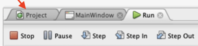
My ideal solution would be to go back to the way RealStudio worked. There was one tab at the extreme left called “Project”. It never moved, its caption never changed, and it always showed the full project tree. Any item opened in its own tab never changed either. If you opened a tab for MyWindow, it always stayed MyWindow. Everything was stable and predictable, with things doing what you asked them to do instead of some programmer’s guess as to what they think you might want.
FWIW, I wrote an app that locks the .uistate file for text format projects. When used as designed, this lets you create a UI state that you like as a “clean slate” and every time you open the project the workspace is in your clean slate state.
Just to clarify, my suggestion about “preview” and “edit” tabs simply mimics the tab mechanism of Xcode and Visual Studio. I don’t think it would be wise for Xojo to reinvent the wheel and come up with a new, original solution. The three-pane layout with Project Navigator, code editor with tabs, and property pane is a standard feature in the most used modern IDEs. Programmers, specially the younger generations, are already familiar with a certain workspace and providing them the same tried and tested layout that they learned in countless online tutorials about Javascript, Java, Python, C# and Swift would certainly help with the adoption of Xojo.
Request 71058: Navigator should be a separate pane and not a tab
That’s a huge conceptual error, just like the current solution in Xojo of having it inside any tab. Both are UX faux-pas.
There is one project, so there must be one navigator, locked to its own side of the main window and easily accessible.
Tabs are for the items contained in the project: code, project settings, build settings, file types, resources, etc.
A third pane is for properties, UI libraries, etc. Certainly not suitable for long texts like method declarations.
Look at how a macOS Finder window is structured, or any mail application, 3D modelling software or any other IDE: they all share the same three-column layout.