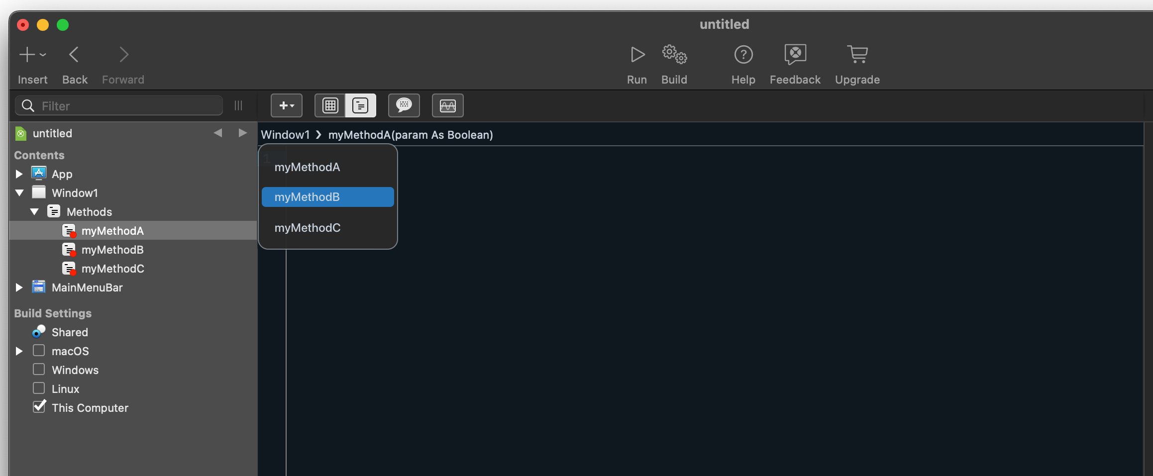
A feature request to add breadcrumbs above the code area, with drop-down menus for quick navigation and editable method declaration.
" The IDE could use a breadcrumbs bar above the code area to show the position of the current item. The last item would show the interface of the current method or property and should be editable to allow the user to change the declarations in place without using the Inspector. Example:
Project > UI > Window1 > Foobar(p as Point) As Boolean
The method declaration should be made editable by clicking on it. The other items should be at least clickable to allow quick navigation (that’s what breadcrumbs are for), but ideally should also open a drop-down menu. In the above example, clicking Window1 would open a menu that lists all its events, methods and properties."
I proposed this back in 2013, but it didn’t really feel right anywhere. Even in your mock-up, the path bar kind of sticks out and has no horizontal continuity with the other sections. I think it would be a great addition, but the IDE needs a little more polish to fit it in nicely.
As for the editable method information, that was also part of the plan, though not part of the path bar. We needed a token field first, and well… that hasn’t happened.
Both Xcode and VS Code have the breadcrumb bar in that exact location. I’d be more than happy if Xojo just cop… ehm took inspiration from those. That would be a huge usability improvement, especially on smaller displays.
That’s certainly true, tabs need to be fixed as soon as possible (again just copying VS Code would be a wise move), but the two requests are not mutually exclusive. Working in Xojo on a laptop is painful because of all the wasted space and the vertical layout of the declaration fields.
I’m not saying the position is wrong. I’m saying the surrounding elements need to also be updated. The project level selector probably needs a separator, but I don’t know what would take up that vertical space in the inspector and properties panel. My point is that there’s more to consider than just slapping a breadcrumbs element below the command bar.
I’m fine with the tabbed interface rather than your proposed drop-down scheme, if only the tabs would show what I ask them to show without seemingly changing of their own accord.
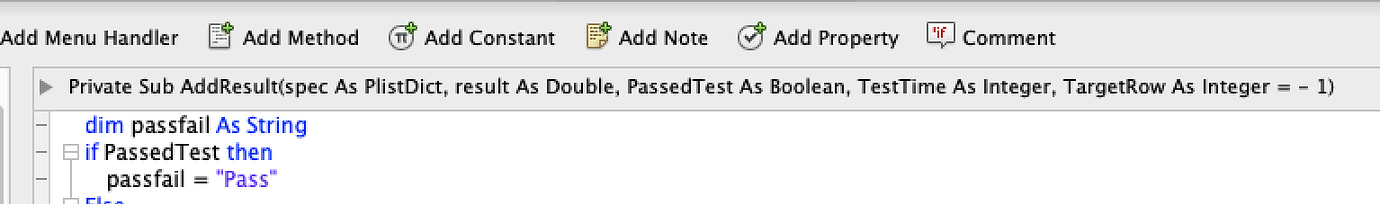
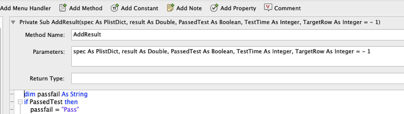
The older layout with the signature editor and no sidebar was a much more efficient design for programmers. Which should be who the product is designed for…
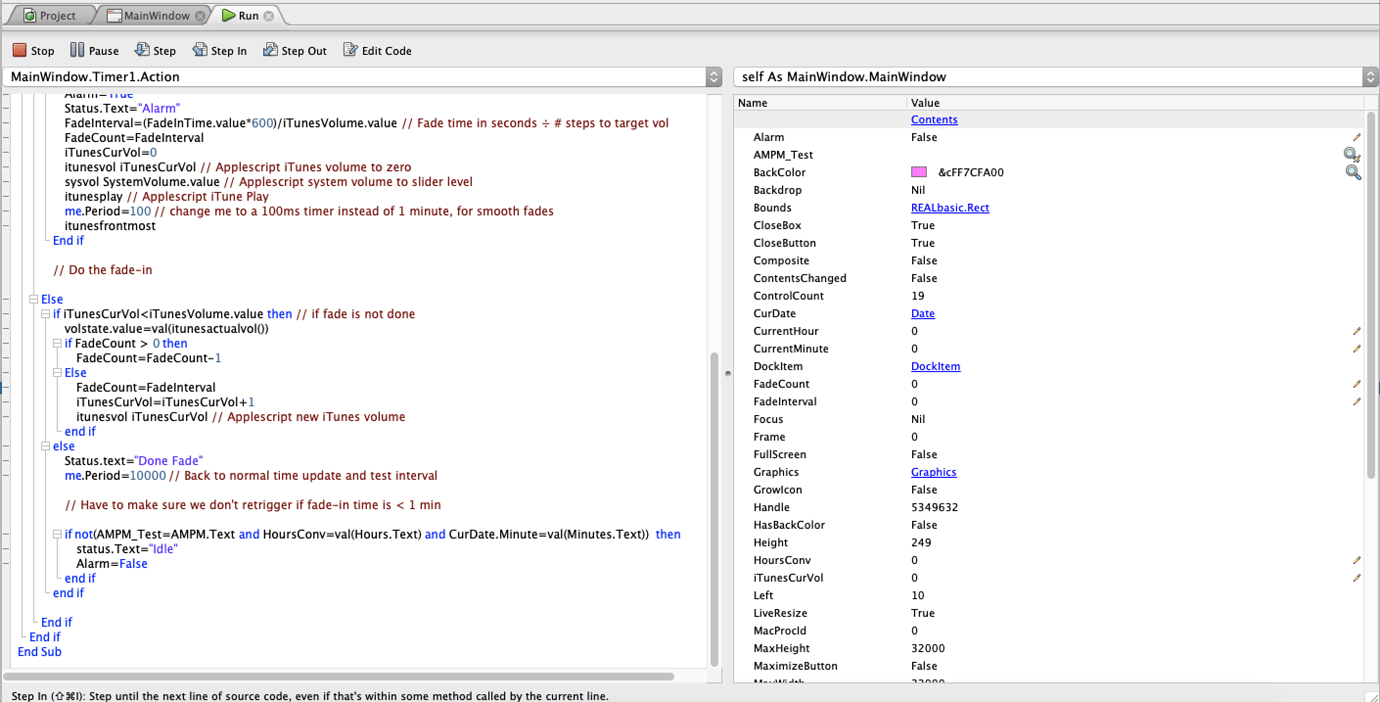
Completely agree. Just look at how much empty wasted space there is while debugging. I’m constantly scrolling the variables list to examine the one I want, and the most maddening thing is the list always scrolls to the top with every step.
Fully agree. I often ask my self why the Xojo engineers don’t find that annoying, too. And after a lengthy debugging session the debugger crashes ALWAYS.