Does anyone know what to do for the best with icons these days?
There is no uniformity any more.
Even this ‘helpful’ web page seems to end up with ‘you know what… just do what you like and call it a trend, but there will be another along in 10 minutes…’
I love icons. And this is why I take their design seriously.
Especially to be careful in administrative systems. Where data management and capture are required. To look at a modern design, they have a relevant role in the presentation of the data and the icons there.
On non-administrative web pages, designers promote their imagination and run wild. But, they always using design structures.
What the designers say:
Now the iconography is bigger, not small. Enough to fit a finger.
They also perform small movements as an effect.
Of course, using modern fonts for writing is essential, as they visually make a big difference.
So far, this is what is most fashionable and modern for them.
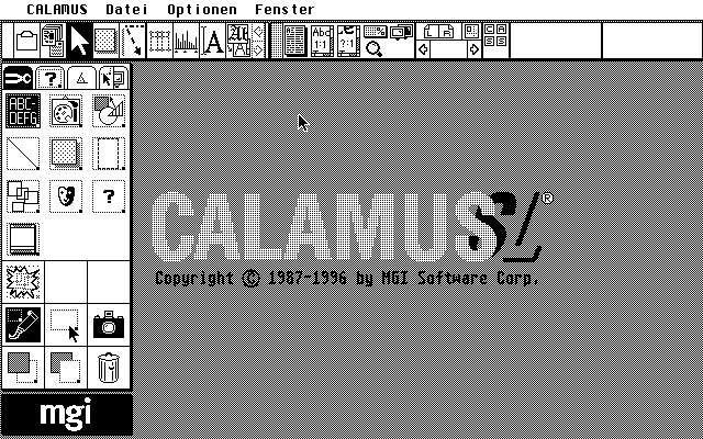
Do not forget the horizontal toolbar at the top is considered “old”; the “modern” thing is to do it on the left side and vertical.
Do not forget the horizontal toolbar at the top is considered “old”
Excellent.
Heres the new style then…
Line icons, and a toolbar down the side.
I’m going to get ahead of the game. I’m going for semi- invisible icons which look like feet in a variety of positions, and put the toolbar in Venesuela.
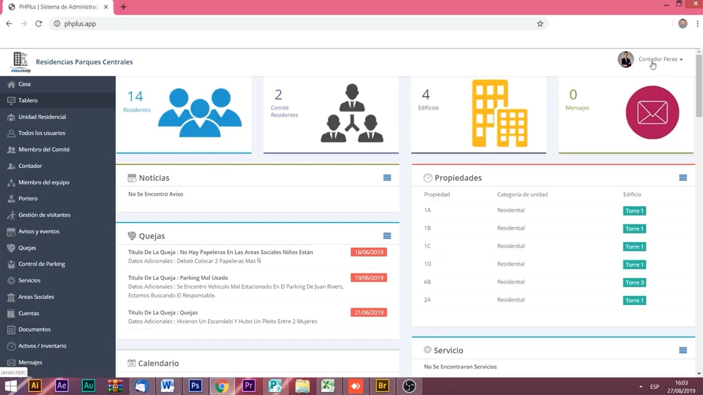
Here, the icons down the left don’t appear to be a ‘toolbar’’ , these look like navigation.
They act like tabs on a tab panel.
A toolbar contains buttons that do actions or change state.
probably because these screens are activity based, not document oriented
When it comes to icons, the best is to have uniformity throughout the app. Don’t mix and match different icon styles.
Before Apple released SF Symbols I used to get all my icons from https://icons8.com
The wide variety of icons available at icons8 makes it a great resource when creating an app.