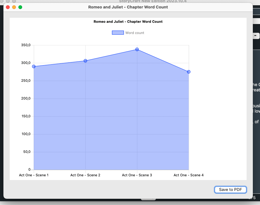
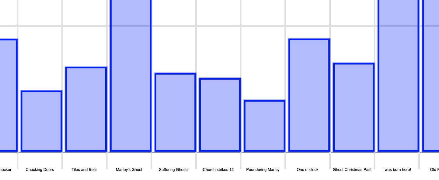
I am using a chart to show the amount of words in a chapter for my story writing app, it looks great, but it would be nice if the page would be filled from the left to the right page side. Is that possible? Right now it looks like this:
I’m not sure what you mean, can you do a sketch of what you want?
Presumably you need to set the chart’s .Left and .Width properties.
Ah, if you mean that there is a lot of space to the right, I’m not sure if there is a bug report about that already:
I think it has to do with the line vs bar chart settings. @Javier_Menendez may know if there is a bug report about that.
How is the Chart Mode popup menu programmed in this blog post?
I am able to change the modes with the popup, but for this to really change the chart it needs to be closed and opened again. I use booleans in the popup which then close and reopen the ChartWindow, but maybe there is a better way? The refresh method doesn’t work btw…
if PopChartmodes.SelectedRowIndex = 0 then //Show Line
  app.chartModeBar = false
  app.chartModeLine = true
  ChapterWords.Refresh
end if

if PopChartmodes.SelectedRowIndex = 1 then // Show bar
  app.chartModeLine = false
  app.chartModeBar = true
  ChapterWords.Refresh
end if
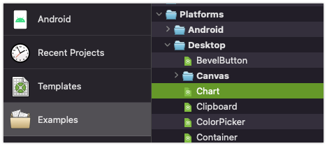
Did you try the Examples - Platforms - Desktop - Chart example?
Why don’t you change the chart mode directly in the Chart instance? It will change to the new mode on the fly ![]()
I did this using the booleans value from the popup menu, but for this to work, the window needs to be closed and opened again:
// Create a new dataset with the array values and a color
Var Chapters As New ChartLinearDataset("Word count", Color.Blue, True, TotalChapterWords)

if app.chartModeBar = true then
  Chapters.ChartType = ChartLinearDataset.ChartTypes.Bar
   PopChartmodes.SelectedRowIndex = 1
end if

if app.chartModeLine = true then
  Chapters.ChartType = ChartLinearDataset.ChartTypes.Line
   PopChartmodes.SelectedRowIndex =0
end if

// Add the dataset to the chart
ChapterWords.AddDataset (Chapters)
It would be good to have a little example project (it doesn’t needs to be too complex) to figure out what are you trying to do (and how). That would glue all the pieces about how are you trying to set the mode on the chart… from one window to a second one or any other approach ![]()
You need to change the mode for ‘ChapterWords’
ChapterWords.mode = DesktopChart.Modes.Line
or
ChapterWords.mode = DesktopChart.Modes.Bar
I don’t see a Desktop Chart example in the Examples folder. I downloaded the new examples yesterday, but there is only a Web chart example.
You can see:
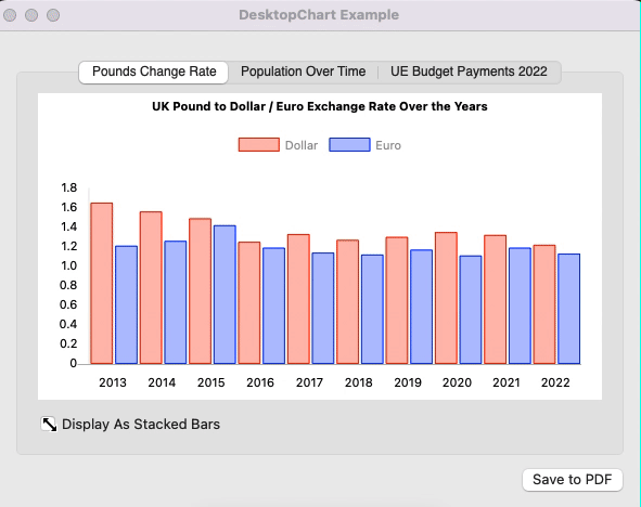
code to change from one to another with that checkbox:
If Me.Value Then
  PoundsExchangeChart.mode = DesktopChart.Modes.Stacked
Else
  PoundsExchangeChart.mode = DesktopChart.Modes.Bar
End If
Thanks, the popup menu works now and changes the chart, but not from Lines to Bars, but from what it seems small bars to large bars. Not sure what is happening, but I can now change the chart without closing and opening the window, that’s progress!
edit: ah, I see. When I change mode using the popup menu, the lines are left or centred aligned, but it’s not showing the Bars anymore.
if PopChartmodes.SelectedRowIndex = 0 then //Show Line
  ChapterWords.mode = DesktopChart.Modes.Line

end if

if PopChartmodes.SelectedRowIndex = 1 then // Show bar
  ChapterWords.mode = DesktopChart.Modes.bar

end if
If you want to display Bars and Lines at the same time in the same chart… you need to create separate datasets for them, and add them to the same Chart instance. Even you can add as many Datasets for Linear data and/or Bar data as you need. Then, you can set the Chart mode to Bar / Line as you prefer. ![]()
I hope that helps!
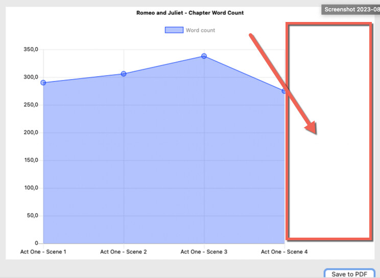
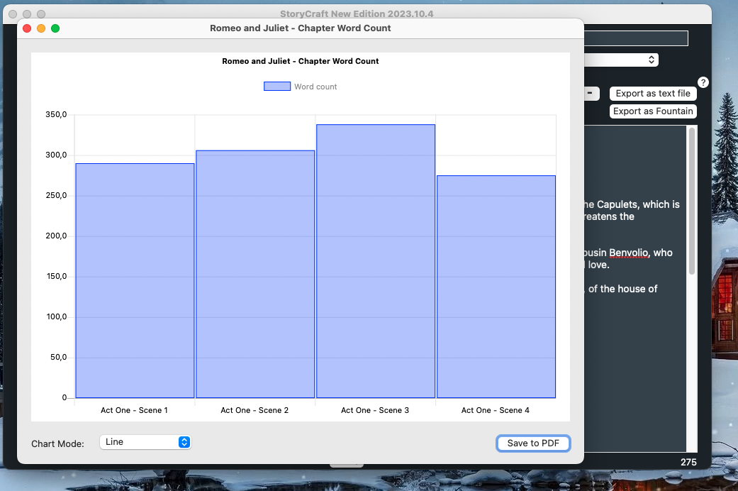
The chart looks good now, but when I export it as PDF, the bar labels are extremely small because they are shown horizontally. Is it possible to make the labels larger and/or rotate those labels so it looks like the image in the Chart window?
This is the Export as PDF code:
Var d As New PDFDocument
Var g As Graphics = d.Graphics
d.AddChart(ChapterWords, 20, 20, g.Width-80, ChapterWords.Height )
d.Save(SpecialFolder.Desktop.Child(StoryTitle_Selected + ".PDF"))
Chart Window:
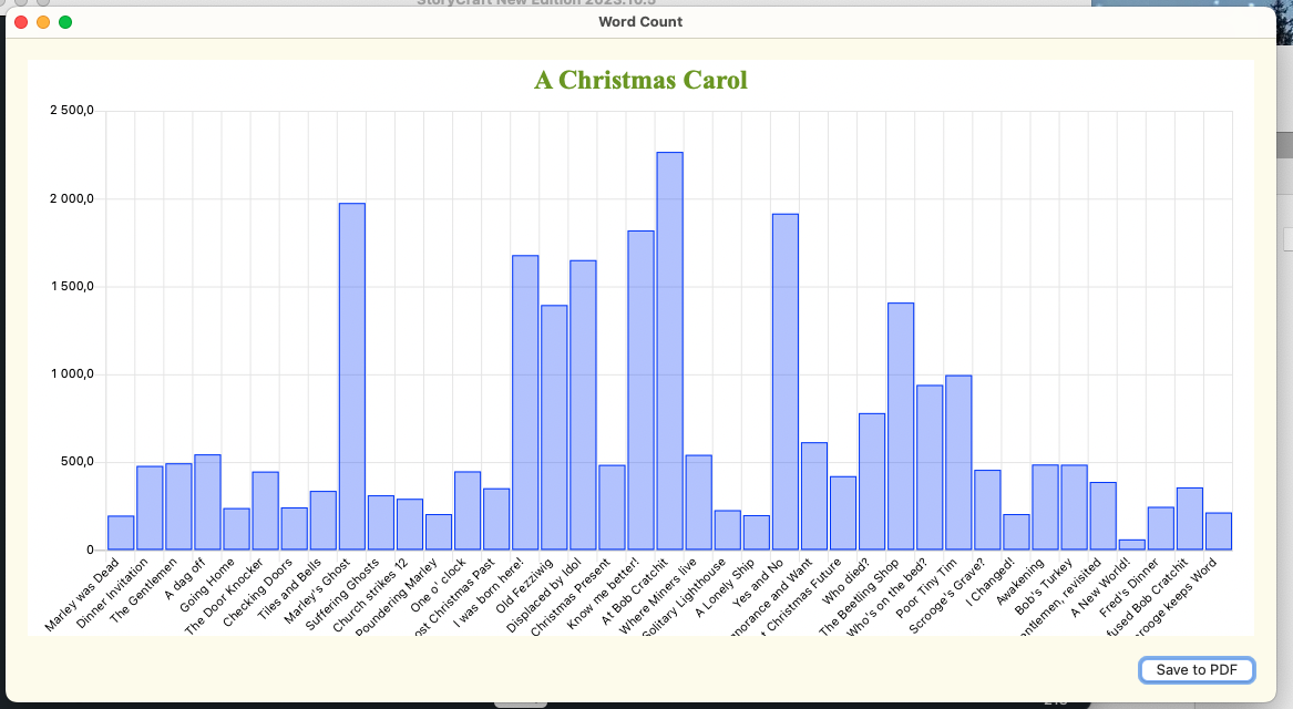
PDF:
Hi @André_van_Haren, you can try to set the labels font size to a higher value (that one will be used both for rendering on PDF and on screen).
Hi,
I assume you mean the general font size but even then, the left axis numbers are getting bigger while the Bars labels are very small still. It’s of course because there are so many bars in such a small space on the PDF, but as it is now, the PDF export is not very useful. Is there not a way to ONLY change the size or rotation of the Y axis labels?
Maybe a workaround could be setting the PDF page in landscape? Or even add a page to the document using a different size?
As you know, it is possible to create a PDFDocument that is composed with pages of different sizes so that option could work in your case. Obviously that depends on the general layout you want to give to the created / composed PDF document, of course. ![]()
In addition I’ll do some test here and see ways to improve that, so thank you for pointing it out! ![]()
I did have a bug report in about the gap on the right, but it was closed as fixed (other items in it were, this wasn’t). I’ll add another:
DesktopChart : Charts in Line mode show a large blank area to the right.
https://tracker.xojo.com/xojoinc/xojo/-/issues/73774
Please thumbs up on the issue if you have this problem.
1 Like