I have an open source Music Font where I’m drawing text into a Canvas. It draws text OK but Italic does not work in MacOS but does work in Windows. Is there a better code rewrite force it to work?
Dim Buffer As Picture

Canvas.Buffer.Graphics.TextFont = "Kodaly"
Canvas.Buffer.Graphics.Bold = True

If CheckBoxItalic.Value = True Then
	Canvas.Buffer.Graphics.Italic = True
ElseIf CheckBoxItalic.Value = False Then
	Canvas.Buffer.Graphics.Italic = False
End If

Canvas.Buffer.Graphics.DrawString("HelloWorld")

Canvas.Invalidate
I’m by no means a Font expert. It does shift the Font a couple of pixels to the left. What makes it explicit bold or Italic? This is taken right out of my Font Creator Application Help.
Older software typically supports the combination of Font Family and Font Subfamily, while modern software uses Typographic Family and Typographic Subfamily. If the Typographic Family and Typographic Subfamily fields are empty, the values from Font Family and Font Subfamily are used.
Well I’m no expert either. But you’re looking on Windows there. Open the FontBook app under macOS to see if Kodaly is installed and what variants it has:
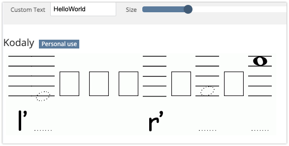
It’s installed but It only has Regular for Kodaly in FontBook. Almost every Font on my Mac is missing Italic and only has regular too. There are only just a few with Italic. The Mac Gate Keeper Standards are really starting to frustrate me. Don’t want to make too many waves here the majority of the people here are Mac users. Why they do this may be outside my understanding.
Thanks, so I guess that Kodaly from FontAdict is not the same that you use.
Can’t you search from where you downloaded it to see if they offer the Italic and Bold versions? If not, I’m sure there could be a way/software for you to create the Italic/Bold versions.
Why or whatever Macs reasons it does not work in Mac & does in Windows. Like I said it may be reasons I don’t understand. I see it as certain standards of allowing something or not. That’s what I mean by gatekeeper. Just like the Mac Store.
AlbertoD - I have a Windows Program called Font Creator. I’m not sure of what tweaks I have to do to make it work. Marc Zeedar did an old Xdev article that explains the issues with Fonts in MacOS & how to get around them. I got to go back and find it.
MacOS is a unix variant. Unix has strict rules about font handling, which MasOS inherited. You’ll have the same issues with Linux. This is one area where Windows is a little more flexible.
Seems to me that this has nothing to do with GateKeeper, which relates to whether an app is allowed to run or not. The app I distribute is allowed to run because I codesign it using AppWrapper, and get it notarised by Apple via AppWrapper. The former aspect means that a user trying to run it knows that the app was written by a registered Apple Developer, the latter means Apple has checked it for malware and found none. Beyond that, the details don’t interest me. You’ll find that Windows is going the same way but the process there seems random and ad hoc, from what I can gather from posts here. At least Apple’s can be made to work, which is all I care about.
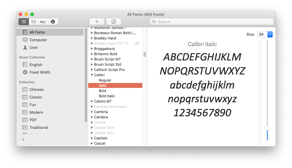
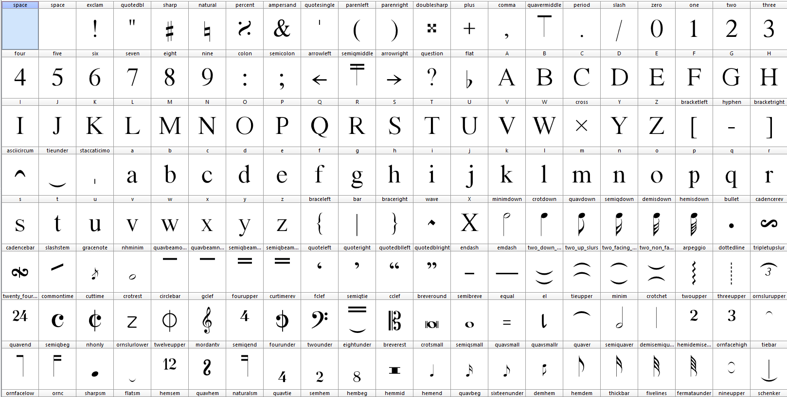
As far as fonts are concerned, seems that in this case whoever created the Kodaly font didn’t bother to make more than the standard variant. They didn’t create bold or italic versions and include them in the distributed package. If you look at the screen shot I posted up-thread, you’ll see that the creators of Calibri created a number of variants.
Interestingly the Geneva font on my Mac here is listed as having just the Regular variant. And yet MS Word for Mac seems able to apply bold and italic to it. Perhaps it’s down to the application to do that if it wants to.
Thanks Tim - There’s one of the reason I didn’t understand why. It has gotten better in Xojo. The Popup menu control used to reject this font completely now it works in the latest version of Xojo. The Font is a free open source created by a Music Professor at a University. It happen to work perfect in my program.
Word probably does this to maintain document layout compatibility with the Windows version. The classic Mac operating system, using QuickDraw, used to emulate bold and italic styles of a font if it wasn’t installed - this feature was not carried over to Mac OS X’s imaging system. The fake italics were a geometrically slanted version of the standard version, which is just barely acceptable; true italics are different from fakes. A similar design difference exists between faked bold and real bold.
Bold and italic font styles are commonly not used for music notation.
ChatGPT can explain it better
—-
Music fonts typically do not include italic font styles because there is no general need for italic notes or symbols in music notation. Music notation uses specific and well-established symbolism to represent notes, chords, bars, and other musical elements. These symbols are usually upright rather than italic as they are most readable and recognizable in this form.
The lack of italic font styles in music fonts also has to do with tradition. Music notation systems have evolved over centuries, and there is a strong cultural consensus on how musical symbols should be represented.
In music notation, italic font styles are usually only used for textual annotations, such as playing instructions or song lyrics. The musical notation itself usually remains upright to maintain its clarity and consistency.
Your sentence says it all: a Music expert created the Font (not a Font expert).
And this Music expert as using Windows and never knew there can be a trouble (he probably never used a MacOS computer… or never believe someone wanted to italicize a music note)
I took Jeffery’s “gate keeper” as an expression, perhaps meaning “a gate where Apple keeps different decisions than the outside world”, and not the Mac OS component.