I’m using Xojo 2017 Release 3 to create an iOS project, and I’m having a problem displaying the app in both the simulator and on the actual device on an iPad Pro 12.9
I’m running XCode 9.2 with iOS 11.2.1, with Simulator 10.
When I run the app on all the simulators and all the devices, it formats on the screen exactly the way it is laid out in the IDE except for the iPad Pro 12.9 inch formats. In the larger iPad 12.9 formats, the image controls are not laid out in a proportional manner as in the other iPad formats. The controls do not grow with the larger screen.
Unless you lock a control to the right side of the view, it will move to where it would be placed on the screen as in an iPad 10.5 screen and the right side controls end up more in the middle of the screen. The controls should proportionally grow.
I’m not sure if this is a known problem, but it does not look correct. The layout should be proportional as to the size of the screen.
I was wondering if anyone else has had this problem, and if so when did it start so I can revert back to an older version of Xojo. Any help would be greatly appreciated. I’ve been messing with this for two days using the ever-so-fun Autolayout.
Example image can be seen at:
If you notice that the fonts sizes for the two iPads are the same. The large iPad should have larger font sizes.
Did you explicitly change the font-size of each control for iPad Pro?
iPad pro has a bigger screen, which means more screen estate to place objects, not bigger font-size. Unless you specify all control sizes in a percentage of it’s parent, all controls will still be the exact same size on iPad and iPad Pro 12.9
Regarding the buttons at the bottom, if you place them in a Toolbar, you could use iOSToolbutton.fixedspace and iOSToolbutton.flexiblespace to evenly place them on the view.
That has not been my experience with iPads. I have iOS apps on the App store, and I have tested them on devices as small as the iPad Mini to the 12.9 inch iPad pro, and they all proportionally size to the size of the screen. That translates to larger font sizes for the iPad Pro in relation to the total screen size.
Running the app on a computer with Xojo 2016 Release 1.0 it is proportional in the simulator. In other words, the fonts are bigger and fill the screen the same way it does in an iPad mini.
Having the larger iPad Pro 12.9 screen does not translate to more screen area in my experience. It should be all proportional according to the screen size. So I don’t know if this is a bug in this version of Xojo.
[quote=368059:@JrmieLeroy]Perhaps it has to do with Xcode 9.
Did you try compiling with Xojo 2017r3 and xcode 8?[/quote]
No I did not try that, I just ran it on an older machine running Xcode 7. It worked correctly on Xcode 7. Can you have and use two different Xcode’s working on the same machine?
It looks fine on an iPad Mini. It looks normal. Everything is proportional. It’s normal on all the other iPads except for the 12.9.
iPad Mini and iPad 9.7 share the same screen resolution thus looking exactly the same only perceived bigger font size because the pixels are bigger on iPad 9.7
Yes you can have two different Xcode versions on the same machine. But you will need to rename one or the other and launch it once to switch the Xcode target in Xojo.
Keep in mind that in some cases, Xojo 2017r3 has a bug when building iOS apps with Xcode 9, so you might need to use Xcode 8 to release your app until this issue is fixed in a future release of Xojo.
As Jérémie notes, the iPad Mini and iPad share the same relative screen size and pixel ratio. The iPad Pro models have different screen sizes and more pixels, so you app is correctly expanding to use the additional screen space. This is how it is supposed to work.
That has not been the case Paul in older versions of Xojo. I have apps in the App Store designed on Xojo 2016 R.1. that will look exactly the same whether the app is run on an iPad Mini or a 12.9 iPad Pro. The view scales evenly to the size of the screen. That is what I was expecting here. The controls get bigger on the iPad Pro.
The same app developed on Xojo 2017 R3 will run correctly sized in the simulator of Xojo 2016 R1.1
Why is it different now? Was there some sort of setting that was changed? Is there a way to create the app so it is relative to the screen size. It would be nice as it was in Xojo 2016 to create an app and have it appear exactly the same on any size iPad.
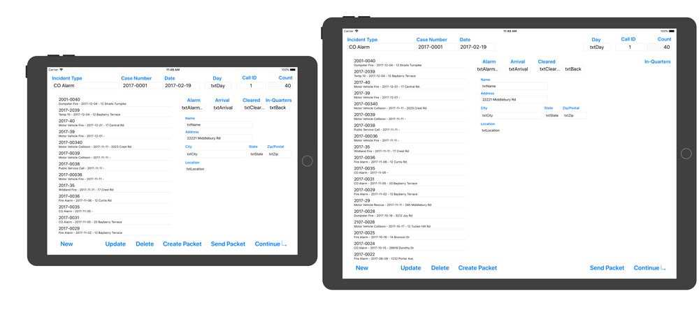
Here is a screen shot of the same app developed on Xojo 2016 R1.1. Left is iPad Mini. Right is 12.9 iPad Pro.
The screens are proportional. You develop one app with one view and it works the same on all iPads. That is how it should work in my opinion and thats how it used to work.
Just tested the app I’m working on an iPad Pro 10.5 in the simulator, and its sizes correctly. Of all the iPads including the iPad Pro 10.5, they all size correctly except for the iPad 12.9. So I don’t really think that is suppose to work that way. I think there is a problem.
[quote=368099:@Alberto De Poo]My guess is that older versions of Xojo didn’t use the higher resolution on iPad Pro 12.9, so when the app run it only do a “zoom”.
I hope there is an option to tell the iPad Pro to just zoom the image.[/quote]
The thing is Alberto, the Xojo IDE is one size for developing on all sizes of iPad. There is not an IDE for the 12.9 iPad Pro. One size fits all, so how can you design for the iPad Pro 12.9 if you can not take advantage of the real estate in the IDE. It also would not explain that the iPad Pro 10.5 sizes correctly. Its just the iPad Pro 12.9 that does not work correctly.
Sorry I can’t help you. I haven’t started learning iOS with Xojo and I don’t have an iPad Pro to test.
Taking the answer from Paul, I guess that newer versions of Xojo know that the iPad Pro 12.9 have more pixels and try to use them.
There is a smaller difference between the pixels on regular iPad and iPad Pro 10.5, than Pro 10.5 and 12.9. Maybe thats why only 12.9 show this problem.
I hope someone with iOS and iPad Pro 12.9 experience can help you.
I’ll need to confirm with Travis, but this is my understanding:
2016r1 uses an older iOS SDK that does not support iPad Pro 12". If the iOS SDK does not support the iPad size, then iOS “scales” or “zooms” the older app up to the new size. When this happens, the app is considered to be “not optimized for the iPad”.
2017r3 uses a newer iOS SDK that supports the iPad Pro 12", so you are now seeing the optimized behavior, which is for the extra screen real estate to be properly used. This is the correct behavior.
The iPad Pro 10.5", since it is newer, probably also needs a newer iOS SDK than what Xojo is currently using in order to it to also create optimized apps rather than doing the zooming.
All this is to say that the zooming is a temporary behavior for older apps. Newer apps are expected to properly use the available screen space.
2016r1 in the Device Simulator window has iPad Pro (iOS 9.3) on the list. Doesn’t that mean it was supported?
2017r3 has iPad Pro 10.5 (iOS 11.2) on the list. Doesn’t that mean it is supported also? The iPad Pro 9.7 (iOS 11,2) is also on the list. That has been out for a while and that scales correctly. Its only the iPad Pro 12.9 that does not display correctly.
But in the IDE you offer only one single size view to lay out the controls. If you wanted to take advantage of more real estate in the higher resolution devices, wouldn’t there be a separate IDE to handle the higher resolutions?
I don’t understand how you can take advantage of the extra real estate in the pro models if the IDE does not give you that room to lay out controls. So if you lay out controls for the higher resolution iPads in the current IDE, when you run the app on lower resolution devices, wouldn’t your lower resolution controls be crowded together?
To me Xojo should have a function where you can write a single app and have it be proportional on all iPad devices for those who want to achieve that effect. That would make developing the UI a lot easier, especially when having to struggle with Autolayout.
Also … Lets say I want to build an app JUST for the iPad Pro 12.9. I layout the UI in the IDE and run it on the simulator. The controls are not where I put them when I laid them out. So if they look one way in the IDE, why don’t they look the same in the simulator. How are you suppose to design an interface that does not look the same in the IDE as it does on the device? It does not make any sense.
No, that just shows what is available for the version of the iOS Simulator used by the version of Xcode you have installed. What is supported is determined by the iOS SDK.
Perhaps there should be a larger layout setting in the IDE to make it easier to utilize all the space on the iPad Pro, but auto-layout can go a long way towards moving things around for you. When you design Windows for desktop apps you typically create them at smaller sizes and let them grow to use more space as it is available. I think the same concept applies here.
iOS itself has no support for what you are describing.
Unless you use a tool like Elastic Window in desktop apps all you are doing is anchoring the controls to one side or another. You really can’t make controls larger to fit the size of the screen. An interface designed for a laptop will not look very good on a really large 4K display unless the actual controls are increased in size. Trying to do that with autolayout would be a nightmare.
I think a larger layout setting for the iPad Pro models would be the way to go. Laying out controls in the IDE should match what you are seeing in the simulator. Anything else is just difficult for the user.