Datetimepicker graphical contrast

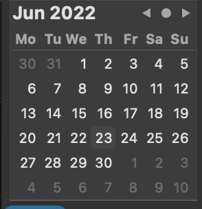
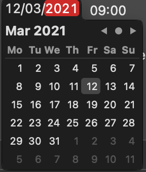
I using the new dateTimePicker graphical version I notice that the contrast between the background (dark grey) and the selected date is not very strong - makes it difficult to see in dark mode.

See Xojo on the left vs Apple on the right. Is there a way to adjust this?

Screenshot 2021-01-20 at 16.16.44 Screenshot 2021-01-20 at 16.13.48

Hi @James_Pitchford

Please, do you mind to submit a feedback case for this?

Thank you!

Never mind. Already done.

<https://xojo.com/issue/63393>

Thank you @James_Pitchford!

Thanks - you got to it before I’m fully awake!