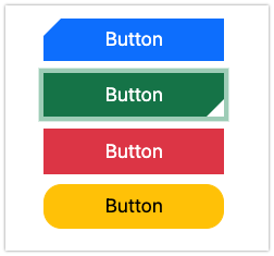
Hi all
I’ve been asked to update a UI and customer loves these buttons.
Anyone have any suggestions on a theme or way of implementing the 45 degree chamfers?
I have all the pluggin options from our friends at Graffiti etc if it helps?
Hi all
I’ve been asked to update a UI and customer loves these buttons.
Anyone have any suggestions on a theme or way of implementing the 45 degree chamfers?
I have all the pluggin options from our friends at Graffiti etc if it helps?
From what I read Bootstrap button corners use radius, so all bootstrap themes have some curved corners and not 45 degree chamfers.
Maybe you can create your own with a picture.
Sure it’s possible. You won’t find much that you can’t do with CSS. Now, easy is another question entirely. Not really. I suspect you’d have to layer the tree just right to clip the button and use static values.
Here’s an implementation on StackOverflow if you really want to give it a shot.
Thank you for the tip, here is the result of my tests:
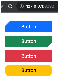
Each button indicator show a different border.
Thanks all. This looks like a way forward. Can you share your code snippet Alberto?
Sure, it was just a quick proof of concept using the StackOverflow information linked by Anthony
<style>
.btn-primary { border-width: 0px;
--bs-btn-border-radius: none; }

.btn-primary:before {
    position:absolute; left:0px; top:0px; content:'';
    border-top: 15px solid white;
    border-right: 15px solid transparent;
}

.btn-success { border-width: 0px;
--bs-btn-border-radius: none; }

.btn-success:before {
    position:absolute; right:0px; bottom:0px; content:'';
    border-bottom: 15px solid white;
    border-left: 15px solid transparent;
}

.btn-danger { --bs-btn-border-radius: none; }

.btn-warning { --bs-btn-border-radius: 15px; }
</style>
In App HTML Header.
Note: this can cause problems with other controls (if any) that use btn- indicators classes. Also, this is not dark mode aware. You should create a proper Bootstrap Theme.
The focus ring will look strange too: