Can the color be improved? It makes orientation very difficult.
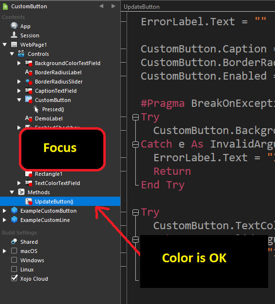
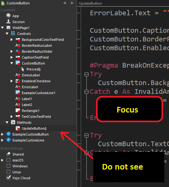
Yeah, that’s the “selected but not focused” color that Apple provides.
Try turning on High Contrast mode in System Settings. It will help you see all of macOS easier. I recommend it ![]()
The selected but not focused color in high contrast mode is easier to see:
Edit: If you’re using Windows (suspicious of how rough around the edges the text is), I think those colors were chosen by Xojo and you’ll have to file a ticket.
Sorry, I didn’t write, I have Windows 10.
I changed the color scheme to a light color in the system and it’s better, but now my eyes get tired quickly.
I’m new here and don’t dare report my problem. I thought maybe something else could be set somewhere. You have to get used to it.
Thank you for your posts and best regards Artur ![]()
Don’t let that stop you.
IIRC, windows doesn’t provide a color for unfocused selected items and we just copied what macos does.
Doesn’t this imply it’s a wrong design on Windows, then?
I do not think so.
When I do not have ideas, either I ask around me or I watch around me. When I find something I like I take it and implement it (and try to not look alike/be different enough: I do not want to carbon copy !)
In short: I invent my solution.
As I said…