Hello all!
Before opening a new feature request, I ask to be sure if I don’t miss something.
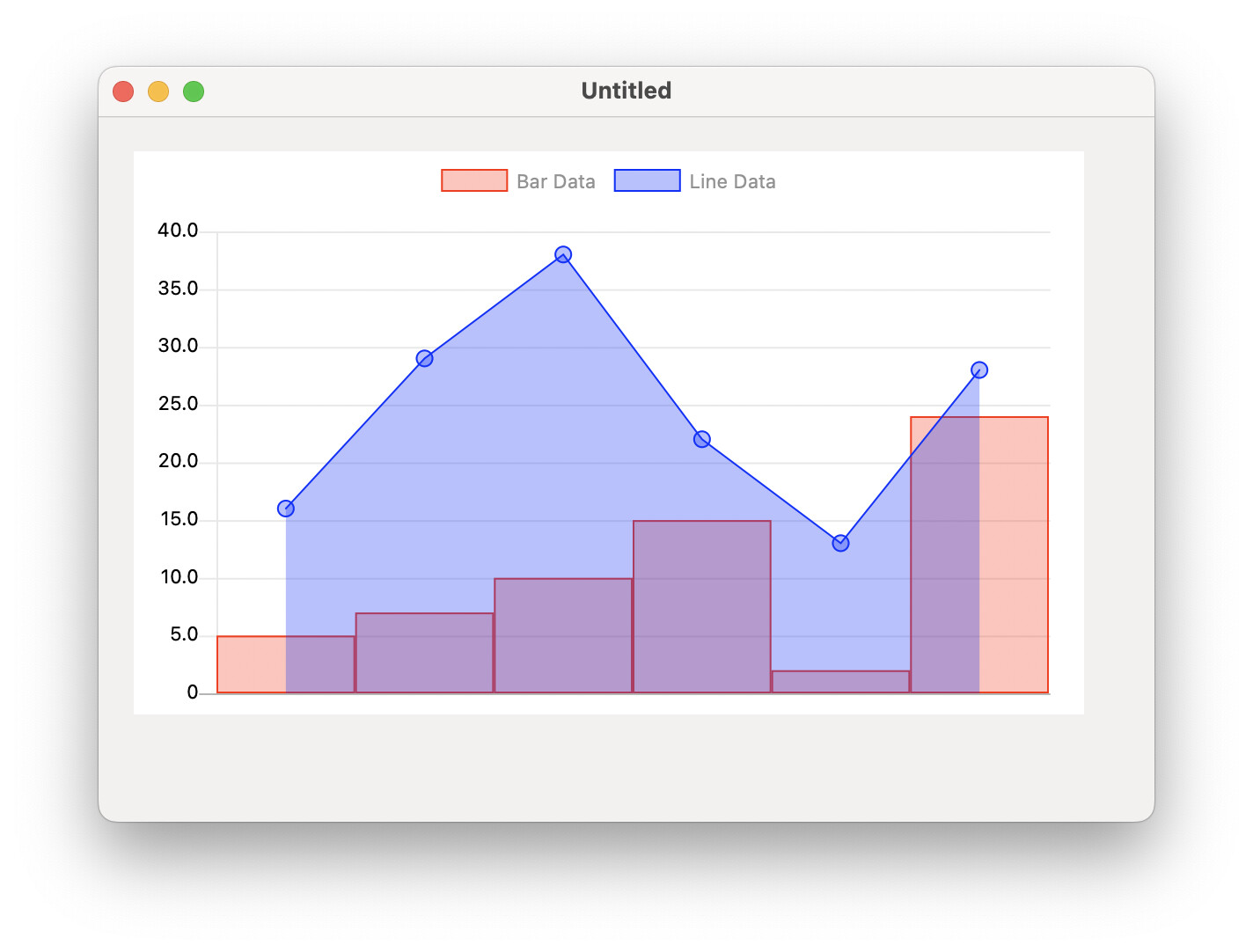
Today I played with the new chart feature. I find it very useful!
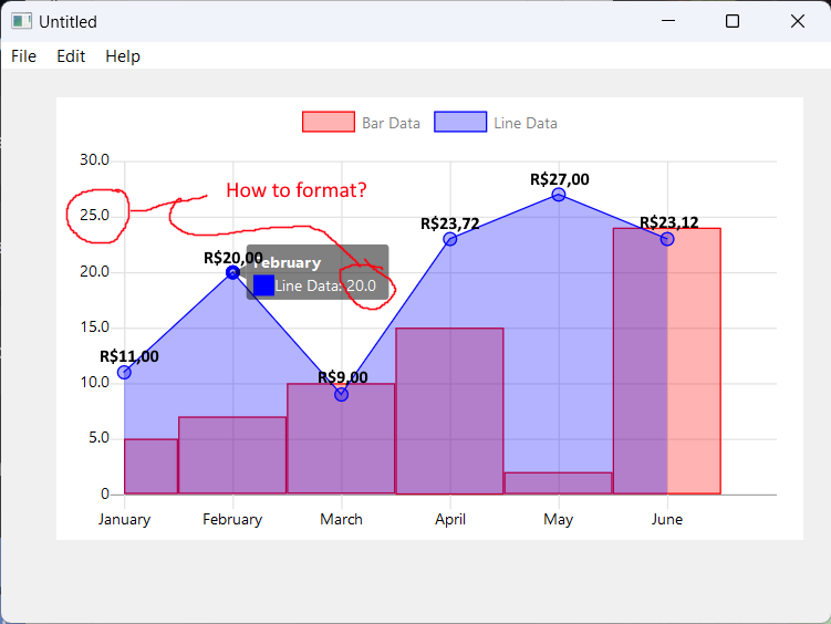
I noticed that the values in the chart are formatted as “raw” double, but in 99% of my needs they will be “currency” values, something like 2.345,67 (“dot” for thousands and “comma” for decimals).
I played for 2 hours and I didn’t find nothing in the documentation… Do anyone have idea if I miss something? Or have I to open a new feature request?
You should file a feature request. Changing to formatting is not what you need. You need it to take a chartdataset with a currency values. I think that’s a whole new variant.
For a chart with a datapoint as 1234,560000002527 with a companion representative label “US$ 1,234.56” it would be irrelevant. But I see his problem. I think there’s no such option.
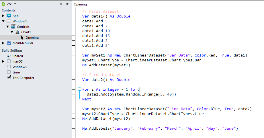
Create a desktop app. Drag a chart component to a window and put this into the Opening() event:
// First dataset
Var data1() As Double
data1.Add 5
data1.Add 7
data1.Add 10
data1.Add 15
data1.Add 2
data1.Add 24

Var mySet1 As New ChartLinearDataset("Bar Data", Color.Red, True, data1)
mySet1.ChartType = ChartLinearDataset.ChartTypes.Bar
Me.AddDataset(mySet1)

// Second dataset
Var data2() As Double

For i As Integer = 1 To 6
  data2.Add(System.Random.InRange(5, 40))
Next

Var myset2 As New ChartLinearDataset("Line Data", Color.Blue, True, data2)
myset2.ChartType = ChartLinearDataset.ChartTypes.Line
Me.AddDataset(myset2)

Me.AddLabels("January", "February", "March", "April", "May", "June")
As I said, it’s irrelevant as no one will see the real infinitesimal value, they should see the representative label you’ve set for such datapoint. But the y axis you wont have such control, for those we need a format mask.
Datapoints should not be array of Doubles, they need to carry more properties. Right now I think a Pair could be enough as (23.7201 : “R$23,72”) // value : substitute label , if label = Nil use value formatted using the format mask of the series (dataset). If label = “”, don’t print the value, if label > “” print the label.
We need the basic option to print the series values under request.
Hi Javier. Has this been completed? I’d like to implement this feature (formatting the y-axis values) on a WebChart. I didn’t find anything in the example project nor the blog other than this is now possible as of r2
You can expect the new DesktopChart features to be working on WebChart, like configuring how the lines look like (including the endpoints), background images or prefix and suffixes.
You can expect the new DesktopChart features to be working on WebChart, like configuring how the lines look like (including the endpoints), background images or prefix and suffixes. Read New Additions to DesktopChart, MobileChart and WebChart to learn more.
The link is not working on the mentioned blog post above.