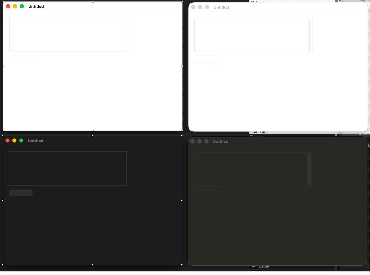
not new, but this time I asked a kid (less than 20 y/o) and he said he does see nothing excepted the window.Screen shot below with a selected TextField. It was not selected when I asked the kid.
To be able to start a brand new project, I had to set a backdrop color (see the yellow screen shot below)…
It was the same on some previous versions; this is not related to Tahoe.
And in my first screen shot, we only see the anchors, not the TextField boundaries (that is the problem).
Show me a screen shot of other IDE in the same condition and I will cry silently (continue to use a window with a colored background when designing a window.
yes its bad visible in design time.
mabye change your monitor contrast.
usually you have a label a hint or some text in it.
if it helps reset the back color at runtime.
For once, I started adding a TextField and because it was lunch time/I am at my local McDonald’s, I took the opportunity there are youngsters to ask them. Now I know it is not my bad eyes, but the stuff is not visible.
Then, a friend comes to me and we were talking until now.
I added the needed numbers of TextFields and here’s what it looks:
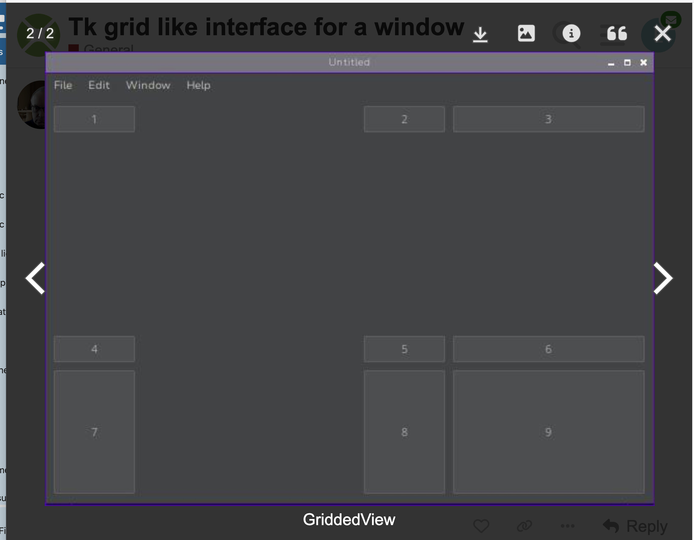
Screenshot taken from this Forum, another Thread. the white signs/characters are from the Forum navigation/information.
You can enlarge the image.
PS: the > sign in the DesktopListBox (Hierarchical Row) also is grey light / I have to put my eye very near the screen to see it (even if I know there is one in that Row)…