Will Big Sur change anything for our apps? Didn’t really see anything that stood out in the developer beta release notes. I haven’t installed it yet. Need to clear some drive space, but can’t do that right now. Hope it’s nothing like the change to Catalina!
You need to test yourself. I had some really odd issues. Buttons - for instance - need to be made larger because the kerning of the system font is a bit different.
A lot of underlying APIs seem to have changed for BS. Quite a few apps are crashy.
On the user front:
is Recent Items (Apple Menu / System wide) still a Sub-Menu ?
There’s a whole lot of cosmetic changes. Sheets, for instance, no longer slide down from the top of the window. The parent window dims and the sheet is centered over the parent. MessageDialog is now much more vertical. Titlebars look… awful.
Most apps will work fine. But you may want to take the opportunity to update your app’s design a bit.
Thank you Thom.
[quote=497393:@Thom McGrath]There’s a whole lot of cosmetic changes. Sheets, for instance, no longer slide down from the top of the window. The parent window dims and the sheet is centered over the parent. MessageDialog is now much more vertical. Titlebars look… awful.
Most apps will work fine. But you may want to take the opportunity to update your app’s design a bit.[/quote]
I am working on a series of articles to aid with this transition.
For a laugh, I made sheets on Catalina appear in the middle of the window. With some customization, I can bring the whole Big Sur sheet style to Catalina and below, as I kinda like it, but I don’t really think it’s a good idea 
Oh, and I detest that messagedialogs and sheets display very differently, with the prior being 260 pt wide only!
à la Windows XP !
This recalls me a beta with a Windows style drag and drop (the dropped folder was moved instead of opened - in Open / Save dialogs - ).
Fortunately, it was reverted in the following beta.
2 Likes
Ugh. I hate changing the look of things between 2 OS versions. Well i guess it’s not as bad as Catalina where some things just won’t work, like the QT dependence. I muddled thru that (somehow) and kept my app alive. Another major change will drive me over the brink, though. Maybe i’ll take up woodworking instead. Guess i’ll need to free up some space and give it a whirl. Thanks for letting me know what to look for.
2 Likes
Hi Thom - I have seen screenshots of sheets comparisons between Catalina and Big Sur. In Catalina it is clear that a window can be moved with the sheet displayed, but this is not clear in Big Sur as the whole window is greyed out. But that is the whole point of a sheet - a dialog is displayed but it’s up to the user when they deal with it, and moving the window is possible. Did Apple just break sheets?
No, you absolutely can still move the parent window by its titlebar.
Whew! Thanks - but that’s not clear is it? I would have liked to see the grey in the window area and the title bar the usual colour, which would make it clear.
I think that would look very weird. I don’t think it’s any more or less clear than it used to be. Maybe a tad less clear I guess, but not something I really concerned about.
Ironically, I kinda like the sheets appearing in the middle, IMHO it makes it more clear. But hey.
For fun, I hacked the sheet placement so that sheets in 10.15 (or lower) could appear in the middle. But it looked weird.
You know Sam, for somebody who has built up a reputation for hating every macOS update, that kind of talk is dangerous 
2 Likes
Don’t worry; there is plenty I dislike about Big Sur too.
- Alerts designed for an iPhone 5.
- Alerts and Sheets draw in the same location, but use different controls.
- Unreadable menubar on some backgrounds.
- Toolbars are confusing and messy (like where on the window do I click to move the window?).
- SegmentedControls.
- Dock icons are now indistinguishable by shape, and rely so much more on color.
- Single color sidebar icons take more through to distinguish.
- Default buttons are different colors in different applications.
- Some buttons, you simply don’t know if they’re enabled or not and with the new “show no progress” mentality, you don’t know if you’re clicking on a disabled button, or it’s doing something?
- New Toolbar control style is limited to the toolbar only, so creating partial toolbars (because it’s much harder to do it correctly in Xojo) seems like it might be impossible, although I do have a few more tricks up my sleeve to try.
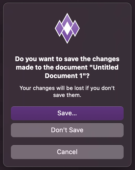
Here is one of the start dialogs of my app:
Now compare this to BS:

The width alone is bad. But the contrast of the buttons and the position of the buttons are so terrible. As this is one of my start dialogs I’ll need to do a redesign with a window.
1 Like
Looks like you are going to have to create a custom “On boarding” window. The upside to this is you can create a really nice window for it  Downside, is Apple have given you more work on top of what you’ve already got!
I am shocked it doesn’t even highlight the default button any more for you.
Yes, more work for us as usual. The order of the buttons doesn’t make any sense.
2 Likes
Makes me wonder if Apple hired a GUI designer from Microsoft.
That dialog looks like it doesn’t have the focus. When active, there’s much better contrast. It’s not a dark mode issue either. Admittedly, the contrast in light mode isn’t great.
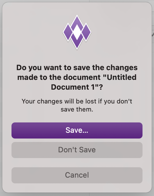
I also don’t understand the complaint about button placement. The default is at the top, followed by the alternate, which I’d agree with featuring more prominently than cancel. And they put the cancel on the bottom with some extra spacing to help differentiate it. What’s the problem here? This is the same order as your screenshots. They just changed the order from “Alternate, Cancel, Default” to “Default, Alternate, Cancel.” Sounds more logical to me.
1 Like