Hi everyone and welcome to month 7 of the 2025 Year of Code! This is the thread to share your Charting project. Charting uses the DesktopChart, WebChart or MobileChart controls to make your data stand out with visualizations like Bar, Bubble, Pie, Scatter charts and more.
Read about @Javier_Menendez’s example charting project on the Xojo Blog. Check out his iPhone app that tracks expenses - something I know I could use While it’s designed for tracking holiday and travel spending, it works just as well for managing general monthly expenses.
Remember: To be entered in the drawings for this month’s prize and the grand prize at the end, you need to share your code, preferably on GitHub. Refer to this blog post if you need help with getting your project on GitHub.
I realize it’s mid July and many of you are on vacation, I will be in week too! But here’s your just past halfway reminder that you can still win July’s Year of Code prizes! I’d like to thank some of you who a have participated multiple times in the past 6 months. Thank you to @Wolfgang_Schwarz who has participated the most with 4 monthly projects and to @Serge_Louvet1 who has participated 3 times! Other notable users include @Jürg_Otter, @Sascha_S, @Valdemar_De_SOUSA and @Philip_Cumpston who have each participated 2 times. I hope you continue to participate with July’s Charting project!
Remember, every month you submit a project is another chance to win the grand prize. The grand prize is $250 cash plus a Xojo Pro license and a year of GraffitiSuite and will be announce in December. Learn more about the prizes.
Would my Simple Reporting project count? It doesn’t do charting by itself. But with the project I can do charts what my app is doing in Google Looker Studio.
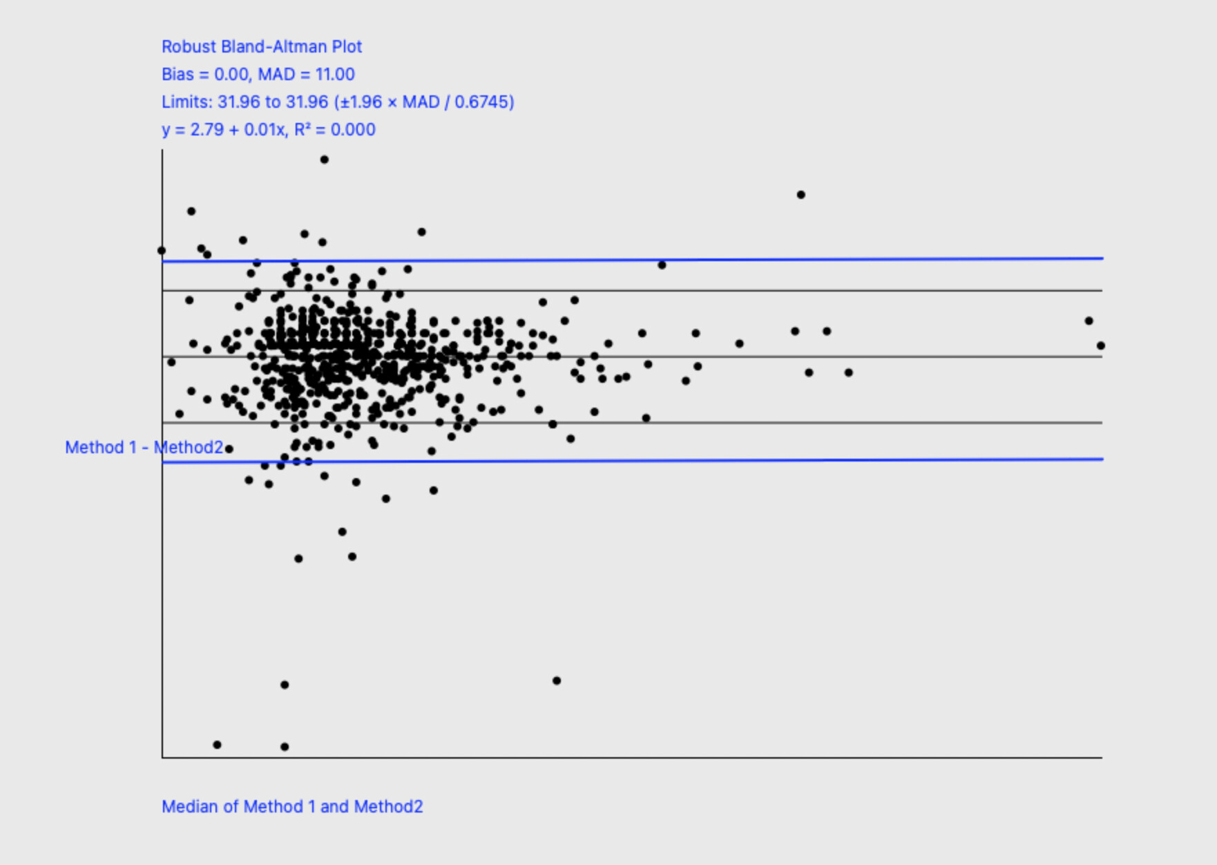
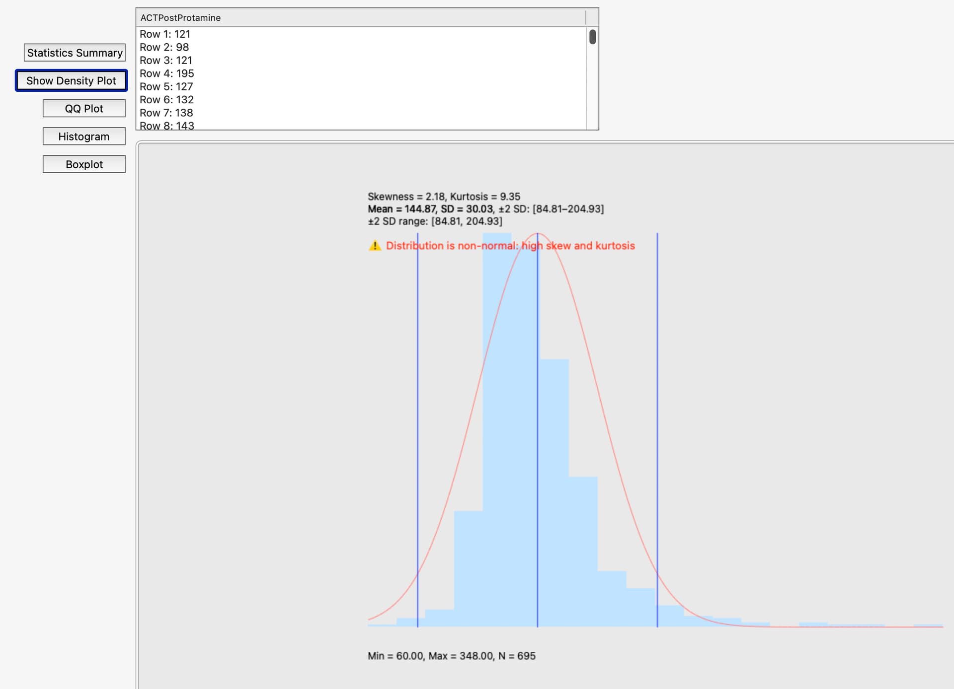
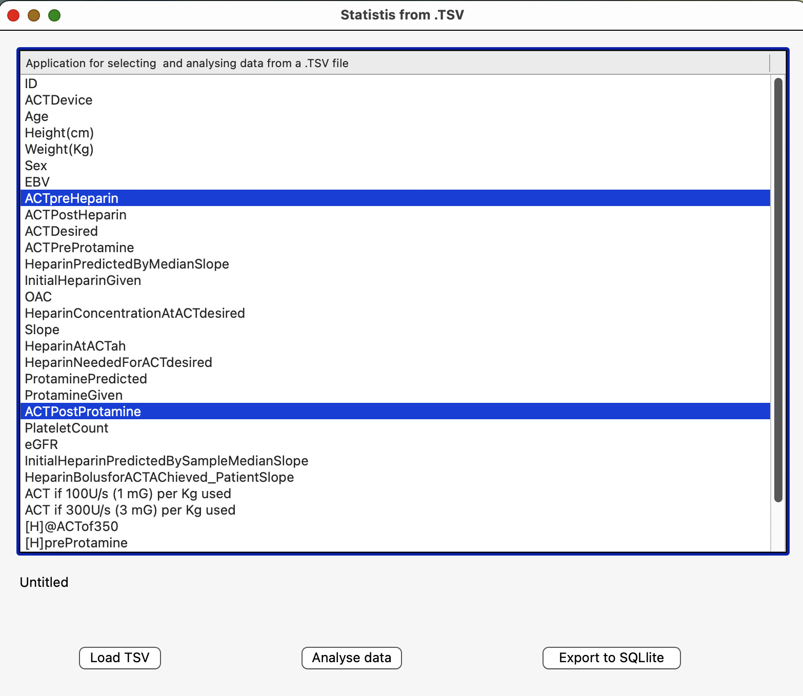
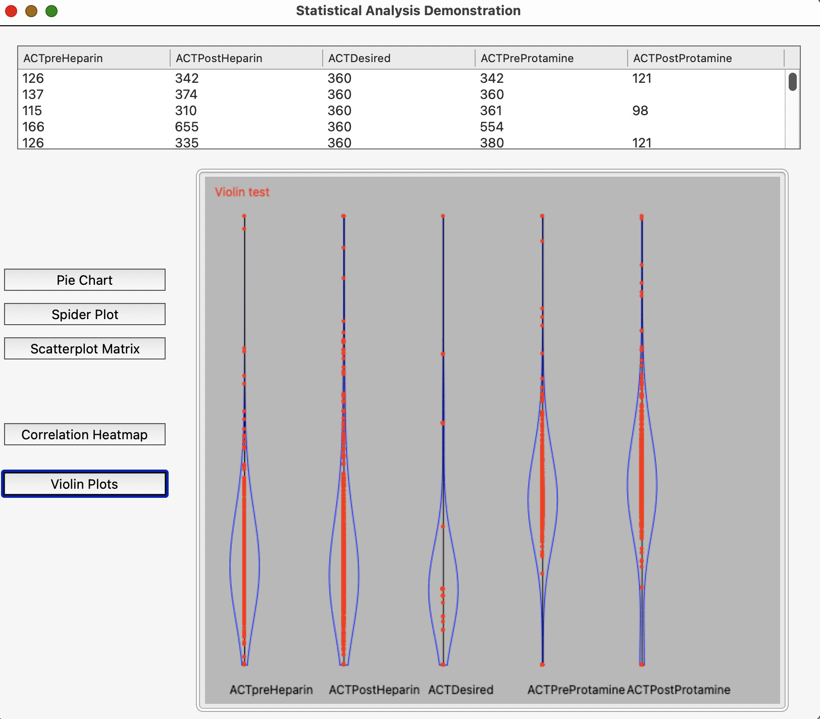
I have written a desktop application that loads data from a .TSV file, dislays the header column names in a listbox and allows users to choose one, two or many columns for statistical analysis. Each of those three choices is managed separately and where appropriate, charts are displayed of the results. The application is still being updated but will have all three components working soon. It will be available for review on GitHub: Statistics Application
analysing one, two or multiple fields to generate statistics
displays the results in picture format in an imageviewer
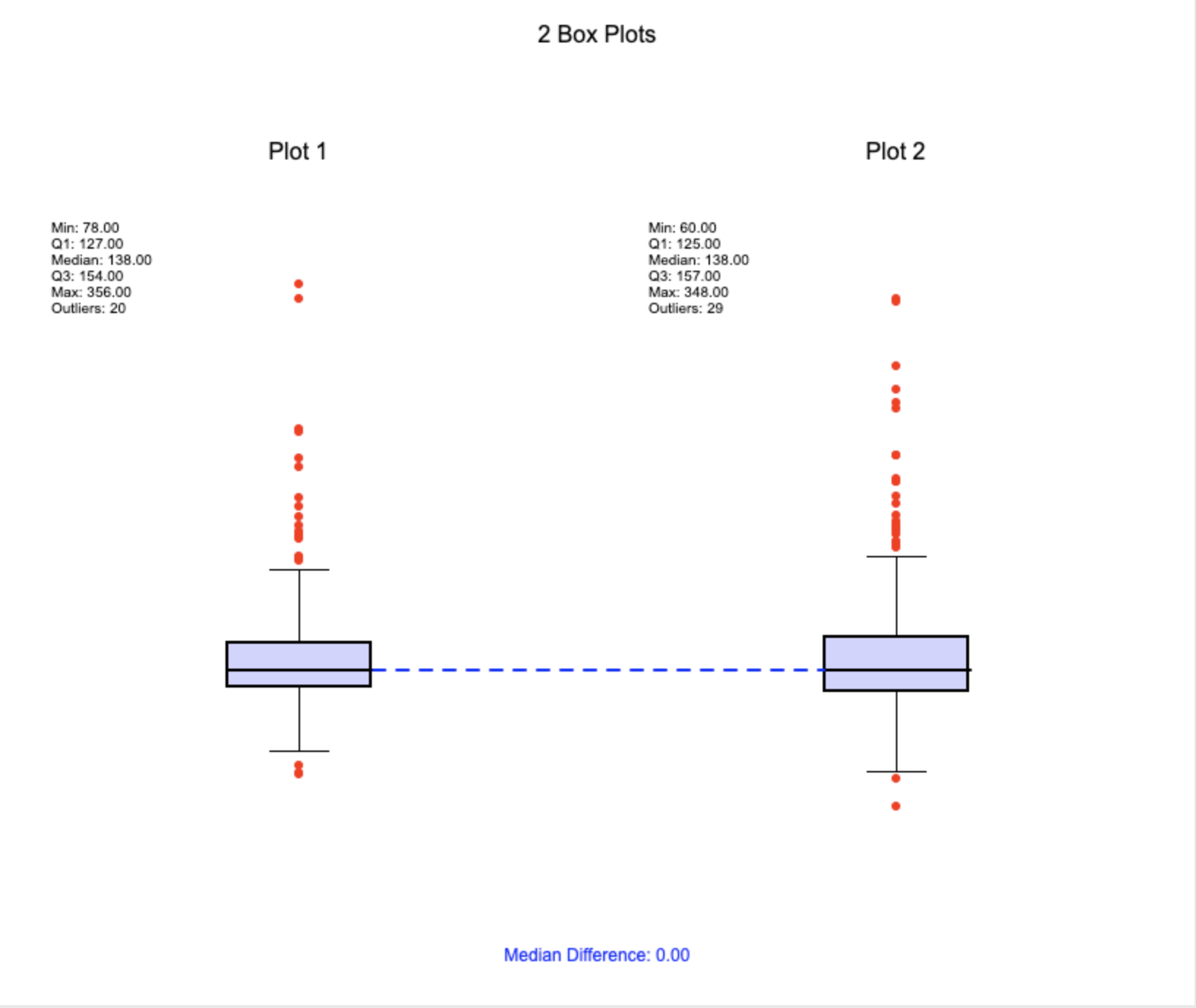
I found the exercise challenging and interesting, and learned a lot. The application contains redundant methods and different ways of laying out methods, including one class and one module. There are some redundant methods, and the code could be refactored, but I have run out of time to do that. I am most happy with the Bland-Altman analysis and violin plots, which are not generally available in Xojo.
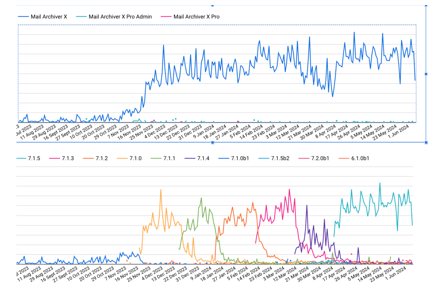
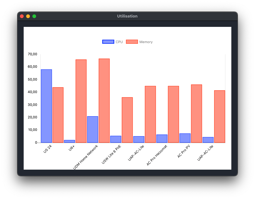
This month I have extended the class I created last month. With GetLatestDeviceStatistics you can read a few values from the UniFi devices. In my example, the Utilisation of the CPU and Memory is displayed as a percentage.
Thank you to everyone who participated by sharing your code in July’s Year of Code event. All the participants who posted in this thread with links to their code were entered into a drawing and the winner is @Wolfgang_Schwarz! Wolfgang is also Year of Code’s top participant, submitting projects for an impressive 5 months this year so far!
To participate in Year of Code, share a project related to each month’s programming theme. Remember, Year of Code is about learning from both the code you write for each month’s project as well as from exploring the code others have shared. You must share a link to your code, preferably on GitHub, be be eligible for prizes and Xojo fame.
We’ll announce the August project soon; stay tuned to the Forum, the Blog and our social media accounts for announcements.